1) The NEM reaches 10
For those who are unaware, 13th December 2008 marked the 10th Anniversary of the inception of the NEM. We released a short review of NEM history on that day to commemorate.
Given the occasion, however, we thought it would be useful to have a look, in more detail, at what has happened over the past 10 years.
Taking a slightly different approach, we’ve opted to review each month at a time – hence, this is one of twelve articles posted on this site at the same time.
2) 10 years of July
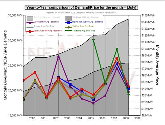
Through the NEM-Review software, we have prepared this illustration of how (average and peak) NEM-Wide Demand for electricity has grown over the past 10 years.
With respect to this chart, two things in particular need to be noted:
- Tasmania only joined the NEM in mid-May 2005 – hence the data for July 2005 shows the effects of Tasmanian region demand for the first time.
- The measure of “demand” calculated in NEM-Review v5.3 is the (30-minute) Trading Demand Target, which is the time-weighted average of the (5-minute) Dispatch Demand Targets over the half hour:
- Hence, the demand shown here is an output from NEMMCO’s NEM-DE (Dispatch Engine) and not a metered demand. In most cases, the numbers will be very similar, but they will vary from figures quoted elsewhere for “maximum demand”
- This is further explained in the glossary on the NEM-Review portal.
3) Quick Links
As the following table is quite lengthy, we’ve included here Quick Links to each of the 10 years included in the table below:
- July 1999;
- July 2000;
- July 2001;
- July 2002;
- July 2003;
- July 2004;
- July 2005 (including Tasmania for the first time, from mid-July);
- July 2006;
- July 2007;
- July 2008
4) Each Year at a time
In the following table, we touch on the highlights of some of the July months that have passed, since the creation of the NEM.
|
July 1999 |
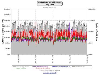
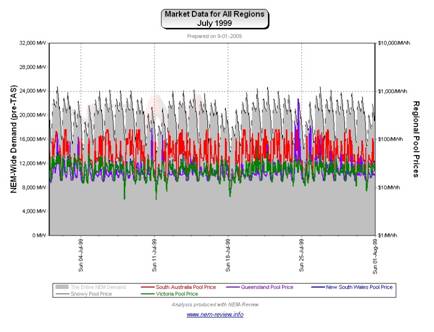
As highlighted in the diagram above, July 1999 saw modest prices in all regions, with the exception of SA.
In particular, note that prices in SA regularly reached $100/MWh (or slightly above) – which was enough to ensure an average price for the month almost double that of the other regions. |
|
July 2000 |
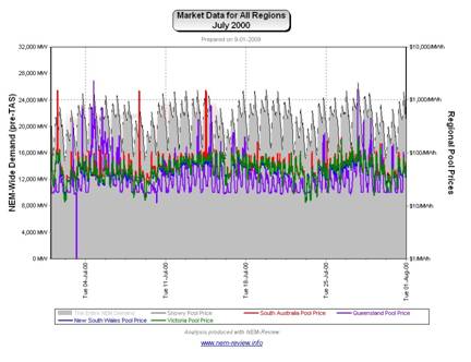
The main chart (above) illustrates that prices rose significantly in all regions in July 2000 (compared with July 1999). As can be seen, the price in SA remained higher than the other regions, but not by as much margin.
It can be seen that:
|
|
July 2001 |
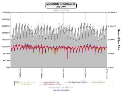
July 2001 saw prices subside in all regions from their levels in July 2000. The chart below (generated in NEM-Review version 5.3) illustrates why this was the case. As can be seen, there was not a single instance of spot prices being above $100/MWh, in any region – no wonder prices were low! |
|
July 2002 |
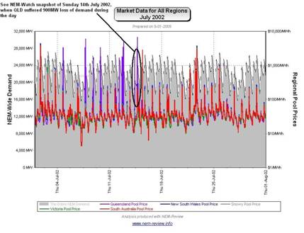
July 2002 saw a substantial rise in average prices, for all regions, but most particularly in QLD. We have previously prepared a more lengthy analysis of this issue – however the following chart (analogous to those above) clearly demonstrates the difference: As can be seen, July 2002 shows a high number of volatile pricing events. In summary, what emerged in winter 2002 was the wide-spread employment of a tactic that has become known by several terms:
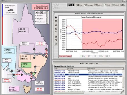
Essentially, generators took advantage of a predictable spike in demand around 18:00 and 18:30 each evening, and changed their offers to the market (pricing some of their capacity more expensively in the knowledge that, on most occasions, it would still need to be dispatched). Hence, generators engineered higher prices for winter peaks in demand – which offered them some relief from the many months of low prices they suffered prior to July 2002. The following snapshot (Playback of Sunday 14th July 2002, taken from NEM-Watch version 4) illustrates an interesting case where QLD demand dropped approximately 900MW over a 40-minute period during the morning. |
|
July 2003 |
As noted in the chart above, prices were lower across all regions in July 2003 (though prices in SNO, NSW and QLD remained higher than prices in VIC and SA).
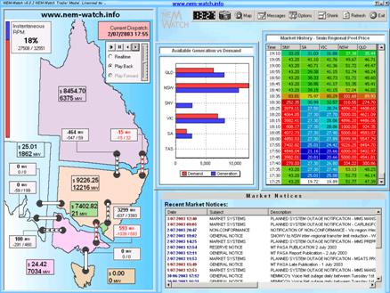
As can be seen, the evening peaks in price engineered in July 2002 continued in July 2003 (particularly in the northern regions), but to a lesser degree. Presumably, constraints out of Snowy limited the extent to which southern generators could also enjoy these spikes. The following snapshot (Playback of 2nd July 2003, taken from NEM-Watch version 5) illustrates one of the occasions over the month when this was the case. Note that the SNOVIC interconnector is shown as red (denoting constraints) hence excluding the generators in VIC and SA from the high prices. As noted in other articles on WattClarity, the inclusion of the dynamic calculations of the IRPM of Economic Islands in the Gold Model of NEM-Watch version 8 would have made it easier to see what the local supply/demand balance was in QLD+NSW+SNO at the time. |
|
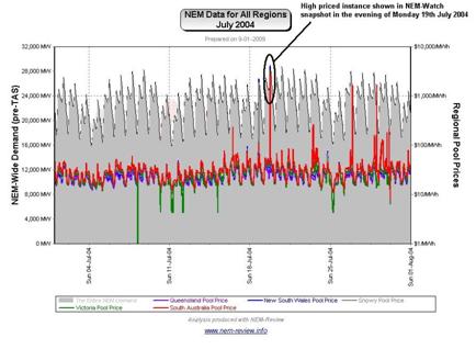
July 2004 |
As shown in the main chart (above) July 2004 saw prices in VIC and SA climb, whilst falls are seen in NSW, QLD and SNO.
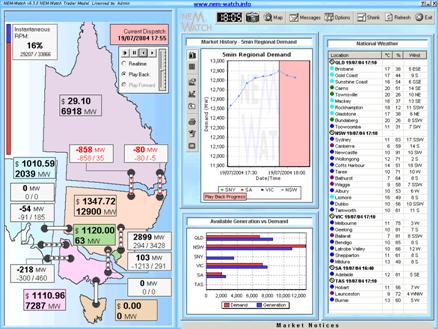
In contrast to the case of July 2003, we can see that the generators in VIC and SA enjoyed increased incidence of price volatility – not many more instances of prices above $1000/MWh, but enough to drive the average up somewhat. An example of this can be seen below (Playback of 19th July 2004, taken from NEM-Watch version 5), where prices were high in NSW, SNO, VIC and SA to coincide with the peak in demand in NSW. |
|
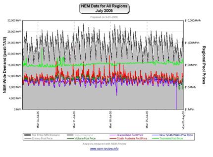
July 2005 |
As noted in the chart above, prices were lower across all regions in July 2005.
This was similar to what happened in June 2005 (indeed, prices were even lower in QLD in July 2005). |
|
July 2006 |
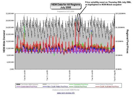
As the main chart above shows, July 2006 showed prices kicked significantly, compared to previous – with prices in Tasmania converging on the mainland (given the commissioning of Basslink earlier in the year).
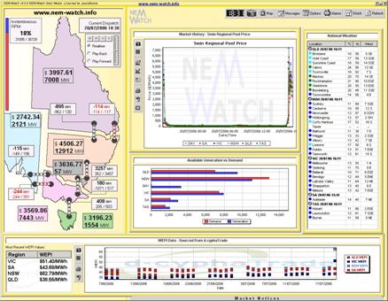
An example of this can be seen below (Real-time view of 18:30 on the 20th July 2006 taken from NEM-Watch version 6), where prices were high in all regions simultaneously, at a time when the NEM-Wide IRPM was a healthy 18%. |
|
July 2007 |
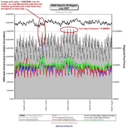
As shown in the main chart (above), average prices in July 2007 were absolutely huge! Our review for April highlighted the reasons why the drought meant 2007 was a unique year, amongst the 10 years of NEM history to date. The drought goes to explain some of what is shown in the chart for July 2007, below (produced from NEM-Review version 5.3 below).
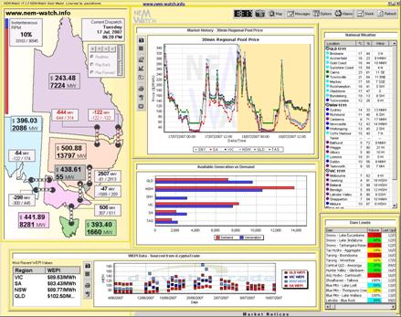
Also of interest in the diagram, above is the record of 4 days of very high evening demand over the month. With respect to the following snapshot (Real-time view of 18:20 on the 17th July 2007 taken from NEM-Watch version 7), we would like to point out that:
Note that this exceeded, by more than 1000MW, the peak demand experienced the following summer 2007-08 (6 months later), which (coupled with what we saw in June 2006) really does call into question the tenet that the NEM is consistently summer peaking.
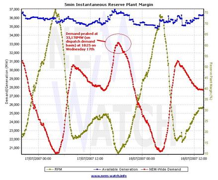
As shown in the next chart (from NEM-Watch) demand actually peaked at 33,170MW only 5 minutes after this snapshot was taken. |
|
July 2008 |
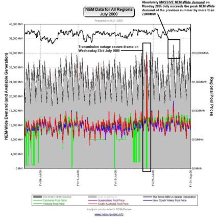
Finally, we see that prices subsided from their July 2007 high a year later (in July 2008). The reason for the subsidence (little volatility plus the return of the price shape to more “normal” levels) can be seen in the chart from NEM-Review version 5.3 below:
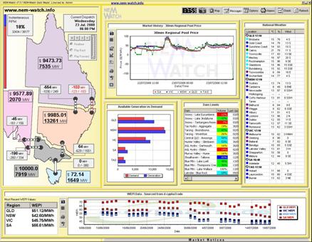
However, following that comment, 2 separate events occurred in the market that were particularly noteworthy – as shown in the diagram above. 1) Transmission outage creates drama (23rd July 2008) This incident is shown in the following snapshot (Real-time view of 18:00 on the 23rd July 2008 taken from NEM-Watch version 7): 2) Massive Peak Demand recorded (28th July 2008) From NEM-Review, we see that the Peak Trading Demand Target on the day was 34,292MW at 18:30 (we have not checked to see what the actual Dispatch Demand Target was, during the month – it is certain to be higher). Even with that number, it should be noted that the demand was more than 2,000MW higher than the peak demand recorded over the whole of summer 2007-08. Keep in mind what we found for July 2007 (above) and also what we saw in June 2006. In summary, the winter NEM-Wide demands in winter 2006, 2007 and 2008 all exceeded the peak NEM-Wide demand the previous summer, and the margin appears to be increasing. Hence, it might be hypothesised that:
|



PS – it’s been pointed out to me that NEMMCO were about 7 months quicker than us, publishing this press release about the fact that a new record NEM-Wide demand was set on Monday 28th July 2008.
Also, we’ve been told that:
(a) There is a discussion on nem-wide demands in section 3.3.6 of the 2008 SOO.
(b) It provides similar results to those quoted in our article and notes a significant difference in the level of diversity between summer and winter.
(c) More infomation on diversity is provided in chapter 13 of the SOO.
Hence, we probably need to be running a peak demand picking competition in winter 2009 as well. More on that later…
PPS – in Winter 2009 we did launch a “Best Demand Forecaster” competition in winter for the first time!
You can also check out the range of entries we received this time, as what we asked for was slightly different than during summer.