
1) The NEM reaches 10
For those who are unaware, 13th December 2008 marked the 10th Anniversary of the inception of the NEM. We released a short review of NEM history on that day to commemorate.
Given the occasion, however, we thought it would be useful to have a look, in more detail, at what has happened over the past 10 years.
Taking a slightly different approach, we’ve opted to review each month at a time – hence, this is one of twelve articles posted on this site at the same time.
2) 10 years of August
Through the NEM-Review software, we have prepared this illustration of how (average and peak) NEM-Wide Demand for electricity has grown over the past 10 years.
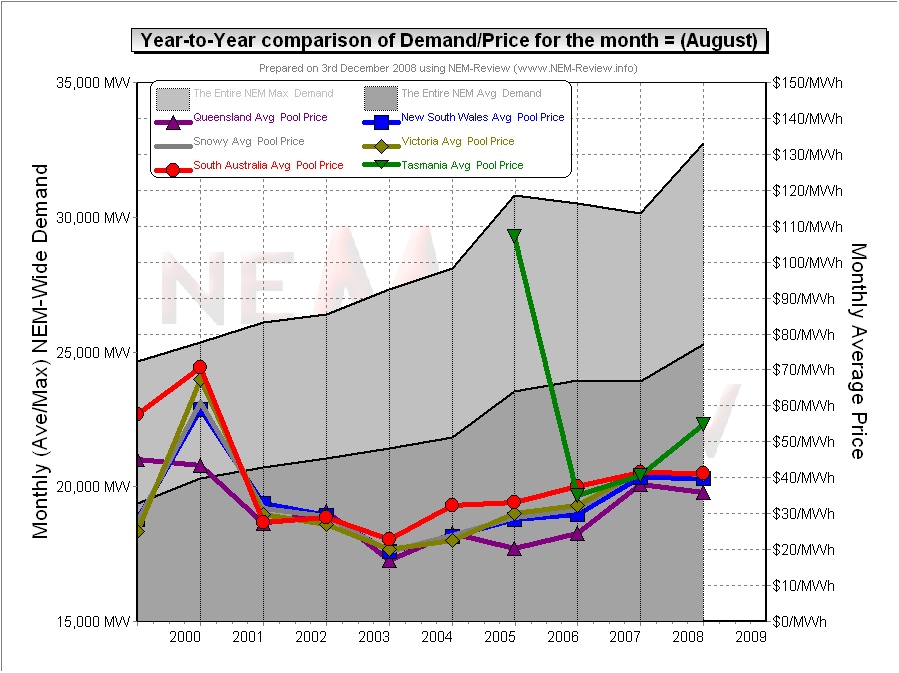
With respect to this chart, two things in particular need to be noted:
- Tasmania only joined the NEM in mid-May 2005 – hence the data for August 2005 shows the effects of Tasmanian region demand for the first time.
- The measure of “demand” calculated in NEM-Review v5.3 is the (30-minute) Trading Demand Target, which is the time-weighted average of the (5-minute) Dispatch Demand Targets over the half hour:
- Hence, the demand shown here is an output from NEMMCO’s NEM-DE (Dispatch Engine) and not a metered demand. In most cases, the numbers will be very similar, but they will vary from figures quoted elsewhere for “maximum demand”
- This is further explained in the glossary on the NEM-Review portal.
3) Quick Links
As the following table is quite lengthy, we’ve included here Quick Links to each of the 10 years included in the table below:
- August 1999;
- August 2000;
- August 2001;
- August 2002;
- August 2003;
- August 2004;
- August 2005 (including Tasmania for the first time, from mid-August);
- August 2006;
- August 2007;
- August 2008
4) Each Year at a time
In the following table, we touch on the highlights of some of the August months that have passed, since the creation of the NEM.
|
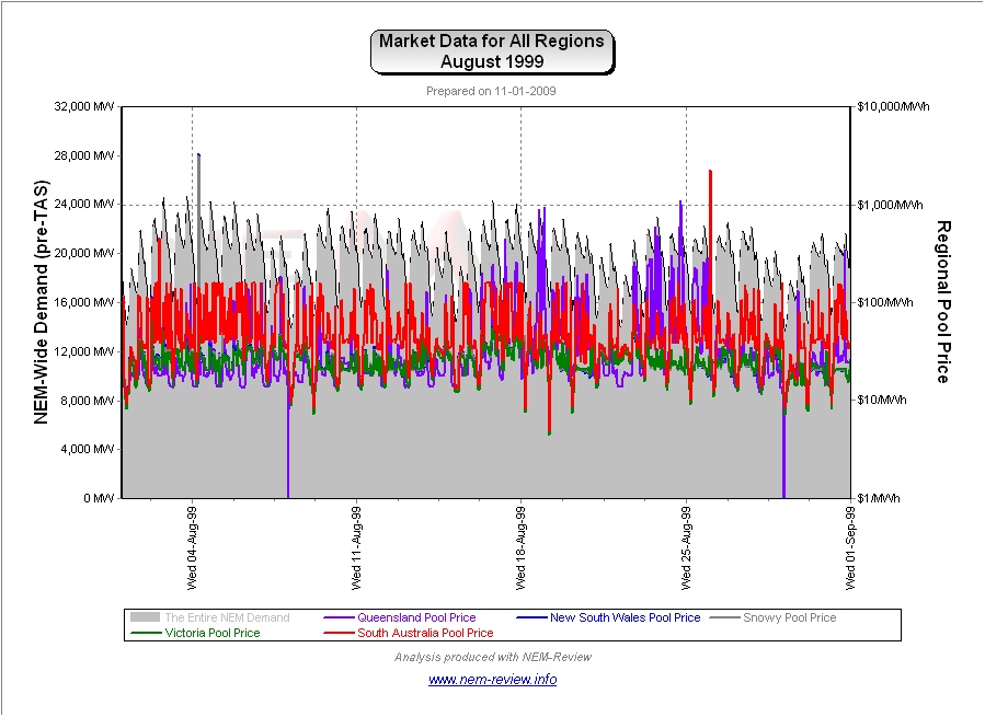
August 1999 |
As highlighted in the diagram above, August 1999 saw modest prices in the “core” regions (of VIC, NSW and SNO), with higher prices in the “outlying regions” of QLD and SA.
|
|
August 2000 |
The main chart (above) illustrates that prices rose significantly in all regions in August 2000 (compared with August 1999) except QLD, which was still only connected to the southern regions by the smaller Directlink interconnector.
As can be seen, prices in QLD consistently dipped much lower than in the other regions, overnight, which contributed to the lower average. For the other regions, we see that day-time prices regularly approached $100/MWh. |
|
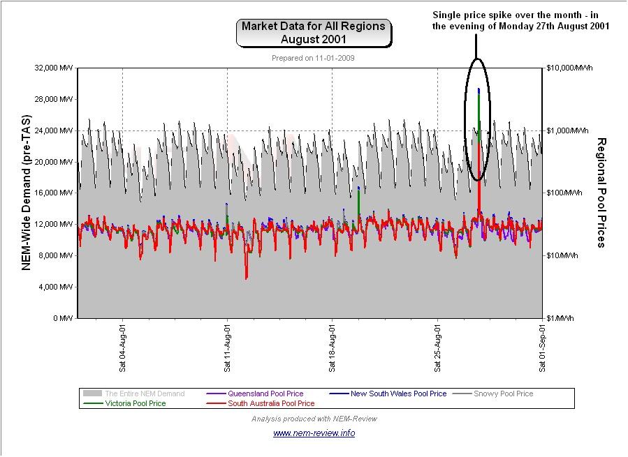
August 2001 |
August 2001 saw prices subside in all regions from their levels in August 2000.
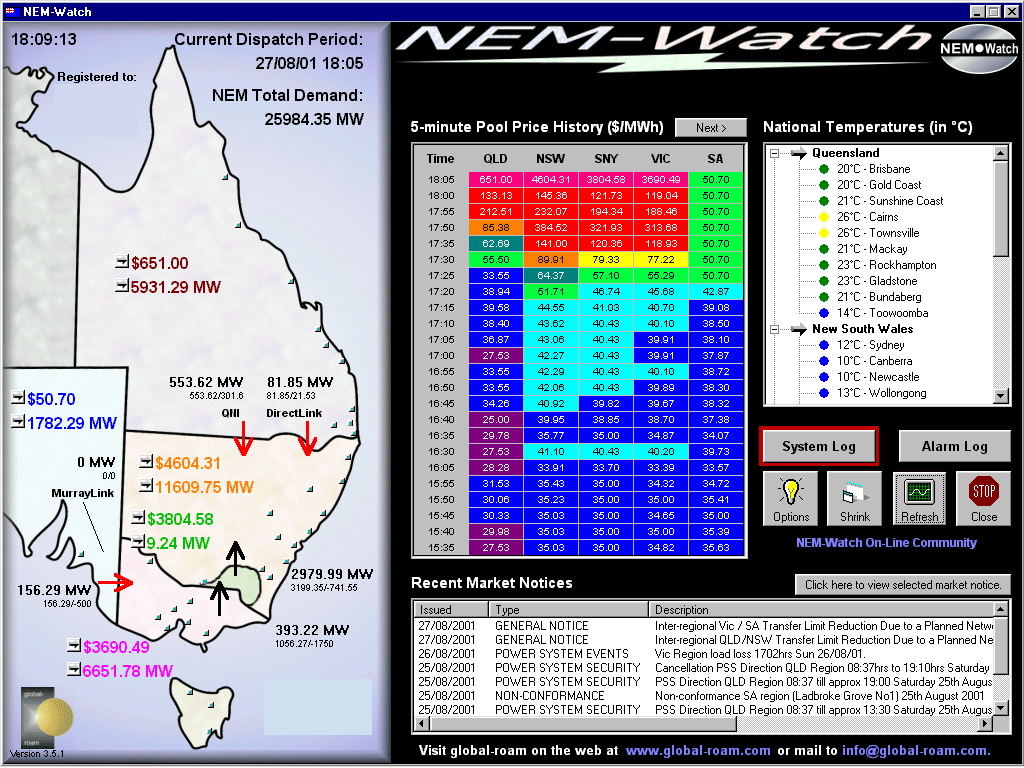
The chart here (generated in NEM-Review version 5.3) clearly shows the single price spike that occurred over the month – on Monday 27th August 2001. This incident is also shown in the snapshot from NEM-Watch version 3, below:
At the dispatch interval shown (18:05) we see prices high in NSW, SNO and VIC, with constraints on QNI and Heywood excluding generators in QLD and SA from these prices. |
|
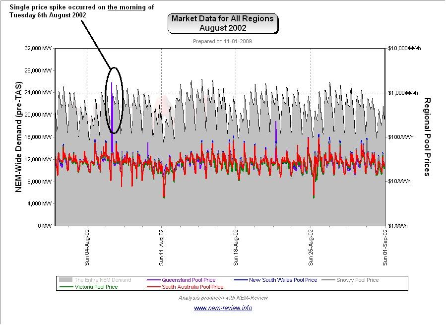
August 2002 |
August 2002 saw average prices drop slightly more (from their levels at August 2001). The following chart (from NEM-Review version 5.3) provides more detail about what happened over the month.
As can be seen, the price shape was largely the same as the price shape seen for August 2001 (hence making the average monthly prices similar). Additionally, there was a single price spike in the morning of Tuesday 6th August 2002. This pattern was distinctly different to the pattern shown for the months of May 2002, June 2002 and July 2002 – when regular spikes in price were engineered around the evening peak in demand. |
|
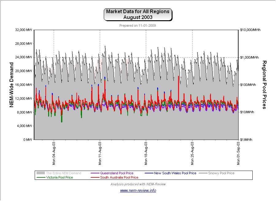
August 2003 |
As noted in the chart above, prices were lower across all regions in August 2003 (the lowest of all 10 x August-months).
|
|
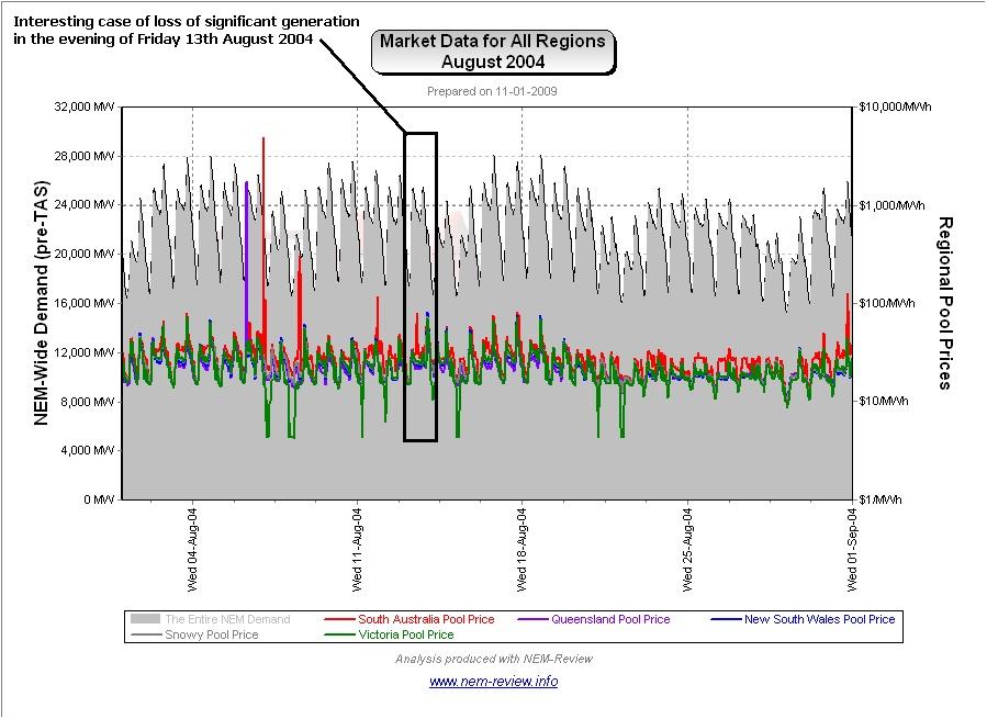
August 2004 |
As shown in the main chart (above) August 2004 saw slight price rises in all regions (most significantly in SA).
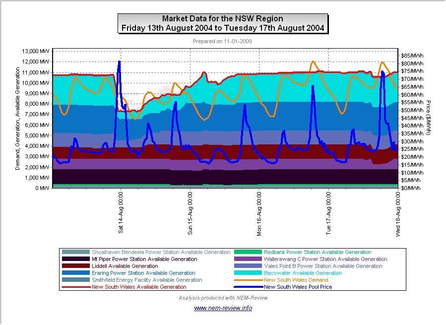
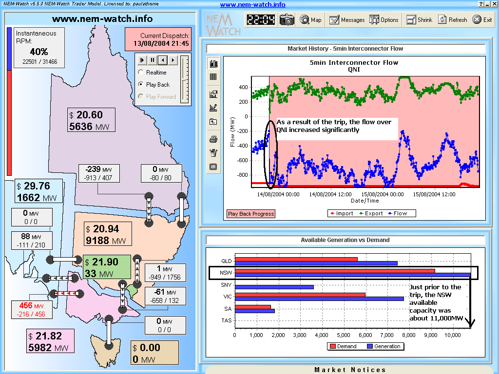
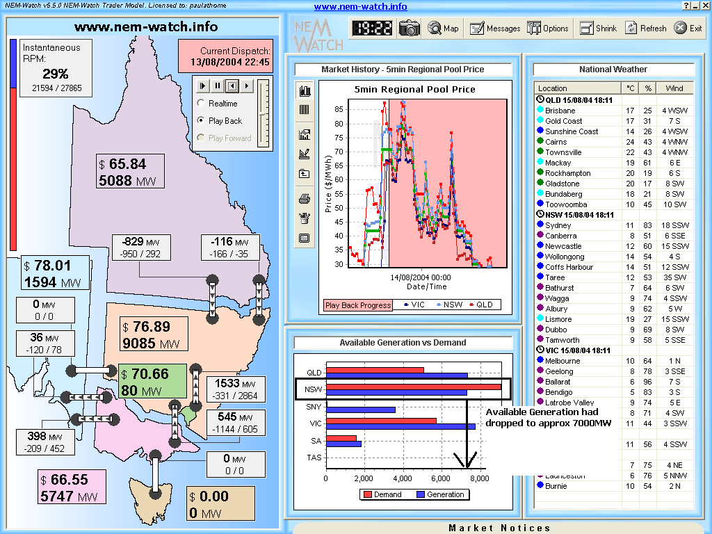
The NEM-Review chart (drawn with NEM-Review version 5.3 and shown above) highlights the reason for the difference – in SA, prices were consistently higher than in the other regions (plus there were two price spikes above $100/MWh). Note, in the diagram above, I have highlighted an interesting case in the evening of Friday 13th August 2004, when there was a significant (approx 3,000MW) loss in available generation capacity in NSW in the evening.
As can be seen from the second NEM-Review chart (above):
This incident is also shown in the two snapshots taken (in Playback Mode) from NEM-Watch version 5, below:
At 21:45 (just prior to the trip) we see low prices across the NEM. One hour later (following from the trip) we see that prices had jumped slightly (across all regions) due to the reduced capacity of low-cost generation.
|
|
August 2005 |
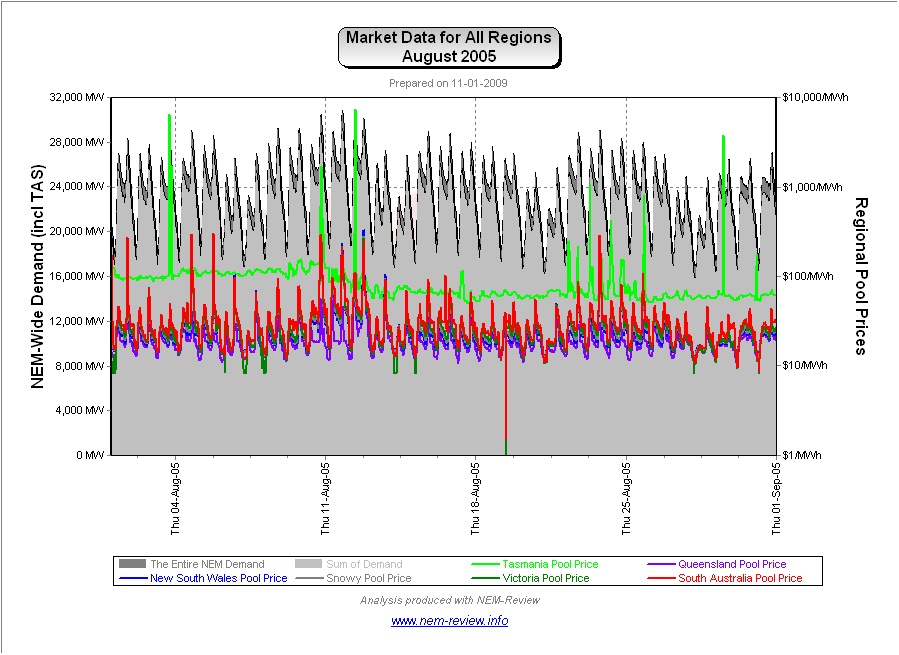
As noted in the chart above, prices climbed slightly across all regions in August 2005 (except in QLD, where they declined slightly). Tasmania was also a part of the NEM for the first time this August – though, because Basslink was not operational, TAS prices were totally independent from mainland prices.
|
|
August 2006 |
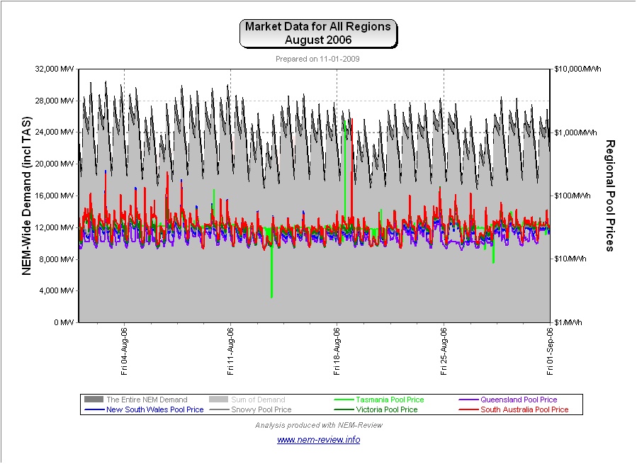
As the main chart above shows, August 2006 showed that prices continued to nudge upwards, compared to previous years – with prices in Tasmania converging on the mainland (given the commissioning of Basslink earlier in the year).
|
|
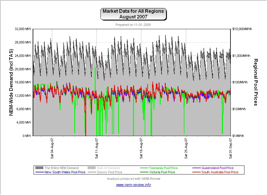
August 2007 |
As shown in the main chart (above), average prices in August 2007 were slightly higher than in previous years – but nowhere near the huge levels seen in other months of 2007.
Our review for April highlighted the reasons why the drought meant 2007 was a unique year, amongst the 10 years of NEM history to date. |
|
August 2008 |
Finally, we see that prices continued (in August 2007) at about the same level as the previous year, with the exception of TAS, where average prices climbed further. The reason for this divergence can be seen in the chart from NEM-Review version 5.3 below:
As shown in the chart above, the demand peaked (in August) at a level that was higher than the peak demand experienced the previous summer. The peak demand in August, however, was well below the massive demand experienced the month earlier, in July 2008. |


Be the first to comment on "August in the NEM (a review of 10 years of history)"