
Earlier this afternoon, just after 12:20pm (NEM time), we noticed a spike in mainland frequency on the frequency monitoring devices in our office. Paul has already written this follow-up article to show that the AEMO was reporting that demand in Victoria steeply rose around this time — he suggests that there may have been a data glitch at the AEMO’s end, and actual demand may not have in fact increased. If this was the case, this would have led to an over-frequency event (as more generation was dispatched than was actually needed).
In this short article, we’ll walk through a few charts and dashboards from our ez2view software to have a quick look at some of the market dynamics that occurred during this event. At a later date, we’ll aim to publish further analysis digging deeper into some more of the outcomes and system dynamics than this initial look.
Regional Market Demand
To begin, let’s look at the AEMO’s ‘Market Demand‘ trend for each region between the 12:15 and 13:15 dispatch intervals today — so that we can see the reported spike in Victorian demand relative to the other four regions. We see that it occurred between the 12:25 and 12:45 dispatch intervals.
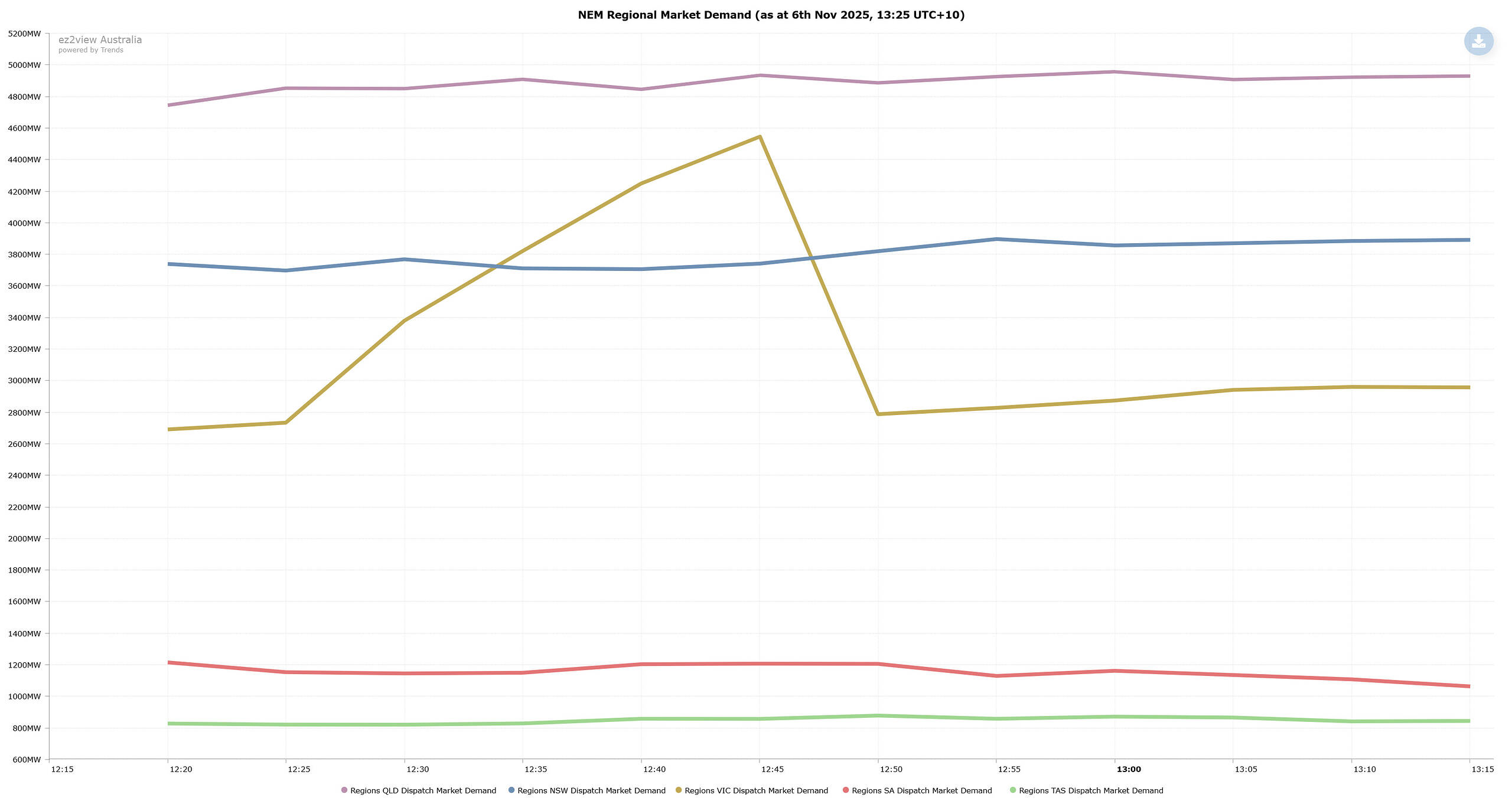
Source: ez2view’s Trend Editor
I use the word ‘reported’ above, as we must keep in mind that, as per our WattClarity glossary, market demand represents “the AEMO forecast at the start of each dispatch interval for the requirement to be met (at the end of each dispatch interval) by ‘dispatchable’ Scheduled and Semi-Scheduled supply-side units, and/or imports for a region (net of the output of Scheduled loads)” — hence, it does not represent actual physical demand in the system, but rather the amount of demand that the AEMO expects/thinks it needs to meet through the dispatch process.
Regional Spot Prices
In the next chart, we’ll look at regional spot prices over the same period of time to see if there were any impacts on price.
Below we see that there wasn’t any large spikes in spot prices for any of the five regions during this period. There was some movement in the range of $100/MWh in SA during this period — which may or may not have been incidental.
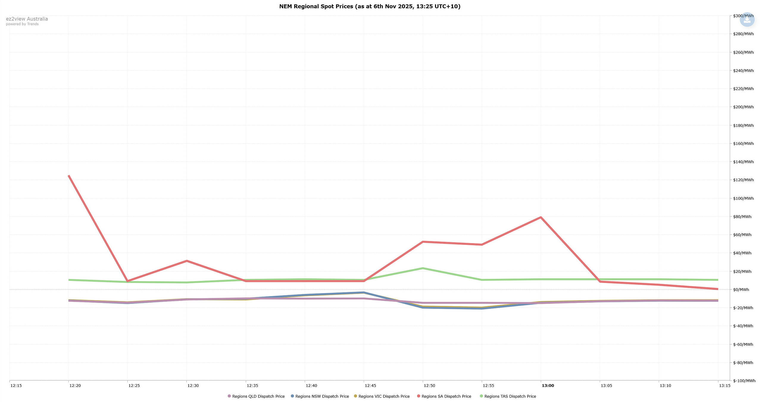
Source: ez2view’s Trend Editor
Interconnector Target Flows
In the chart below we see the target flow of each of the six interconnectors over this period. This value represents the flow AEMO’s dispatch engine expects from each interconnector at the end of each 5-minute dispatch interval, based on its dispatch solution.
We can see that target flow on VNI and QNI flipped negative during the frequency event (representing greater southward flow on each of these interconnectors). From this we can glean that the AEMO dispatched additional generation from New South Wales and Queensland to make up for the reported rise in demand in Victoria.
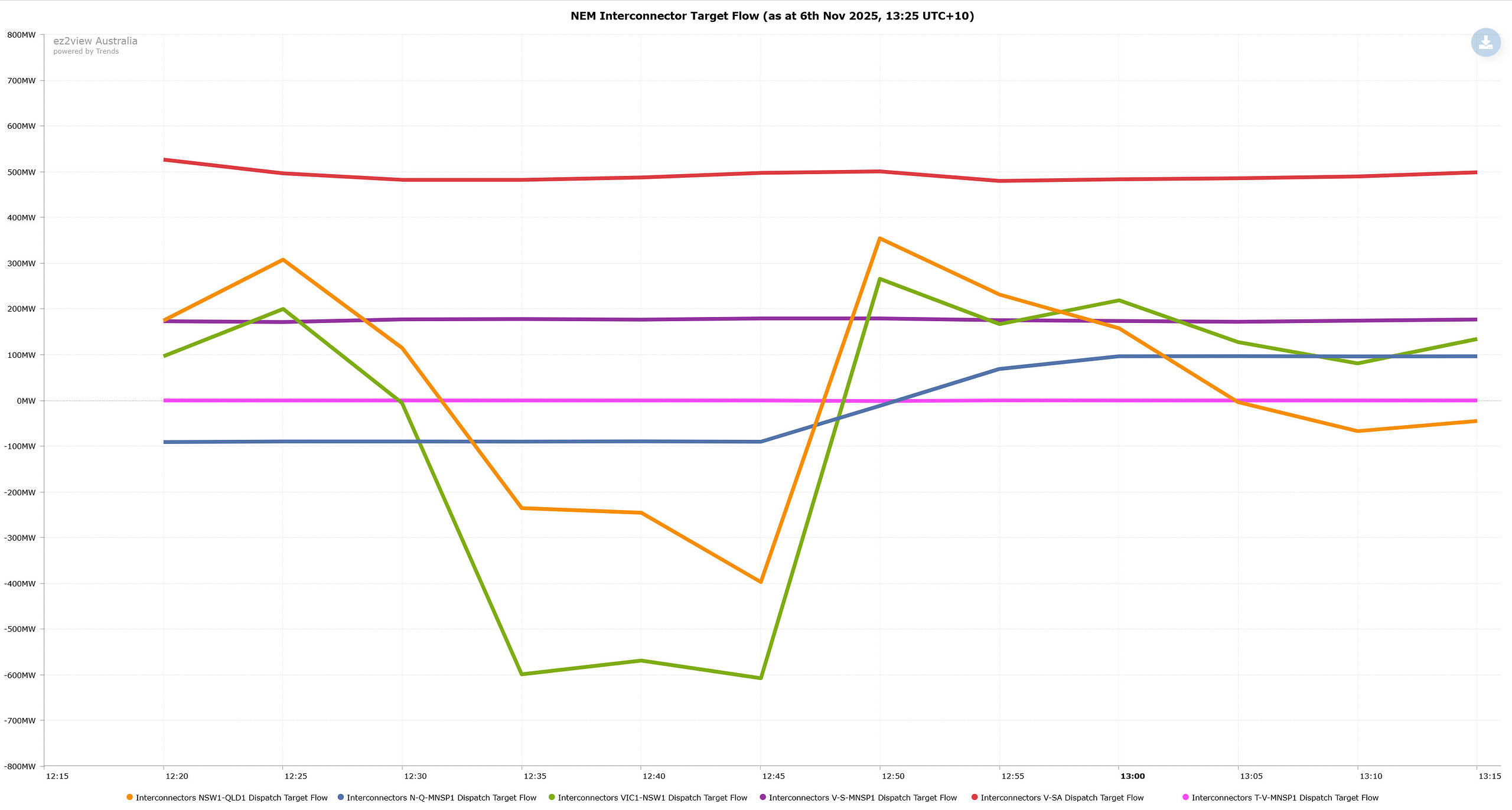
Source: ez2view’s Trend Editor
Changes in Generator Output
Given the change in interconnector flows on QNI and VNI during this period, next we’ll look at our Regional Schematics widgets to see the changes in generator output profiles in QLD, NSW and VIC. Within each of these schematics, we display a sparkline of the last 2 hours of generation output for each station. These screenshots were taken during the 13:25 dispatch interval (after the frequency event concluded).
We’ll start with our QLD schematic where I have highlighted each of the generators in QLD that saw their output noticeably rise or spike during the event. We can see that all of these stations are solar farms, almost all of which were likely to have otherwise been experiencing economic curtailment/offloading based on output patterns prior and subsequent to the event.
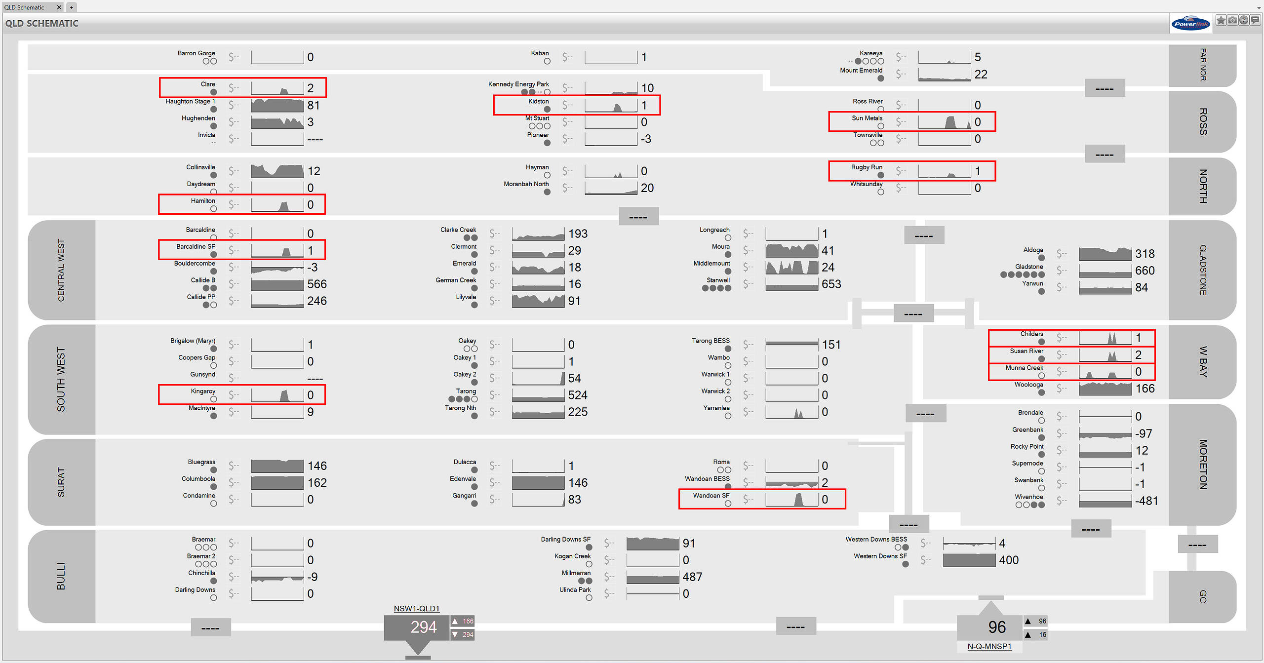
Source: ez2view’s QLD Schematic
Next we’ll look at our NSW schematic, where we see that a number of solar farms in this region also saw a brief spike in output during the event.
I will also point out that there were a handful of solar farms in the northern half of the state that saw their output briefly drop during this period (namely Stubbo 1 SF and Wellington SF). A quick look at our unit dashboard for these units shows me that this coincided with the the binding of the ‘N>94T_947_72’ thermal constraint equation – this demonstrates how the change in intra-regional power flows in this instance appears to have led to network curtailment for these units (although I note that this constraint equation binds regularly, so this is not an uncommon occurrence).
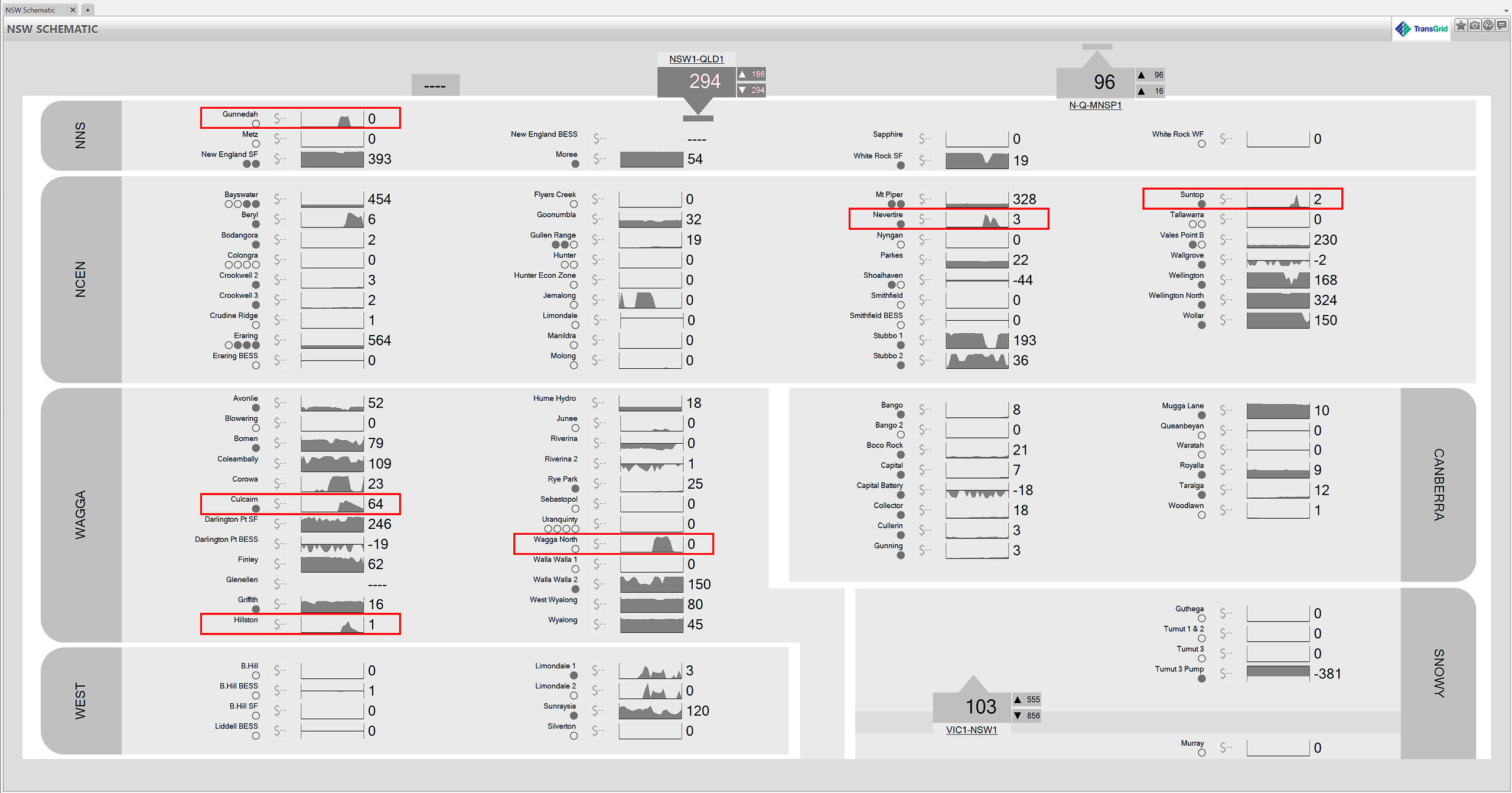
Source: ez2view’s NSW Schematic
Finally, below we see the VIC schematic. A number of solar farms in the northern half of the state saw spikes, in addition to the Golden Plains East WF. I note that there was a brief dip at the Moorabool WF that occurred slightly after the market demand in VIC corrected itself — so this variation in output may not be directly related.
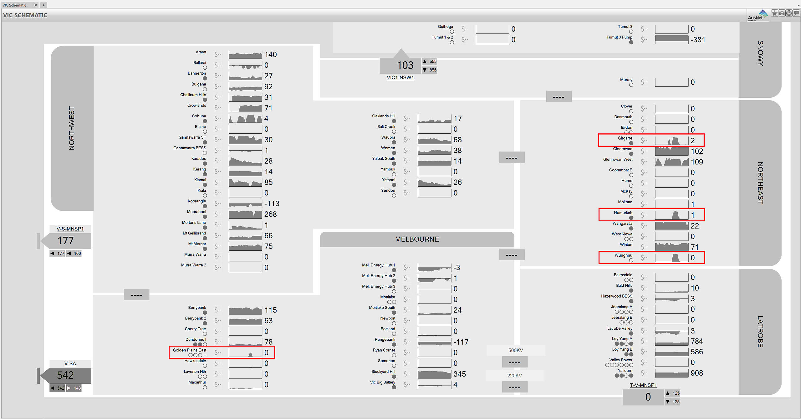
Source: ez2view’s VIC Schematic
Good series of articles Dan, all seem to be pointing in the direction of why local control of key electrical variables is necessary and showing the weaknesses of centralized control. Controlling a global system means if something goes wrong – it goes wrong everywhere.