The month of August really seemed to be ‘the tale of two halves’, with:
1) The Southern Half of the NEM beset by strong winds and wild weather, whilst
2) The Northern Half experienced what certainly seemed to be unusually hot weather… even before winter 2024 ended (although it cooled back to more ‘normal’ temperatures yesterday).
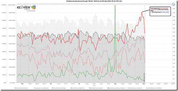
Given that many of our team are based in and around Brisbane, and particularly in locations where Archerfield temperature is more typical of what we feel than Brisbane airport (along with being perhaps a better determinant of electricity demand in Brisbane) I was interested to have a look this chart created in the ‘Trends Engine’ within ez2view:
In this chart we can clearly see both:
1) the spike in daily maximum temperature on Saturday 17th August 2024 (30.4C)
2) but, more significantly, the ~11 day ramp up in daily maximum temperature to Saturday 31st August 2024.
(a) With the highest point being 36.4 °C on that Saturday
i. Last day of ‘winter 2024’!
ii. Which, coincidentally, was captured in the NEMwatch snapshot when we wrote about low demand in NSW on that day.
(b) Noting that there was also a notable ramp in daily minimum temperature points, as well.
Whilst that ramp in temperatures were underway, it certainly felt unusual … but I wondered how unusual it would appear if we used our growing history of weather observations stored in the ‘Trends Engine’ within ez2view (also accessible in NEMreview v7) to compare …
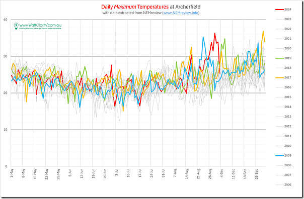
19 years of daily maximum temperatures at Archerfield
So in the chart below we’ve utilised the same 5-month date range (i.e. May to September) to cover the (normally!) cooler months
There’s too many years shown here to colour them all – but we have used colour to call out:
1) The sustained ramp in temperature at the end of winter 2024;
2) Which does stand out, but is not totally unique, with (shorter duration) spikes also seen:
(a) In Winter 2009:
i. With a peak of 35.3°C on 24th August 2009
ii. Which was recorded at the time in the article ‘A beautiful summer’s day for South-East Queensland – in August’.
(b) In Winter 2017
i. With a spike on 17th August 2017 (to 32.5 °C)
ii. I could not see any record of it here, on a quick scan.
(c) Just after the close of Winter 2019
i. The spike was to 33.3 °C was on 4th September 2019
ii. Which was technically after winter ended, but that’s just splitting hairs, perhaps.
3) We can see many more years seeing daily maximum temperatures above 30 °C by the end of September.
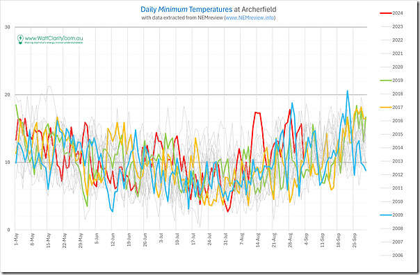
19 years of daily minimum temperatures at Archerfield
Given we’d already extracted the data for daily minimum points (in the process of completing the above) I was curious to see how these points also compared – with the same 4 (of 19) years highlighted:
With respect to this chart:
1) There’s two jumps in daily minimum points apparent through August 2024 in this chart:
(a) There was a more obvious jump over 4-5 days centred on 13th August 2024 and 14th August 2024; and
(b) There’s the ramp at the end of the month, as well
(c) Though perhaps it’s better to look at the broader ramp through the whole of August 2024 from the lowest point in the year (2.7 °C on 1st August 2024).
2) But the larger observation that jumps out to me here is the larger range in daily minimum points (perhaps a 15°C range) compared to daily maximum points in the chart above (perhaps a 10°C range) across all of those years.
If 2009, 2017 and 2019 were ‘most similar’, does that provide any pointers to summer 2024-25?
I am certainly not a meteorologist, so will leave to others to answer that question – but recalling that summer 2009-10, summer 2017-18 and summer 2019-20 all had their challenges, one does wonder …
That’s where I’ll leave it, for now…


I really think there needs to be a weighted standardised measure of temperatures that better reflect their impact on electricity demand. I know all too often I look back at the average temperatures for a month and find they don’t really reflect how hot or cold some of the periods were during the month.
For example a single hot day doesn’t place create as much demand for cooling, compared to five days in a row of the same or even slightly lower temperature.