Since the release of the Generator Report Card on 31st May 2019 we have been involved in providing a number of briefings to different audiences about different aspects of what we have found in the analytical processes supporting the Report Card. There are two upcoming events currently scheduled that are open more broadly to those who are interested to come along:
| (tomorrow) Wednesday 21st August from 16:30 Australian Energy Council – Sydney CBD |
The Australian Energy Council has organised this event for their members (but are happy for others to come along as well).
They have created this page with details of the event, including how you can register. |
| Tuesday 10th September approx 12:00
Queensland Smart Energy Conference – Brisbane |
The Smart Energy Council has organised the “Queensland Smart Energy Conference” for Tuesday 10th September at the Royal International Convention Centre and has asked me to be involved in a session (11:00-12:30) on “Market and Technology”.
I have not given it much thought to this point, but am sure whatever I present will utilise some of the insights gained from the analytical process supporting our Generator Report Card. |
Following some of the prior events (including last Wednesday’s event organised by the Australian Institute of Energy), we’ve received several requests from attendees wondering if we could share three specific figures we have used to illustrate how the fuel mix supporting the NEM is at the start of a massive transformation.
(A) Theme 3 (of 14 themes)
This fact is of such importance that we highlighted this as Theme 3 (of 14 key themes) within Part 2 of the ~170-page Analytical Component provided in the Generator Report Card:

Given requests coming from different people about this one in recent days, we’ve chosen to describe (here) some of what was discussed in the Generator Report Card under this theme.
(B) Two important aspects about the transformation
There are two aspects of the above statement that need to be understood together. Unfortunately, different parts of the broader energy sector commentariat seem to selectively ignore either one, or the other, of these aspects (seeming to reflect the views at either extreme of the Emotion-o-meter).
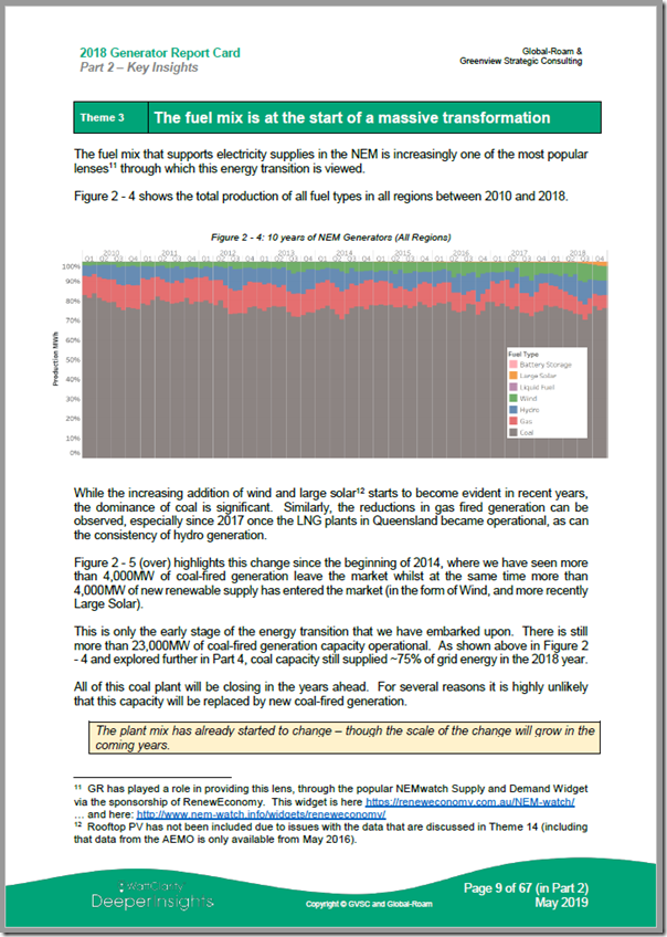
One of these aspects can be seen in the trended, stacked fuel mix chart that was featured on page 9 within Part 2 of the Generator Report Card:

(click on the image for a full-screen view of this page)
In the Generator Report Card we utilised 20 years of generation data to provide a broader context to what’s changed (and what’s not changed) in relation to this transition. In Figure 2-4 shown in the page above, we consciously limited the date range to show only the most recent 9 years ending 31st December 2018 in order to focus on the following two aspects:
Aspect 1 = the transformation is “massive”
As can be seen in the chart above, the bulk energy supplied by the wholesale National Electricity Market is still dominated by energy supplied by coal-fired generation. As noted in the Report Card under this chart, “coal capacity still supplied ~75% of grid energy in the 2018 year”.
1a) Furthermore, this large volume of energy has been supplied, following the closure of Hazelwood at the end of March 2017, is supplied by just 48 units across Queensland (22 units), NSW (16 units) and Victoria (10 units).
(i) For comparison purposes, there were 242 units in total that were available to the market in December 2018;
(ii) That’s 48 units supplying 75% of the “grid energy”, whilst close to 200 other units supplying the remaining 25% (using gas, hydro, wind, solar, etc…).
1b) These 48 units could be viewed as the current “work-horses” of the NEM
1c) As noted on the page above, all of these units will be closing in the years ahead (some sooner than others) – because of their criticality to the current energy mix (and because of the other services they provide – with inertia being just one) it will be a complex, and very important, process to ensure that this is done properly.
1d) Unfortunately the closure of Hazelwood showed some examples of what not to do (prior closures – like Northern, Wallerawang and so on – were far less critical as the share of energy supplied by those plant when they closed were much lower).
That’s another reason why the level of risk in the NEM is increasing.
Aspect 2 = however the transformation just “at the start”
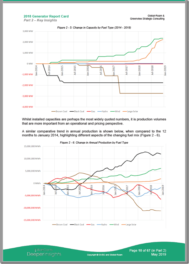
On the following page in the Generator Report Card, we included a pair of trends that typify the dichotomy (or even the “schism”) that has opened up in the conversation about this evolving energy transition:
2a) The top chart (fig 2-5) shows the change over 5 years in installed capacity of registered generation assets supporting the NEM, aggregated and identified by fuel type.
(i) In this chart we see the growth in capacity of wind farms and solar farms (over 4,000MW in new capacity split evenly between both).
(ii) We also see that there is a similar-sized decline in capacity for coal-fired power (almost 5,000MW for black and brown coal together). The most recent (and largest) step change down was the closure of Hazelwood at the end of March 2017.
(iii) This is a picture that some like to show when talking about the pace of the transition – and one which people might mistakenly interpret as implying that the solar and wind generation has replaced that lost from the closed coal.

(click on the image for a full-screen view of this page)
2b) The bottom chart (fig 2-6) shows quite a different picture – but over the same 5 year period. In this case we show the change in energy supplied by those same fuel types over the period.
(i) In what may be a surprise to some readers, it shows that the reduction in supplies from brown coal (much moreso after the closure of Hazelwood, which was heavily utilised, than after the earlier closure of Northern, which was only used sporadically) have been supported mostly be an increase in production from black coal.
1. The existing black coal fleet had spare capacity to ramp up and support the loss of energy – however this does mean that they are running at higher utilisations (across fewer units across the whole coal fleet) – hence higher risk.
2. Unfortunately, a somewhat mistaken obsession with installed capacities has obscured this important fact.
(ii) Whilst this “black for brown swap” has had the net effect of reducing the emissions intensity of the NEM, it also raises questions about what might actually support the next withdrawal of a coal-fired plant (be that Liddell as announced, or some other station that might close more unexpectedly)? In simple terms, there is less “spare” energy that the remaining coal units would be able to ramp up further to supply – and level of risk will increase still further because of less units supplying the bulk of the energy …
As noted in the Report Card itself, “whilst installed capacities are perhaps the most widely quoted numbers, it is production volumes that are more important from an operational and pricing perspective”. We hope this helps to clarify why this is the case – and one of the big challenges to be resolved as more of the coal fleet close in the years and decades ahead…
(C) Why did we choose to exclude the impact of rooftop PV from this chart?
Astute readers (of this article, and of our Generator Report Card itself) will notice that we have excluded consideration of rooftop PV (and embedded unregistered generation more generally) from these trends.
We have done this consciously, and after careful consideration – and will explain why in a follow-on article in the coming ways. For those with their own copy of the Generator Report Card, you can find some discussion of this under Theme 14 in Part 2 of the ~170-page Analytical Component that constitutes one of the core pieces of value in the Report Card.
—————
Those in Organisations who have already arranged access to the Report Card can download it here with your organisation’s email address. If you don’t have access, the order form is here.
Will see you tomorrow evening in Sydney, if you can make it!


Leave a comment