The surge in NEM spot prices since 2015, and related impacts on contract and retail prices, have been extensively discussed and analysed in many forums, from ACCC inquiries to Twitter.
The underlying reasons for the rise are well understood and centre on reductions in available supply – retirement of some largeish, low marginal cost generation – and the increased cost of gas.
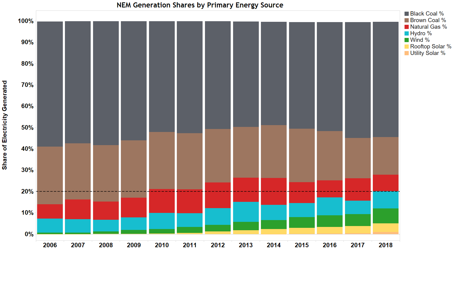
However since the retirement of Hazelwood in early Q2 2017, we’ve seen significant additions to supply with an accelerating wave of investment in renewable generation, both large scale and small, with a good part of that investment helped by the rise in market prices – which is the way markets generally work: higher prices stimulating increased supply. We can see the impacts of these retirements and increased renewables capacity in the final year of this long-term chart showing relative shares generated from the NEM’s different primary energy sources:
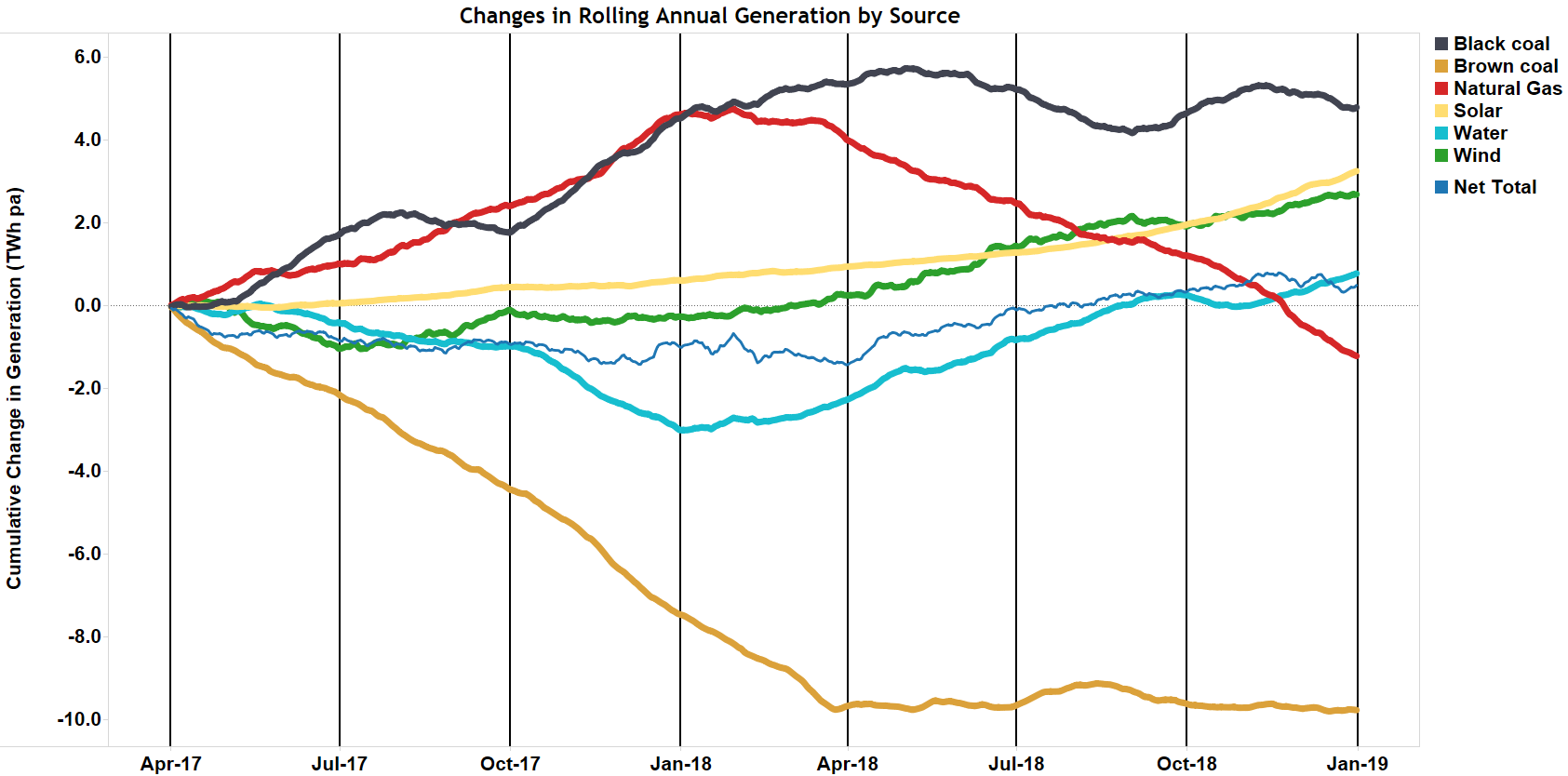
To show in more detail the evolving supply mix since Hazelwood retired we can look at changes in rolling annual energy output by generation energy source. I like the rolling annual view – which at each point in time captures the total energy generated over the immediately preceding 365 days, plotted as the difference from generation over the 365 days prior to the start of the chart – because this smooths out seasonal or short term factors which can impact (say) quarterly changes in supply mix. It also captures movements in generation levels throughout the period, not just the net change between start and end dates:
The chart clearly shows Hazelwood’s closure reducing annualised generation from brown coal, which at the end of March 2018 had fallen by 10 TWh, a typical year’s output from Hazelwood. Brown coal generation levels have been largely steady since.
Also clear is that over 2017, the gap left by Hazelwood was filled almost entirely by increased output from other fossil fuel sources – black coal and natural gas. These sources also had to cover a significant reduction in hydro generation, especially sharp in Q4 2017. This reduction seems a little surprising but arose because in 2016 hydro generators, particularly Snowy Hydro, generated at high levels, then reduced output in 2017 in order to conserve or rebuild water storage levels. Wind generation also fell slightly in 2017, with a very weak Q2 due to unusually still weather patterns. The modest growth in solar output through 2017 largely reflected ongoing installation of small scale rooftop PV systems.
Over 2018 the picture changes, with a lift in energy generated from renewable sources, including a clear acceleration in solar output over the last six months as a raft of new utility-scale solar farms have been commissioned and very strong growth in rooftop PV. Gas-fired generation reduced sharply back to pre-Hazelwood closure levels. Hydro generation returned to the higher levels seen in 2016.
Given these shifts, it’s a bit surprising that after some retreat from the highs of early 2017, spot prices in 2018 have not been driven any lower as low marginal cost renewables replace output from higher cost gas generation. In fact 2018 has seen a generally rising trend in underlying spot prices even as growth in renewable output has accelerated.
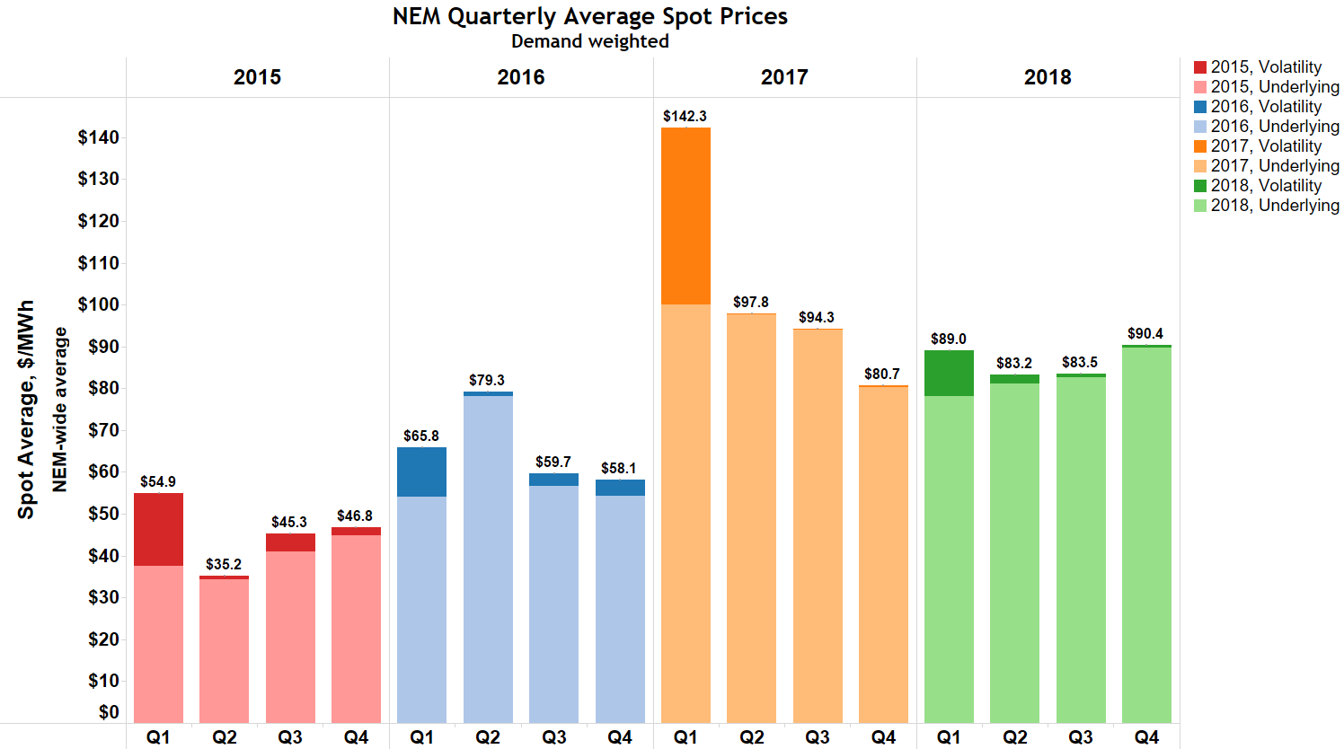
Quarterly NEM prices since 2015 are summarised in the following chart:
Spot prices in this chart are demand-weighted averages over the NEM’s five regions, separated into “underlying” and “volatility” components. The former is calculated by capping half hourly trading prices at $300/MWh prior to averaging, and the latter measures the residual contribution of half hourly prices in excess of $300/MWh to the overall average of uncapped prices. Volatility typically reflects the impact of a small number of half hours of extreme price up to the Market Price Cap (currently $14,500/MWh), while the underlying component captures the general level of spot prices across all half hours.
Underlying averages declined through 2017 and the first quarter of 2018, with the uncapped averages being raised significantly by price volatility in Q1 2017 (principally in Queensland) and Q1 2018 (South Australia and Victoria).
The chart also shows that underlying spot prices have risen through the rest of 2018, the largest rise being in Q4, despite the acceleration in renewables output.
The rest of this post will dive a little deeper into the reasons for the elevation in underlying spot prices in Q4 2018, as it provides insights into the NEM’s pricing mechanisms and the impacts of participant behaviour.
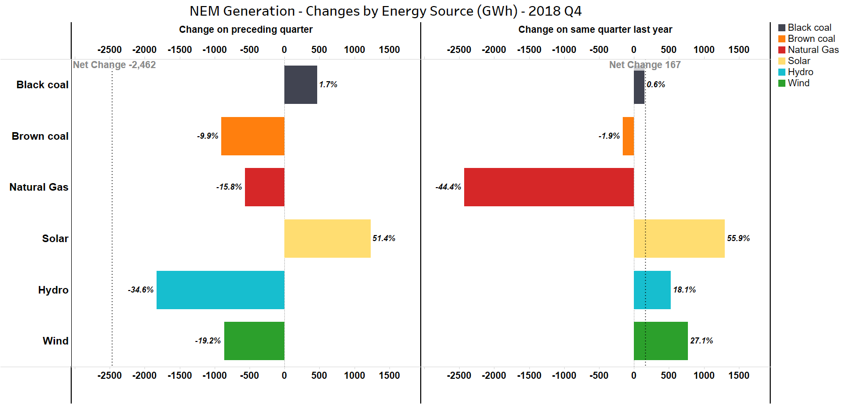
Let’s start with a quarterly view of changes in energy generated by source, comparing Q4 2018 with the previous quarter (Q3 2018) and also with Q4 in 2017:
We can see in the left panel that between Q3 and Q4 2018, generation fell from sources other than solar and a small increase in black coal. Overall electricity demand in Q4 (which necessarily equals total generation) was, as usual, lower than in Q3. But it’s interesting that the largest declines in generation volumes came from sources which are potentially lower in marginal cost – wind, brown coal and hydro (where most of the decrease was due to Hydro Tasmania reducing its generation and exports to the mainland). In the right panel we see that relative to Q4 2017 demand was virtually flat, and that there was a 44% drop in gas-generated electricity, displaced by growth in solar, wind and hydro.
There’s a mixed story here: relative to Q3 2018 the fall in supply from lower cost sources may partly explain why spot prices rose in Q4. But relative to Q4 2017 the large reduction in gas-fired generation and increased supply from lower-cost sources might have been expected to reduce spot prices – but instead they were well above their level a year ago.
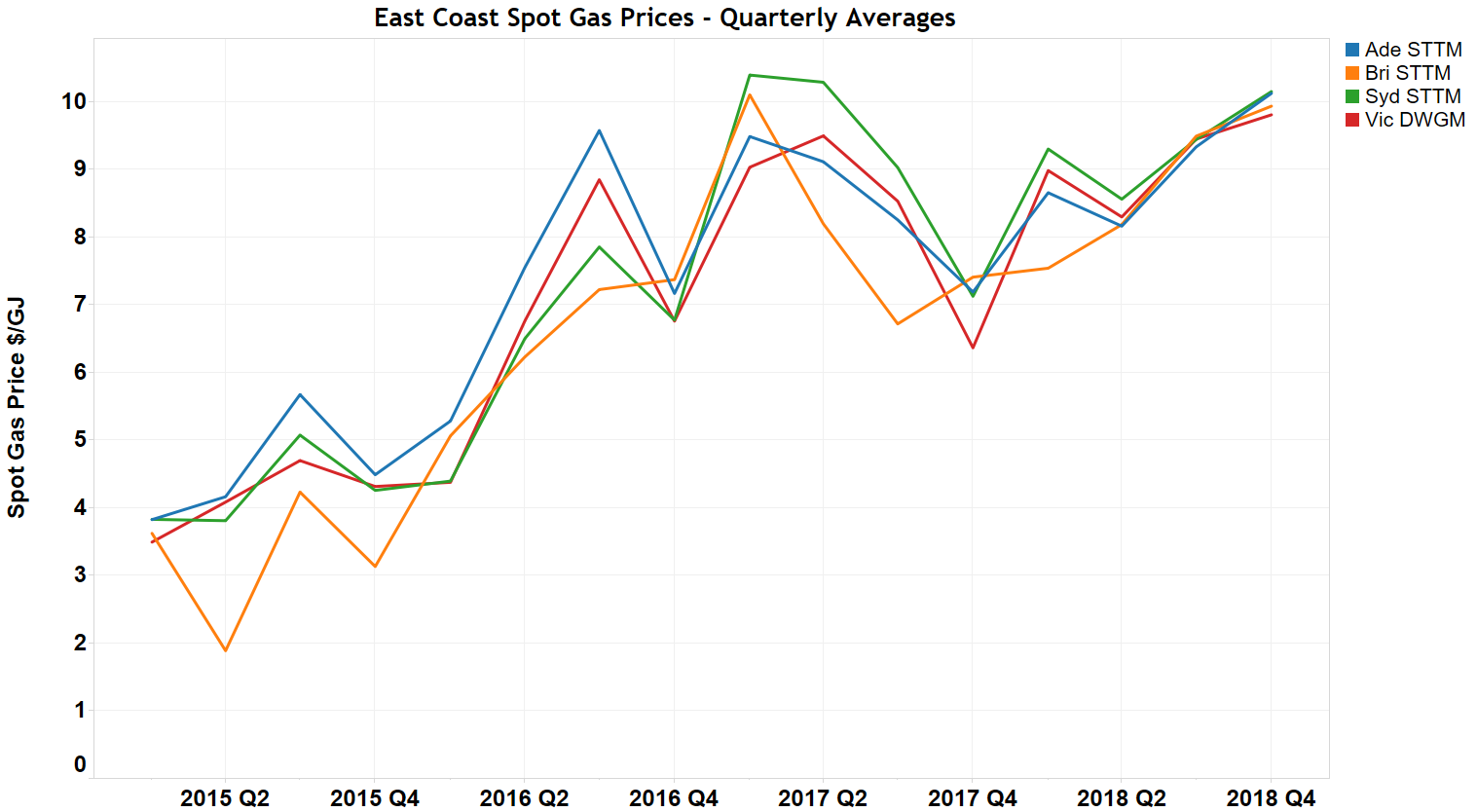
Additional insight comes from looking at gas prices. We don’t know the contract prices that gas fired generators pay for their fuel, but we can get a general indication of wholesale gas price movements from spot gas prices in AEMO’s Short Term Trading Markets in Brisbane, Adelaide and Sydney and the Victorian Declared Wholesale Gas Market:
This shows a strong runup in 2016 and the first half of 2017, as Queensland’s LNG export terminals ramped towards full capacity, a dip in the second half of 2017 and then a steady increase to near-record levels in Q4 2018. This pattern broadly matches the behaviour of spot electricity prices over the last two years, reinforcing the role that gas-fired generation plays as a marginal price-setter in the NEM.
For readers not fully familiar with how NEM spot prices are set, Paul McArdle has posted a couple of excellent educational pieces on this site, an overview of NEM dispatch and pricing, and an explainer on the motivation for marginal-pricing mechanisms like the NEM’s, contrasted with alternative models.
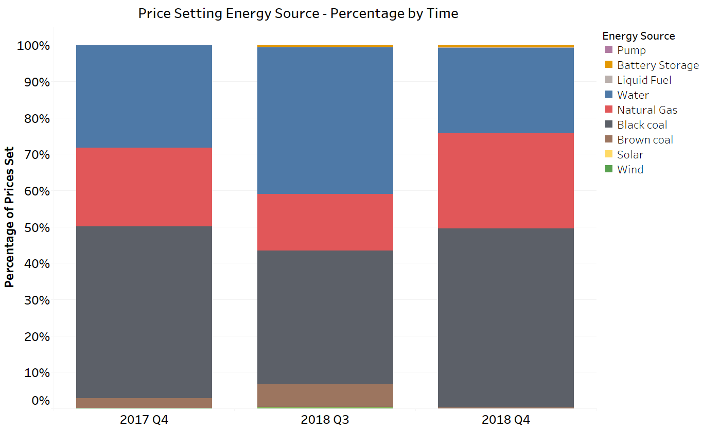
Fundamental to marginally priced markets is that prices are set by the last supply or demand reduction offer dispatched in order to balance supply and demand, after (in principle) arranging the volumes offered in order of increasing price. So it is the pricing of offers that fall at around the total demand level on the cumulative bid stack that is critical, rather than the average level of pricing across all market offers. With the current supply-demand balance in the NEM, gas and hydro generators are frequently the marginal price setting plant:
Data in this chart are derived from very detailed price-setting information published by AEMO for every five-minute dispatch interval. The key point is that although hydro and gas generators supply only about 15-20% of the NEM’s energy, their offers set over 50% of spot prices across NEM regions in the quarters shown. Conversely, solar, wind and brown coal generation which typically offer supply at much lower prices and generated over 30% of NEM energy in 2018 only rarely set the spot price.
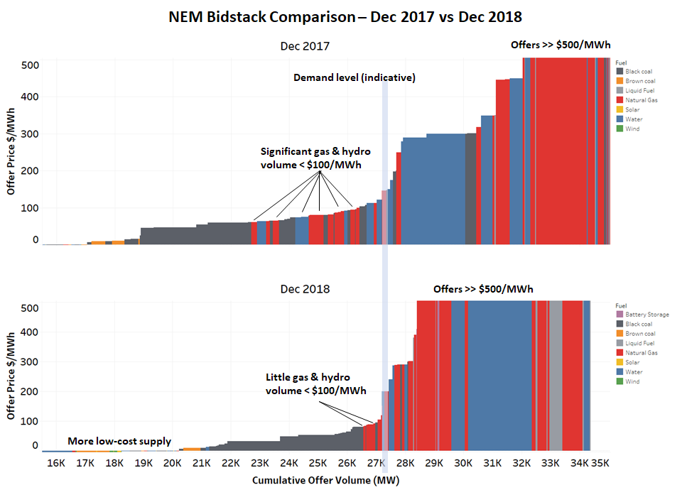
Further insight into these dynamics and a good illustration of why prices in Q4 2018 remained higher than those of a year ago can be gained from a snapshot comparison of the NEM’s supply offer stacks for a couple of representative half hours in December 2017 and December 2018 respectively. I’ve selected two afternoon half hours with very similar aggregate NEM demand levels for this comparison:
The lower panel shows that despite there being significantly more low-cost supply offers in the Dec 2018 bidstack, an upward shift in the pricing of gas and hydro volumes meant that the marginal pricing level was actually somewhat higher than a year ago. Whilst this comparison picks out only one half hour from thousands in each quarter, it is still a good illustration of why we haven’t seen any sustained fall in spot prices just yet.
About our Guest Author
 |
Allan O’Neil has worked in Australia’s wholesale energy markets since their creation in the mid-1990’s, in trading, risk management, forecasting and analytical roles with major NEM electricity and gas retail and generation companies.
He is now an independent energy markets consultant, working with clients on projects across a spectrum of wholesale, retail, electricity and gas issues. You can view Allan’s LinkedIn profile here. Allan will be sporadically reviewing market events here on WattClarity Allan has also begun providing an on-site educational service covering how spot prices are set in the NEM, and other important aspects of the physical electricity market – further details here. |


From the last panel it would seem that an extra 2 GW of low marginal cost wind and solar generation would push the bid stack far enough to the right for prices to be determined by black coal rather than gas. There would be at least 2 GW of wind under construction at present, and with designs that produce well under moderate wind conditions. So it would only take moderate wind conditions in the evening peak to squeeze out gas and peak prices would be determined by NSW coal generators.
I expect there would then be some repricing. The coal units that cycle their output regularly (such as Eraring) would put in low bids for perhaps the first 60% of their capacity, and bids just below the cost of gas for their remaining capacity (used in peak). This would be necessary to protect revenues. Meanwhile the Snowy hydro stations would also need to reprice their output in order to maintain downstream flows, again to just below the price of gas.
“In fact 2018 has seen a generally rising trend in underlying spot prices even as growth in renewable output has accelerated.”
It’s almost as if closing reliable coal fired power stations and increasing penetration of renewables drives up prices.
The claim by the renewable lobby of increasing renewables while driving down electricity prices is nothing but lies.
Why would anyone be surprised that hydro and gas largely set the bid stack pricing when you look at wind output- https://anero.id/energy/wind-energy/2018/june
It’s going to take a mountain of those Tesla 2170 lithium lego bricks to smooth that lot out and keep the lights on but if you can get a sizeable heap of them up and running early you can clearly make a motzah creaming FCAS returns off the top.
A mountain of Lego Bricks (Tesla) will only increase the overall demand, they are like a water tank with a hole in the side of them. 20% minimum, leaks out to onto the ground. (And no one that i know of has worked out, how far the power coming out of them can actually go. Meaning what really are the longer distance losses from operating them. (Yes I know they can be put near the load, however you must look at the average and when longer distances require power they must deliver it)