In these days of an accelerating energy transition, we’re finding a diverse range of opportunities popping out of the woodwork. This morning I was meeting with a Director of a company we’re partnering with to assist small solar operators, when the conversation shifted to a more general reflection of the value of Dashboards for making what was once invisible, visible (and, if the design is right, easily understood).
We have many dashboards – some standard, and some specifically developed for particular client purposes – but NEM-Watch is still one of our favourites even though it’s almost 19 years old (having gone through numerous iterations, with another one on the way).
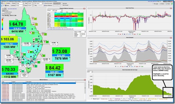
A display copy of NEM-Watch today alerted us to the low wind harvest occurring today right across the NEM – such as in this snapshot from 12:00 showing total wind production down below 200MW NEM wide:
Now that (in and of itself) is actually not that remarkable – this sort of thing happens on a pretty regular basis, and I have posted before about the major need for more diversity in wind farm harvest (something that the current form of support for renewable generation does not really encourage).
What has changed in the more recent months is that there has been an explosion in the numbers of new renewables projects under development (being catalogued in our Generator Catalog). A couple of these are already up and running – including 2 wind farms in the Northern Tablelands of NSW (Sapphire Wind Farm, and White Rock Wind Farm).
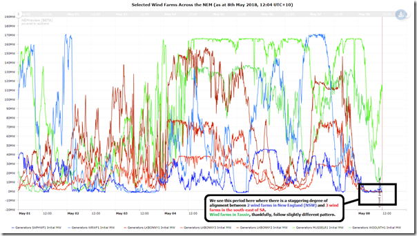
Now whilst these not be as far removed from the wind farms crowded into South Australia as those under development in Queensland, I had hoped to see their output would be materially different from those in South Australia. So using our NEMreview historical analysis software package, I selected a sample of wind farms, aiming for the ones that were as far apart as possible ‘as the crow flies’, and produced this time series trend over recent days:
Given that there are a few of them, and the data is noisy, I have coloured them state colours to make them easier to read (clients can access an updated trend with more current data here).
Two things stand out to me:
Conclusion 1) My expectation (perhaps based partly on what some renewables proponents had been telling me) had been that I would not have seen such an amazing, and somewhat scary, degree of alignment of output at these wind farms in SA and northern NSW over the past couple hours. This clearly indicates to me that we’re depending a lot on wind farms in Queensland to achieve a healthy diversity in wind farm harvest as the numbers grow.
Conclusion 2) Adding together the two numbers for wind farms in Tasmania (with Musselroe being the highest) gives something over 150MW – which also equates pretty closely to the numbers seen NEM wide. What this implies (and I have confirmed offline) is that all the wind farms currently across the mainland NEM are contributing, in aggregate, less than 50MW.
As an integrated energy sector, we are going to have to do much, much better in the future (than we have done in the past) if we are going to have a chance of getting where we need to go …


Indeed, as stated above, “We have many dashboards … “.
One bit of transparency we no longer have is the comprehensive Hydro Tasmania weekly report on dam levels. This report showed the installed generation capacity and whether dams were rising or falling.
With Basslink still out of action and Tasmania totally reliant on its own resources and unavailable to assist with load balancing on the mainland, this report would be making very interesting reading.
Why was this regular report “disappeared”?
Thanks Rob (and for explaining more when you called yesterday).
For our other readers:
1) it’s Hydro Tasmania’s spreadsheet (which used to be on their website) which you’re missing
2) it seems to have been removed when the website was upgraded
3) to understand why, we’d need to hear from Hydro Tasmania.
Paul
ARENA has done a wonderful job with its seed capital in establishing the RE sector.
Proponents of new projects in that sector now need much better meteorological tools to assist in planning the location of their wind and solar farms and managing the output.
They also need storage so that they don’t have to spill energy because of constrictions in the network. Even better, they need much cheaper connections to the main grid from the locations where the sun shines and the wind blows (all pretty obvious).
Perhaps a step by ARENA might be to stimulate research into much cheaper methods of construction of spurs from the main grid to these locations.
great post paul, thanks
1. Storage will need to become an increasing part of the energy scene. Windy periods in southern Australia are separated by lulls of about 3 days, so there needs to be enough storage to cover these periods.
2. Solar would be partially counter-cyclical to wind. Solar definitely needs storage, and this storage will be helpful more wind into the energy mix.
3. While the wind profile in various parts of Australia may be decoupled, showing no correlation, there are probably few negative correlations, which would indicate complementary wind patterns.
4. Bureau of Meteorology wind data would be of limited usefulness in conducting studies of wind complementarity, because the measurements are at 10m, whereas the newer wind farms are harvesting some energy at 200m. The relationship between wind speed at different heights is a “bent stick”, with the lower height becoming becalmed when there is still significant wind higher up.
5. Since most new wind farms will have a height of 200m (hub + blade), wind output data from older wind farms will be of limited value in conducting simulations of a grid with a higher renewable component. Wind farms with the greatest relevance are Kiata and Sapphire, which are both nearly 200m high, and I believe are attaining capacity factors of close to 50%, which should reduce the periods when the wind farm is becalmed.
6. New wind farms under development with the higher hub height include Silverton (NSW), Coopers Gap (Qld), Lincoln Gap (SA) and Stockyard Hill (Vic).
7. Professor Blakers of ANU recommends storage close to major load centres. Yet the largest storage development underway is Snowy 2, a long way from load and other generation. The Murray power station on the Vic system is close to the feed-in point for Snowy 2, and has a marginal loss factor of 0.92. So round trip transmission losses for Snowy 2 could be 8% + 8% = 16%, in addition to the round trip losses of about 30% within the pumped storage system when operated at its full 2000MW (but lower losses at partial capacity). There would need to be some substantial transmission investments to provide for both the capacity of Snowy 2, and reduce the round trip transmission losses.
Thanks Malcolm for highlighting (clearly) a number of points worthy of further consideration.
“Storage will need to become an increasing part of the energy scene.”
Blind Freddy can see that but at what cost? SA now joins the elite having the highest power prices in the world and hasn’t paid for the storage side of the equation yet.
Who is going to break the bad news consumers aint seen nothing yet with their power bills? The obvious reaction will be- Whatever happened to all the cheap power we were implicitly promised from Mother Nature’s limitless free bounty?
Storage for 3days Wowa!!!!!!! I am not sure many people understand these two facts about the world saving storage.
1. They add to the overall demand.
2. They produce nothing but to put energy it into them and then get it out of them the process wastes a variable amount which is depented on a number of factors. But allow 10% minimum, that’s bare minimum like all the stars have aligned. The worst thing is on hot days when the demand is its highest the storage is worst. Not only will nothing be going into them or coming out, the storage project needs power!!!!! So adds to demand.
I am sure however all the pro RE people will have a different view, but unfortunately that’s the reality.
Good article, I would have liked you to diversify the SA sample by using Hornsdale and one of the EP WF’s instead of the three Lake Bonney’s.
In this particular case, Josh, it would not have made any difference as everything on the mainland was down at very low output.
Nice analysis. When we (Gamma Energy Technology and Red Vector) looked at this issue using historic wind data matched to existing and planned wind farms we found a very significant correlation between wind droughts in each state. In fact there was a period in May 2010 when the output from a diverse portfolio of wind farms in each state would’ve averaged just 5% across the entire NEM for 8 days.
That is not something that storage can help with (the volumes are far too large), other forms of generation will be needed during these periods if wind becomes significant, and if the purpose of wind is to decarbonise the system then these will need to be low carbon too.