With the hot weather front afflicting people more north of Sydney currently, it’s clearly a case of extremes across the NEM over the New Year period – with daytime demand levels very low in South Australia (and also in Victoria – with these questions posed previously about that).
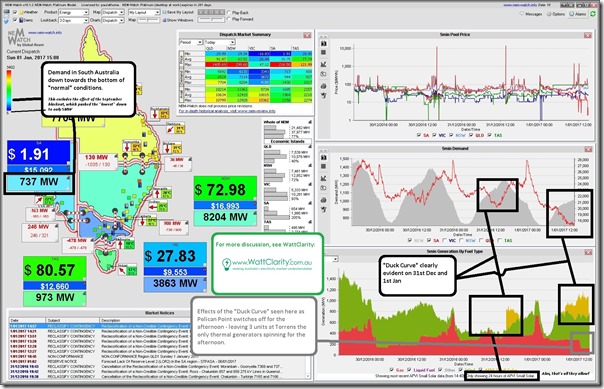
A snapshot from NEM-Watch this afternoon shows the five-minute dispatch price at 15:00 down very close to $0/MWh, and Scheduled Demand in South Australia down at 737MW:
Now the sliding colour-scale dynamically applied to South Australia’s demand provides only a light-blue hue – but that’s because of the reset that occurred after the blackout of September 28th in the year just gone.
Two quick points, which we might follow up on in more detail on a real working day:
(1) Demand dropping
The NEM, and electricity supply in more general terms, is a complex beast – there are many different variables influencing levels of electricity consumption. Here are three, for instance, with respect to what’s happening this afternoon:
(1a) People sleeping off their NYE hangover
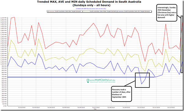
Perhaps most people are awake at this point after whatever celebrations they got up to for New Year’s Eve – but it is still a holiday (and a Sunday, to boot). Hence pretty low demand normally – we can see this in the following comparison of the Sunday extremes that occurred through 2016 in the following NEM-Review trend:
Excluding the effects of the blackout of September 28th, we see that the lowest Sunday demand through the year was just under 700MW on 30th October (which we would, in days of yesteryear, have assumed had happened in the depths of the night).
In contrast we see (in the NEM-Watch snapshot above) that the demand was not as low as this today.
(1b) Weather is moderate in South Australia, and particularly Adelaide
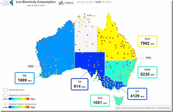
The snapshot from NEM-Watch above only highlights the temperature in Adelaide – given how it is easily the biggest driver of air-conditioning load in the State. The ECA-sponsored NEM-Watch Consumption Widget shows a more colourful view with a greater range of temperature measurement points. The snapshot below was taken at 15:48 NEM time:
In this case, keep in mind that the measure of “demand” used here is closer to Operational Demand than Scheduled Demand.
(1c) Solar is eating away day-time demand
By this time we have all heard about the “Duck Curve” – and how it is eating away day-time demand. The original snapshot from NEM-Watch above provides some great examples of this effect over New Year’s Eve, and New Year’s Day.
(2) Two different perspectives on “the Duck Curve”
Indeed, the Duck Curve has eaten into Scheduled Demand to such an extent in the South Australian region that Pelican Point switched off this afternoon, (presumably because they opted not to lose money on generation).
As noted on the image, this reduced South Australia to a reliance on only three units at Torrens and supplies over the interconnector for all FCAS services. We understand that wind farms, batteries, and demand response can (technically) help to supply these services in future – however, to my knowledge, they are not currently doing so. Economics, and rule changes, and levels of sophistication of new entrants seem to be some of the reasons why.
Frequent readers through 2016 and beforehand will not how we strive to remain technology agnostic in this increasingly political energy transition. From the outside looking in it’s apparent that there are a diverse group of people sitting at all points in the Emotion-o-Meter, with an increasingly vocal subset at either end shouting at each other (we don’t expect this to change much in 2017, realistically).
With reference to the three axis of the “Energy Trilemma”, the Duck Curve can represent very different things:
(2a) Those with a primary focus on Carbon Emissions
For those with a primary focus on reducing Carbon Emissions (and/or the more explicit promotion of renewable generation, which is not exactly the same focus) the Duck Curve can represent growing evidence of success in this energy transition.
(2b) Those with a focus on System Security and/or Economics
For those with a primary focus on keeping the lights on, or keeping costs down in the process of this energy transition, the Duck Curve presents evidence of reduced production volumes for thermal plant with non-zero short-run marginal costs that (for the time being, at least) will continue to be required for System Security.
Hence questions about the rate at which the Duck Curve grows, and whether the introduction of these new technologies that will help with system frequency can be introduced at the right pace to keep the system stable as the old workhorses retire.
I wonder whether, in 2017, we will see any real progress in the technical/economic/social/political dialogue into what mechanisms will be necessary (beyond the current myopic fascination over a 2020 RET Target) to help achieve a broader transition.
My sense is that “more of the same” in terms of a increased single-focus RET mechanism (or single-focus percentage targets in more general terms) is likely to end in tears. The electricity system is complex – we (collectively) can’t ignore or overlook that complexity forever.
Our new year’s resolution – on WattClarity we will continue to strive to understand these complexities, and make them understandable to our readers …


Be the first to comment on "SA electricity demand at New Year’s exhibiting the “Duck Curve” affliction"