As some of our readers are aware, this year we’ve been upgrading our widely-used NEM-Watch application, with one of the key enhancements being the inclusion of the APVI’s estimates for live small-scale solar production in each region (a data set produced as an outcome of ARENA funding).
An early release of NEM-Watch v10 was made available last week. We’ve provided further information about the data sets combined in the NEM-Watch v10 dashboard.
This “APVI Small Solar” data set was also added to enhance the NEM-Watch widget on RenewEconomy, which is a service we have developed in conjunction with our fellow energy-industry-observers at RenewEconomy.
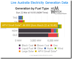
We have done this in order to provide transparency and so improve the level of discussion about policy decisions relating to a transition to lower-emissions energy, as noted in this testimonial by a user of the service. An image of the smaller widget (from Sunday 22nd – coincidentally at the start of production for the larger-scale Nyngan solar farm) is shown on the right ->
We’ve taken this step because of the ongoing boom in solar PV that’s occurring across the NEM – mainly (at at this stage) small scale, and residential.
As an interesting aside, we have also observed the emergence (in parallel) of the the solar industry as a powerful lobby group that seems to have had a telling impact in the never-ending RET Review process. This makes obvious sense, given the rapid growth of jobs in the sector – and also, perhaps, because it is not (yet?) dominated by large corporates (though we have noted that the bigger retailers have shown increased interest of late – in what I presume to be, at least in part, a customer retention strategy).
Obviously there are different views in the energy sector & the broader community of what is seen (by some) as a success story by some, and (by others) another form of socialised cost /privatised profit in a market that’s becoming very crowded with them. As noted before, we try to remain technology-agnostic and just present data & information with clarity – to help people make better decisions.
What’s particularly of interest to me, personally, is to understand the interplay between the two main intermittent generation sources currently available in the NEM – wind and solar. These back-of-the-envelope calculations performed a couple years ago highlighted some challenges that would have to be overcome for the NEM to progress to a large share of generation from wind.
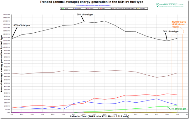
Using the current release of our NEM-Review v6 historical analysis package, we can sum up the path the NEM has taken over the past 16 years in this trended production-by-fuel type chart:
It’s clear, from this chart, that there are a number of other stories that can be extracted from the chart. These will have to be food for other posts, or some of our readers might want to comment in their own sites and link with comments below?
My focus in this post, is the growth of wind production over less than 10 years to be producing, on average, 4% of the large-scale energy generated in the NEM (based on data reported by AEMO and accessible through NEM-Review).
(a) To some this will be a “glass half full” story, whilst to others it will be “glass half-empty”.
(b) With reference to these back-of-the-envelope calculations, the NEM might be able to reach 37% (requiring a massive capacity build even to get there). To go further than that would require:
i. more diverse siting (the big projects proposed for North Queensland would probably fit this bill, but:
– I have been (to date) unable to access data that would help to confirm whether this would be the case, or not.
– whatever the case is, in terms of diversity, their connection would require transmission work (hence increasing the cost of energy delivered).ii. another possibility (suggested by Joel in comments here) would be scaling in the same locations as current wind farms, but “spilling” at times of peak production (which would reduce the capacity factor of affected farms – increasing the unit cost of energy delivered).
iii. the holy grail, it seems, is cost-effective, widespread, distributed storage (which would increase the cost of energy delivered).
Hence we have been interested to consider the interplay between wind and solar, as these are the only two* renewable technologies delivered by the cornucopia of subsidies that have been layered onto the electricity supply industry over nearly 10 years.
* It seems reasonable to assume that, unless something significant changes (in terms of relative costs of other technology, or incentives for them) that wind and solar will continue to deliver the lion’s share of new renewable generation in the NEM
Until now, it has not really been possible for us to investigate the interaction between the two ….
It’s very early days for us, in terms of the availability of the ARENA-sponsored APVI solar data, but I have been interested to have a look at historical trends of solar and wind over the past month or so (the limit of our data collection, at this stage) in a very early beta of a NEM-Review upgrade that might be released later this year (pending a few things). Email us if you’d like us to notify you if/when this upgrade becomes available?
So what have we seen in the limited range of solar production data history (29th January 2015 to 17th March 2015) we have collected, to date? Note that this is only a 7-week history, so be careful what conclusions you draw in the following. This analysis is not provided to be conclusive, but rather to stimulate further thinking.
1) The highs and the lows
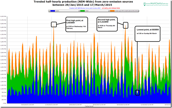
Stacking hydro, wind and solar (the three zero-emission generation sources currently contributing anything significant) together over that period produces the following trend:
In this trend I have annotated the peaks and the troughs:
(a) A peak of 5,465MW in the 15:30 trading period on Wednesday 11th February, and another peak at 5,422MW in the 16:00 trading period on Thursday 4th March (a day prior to this peak in QLD’s electricity demand);
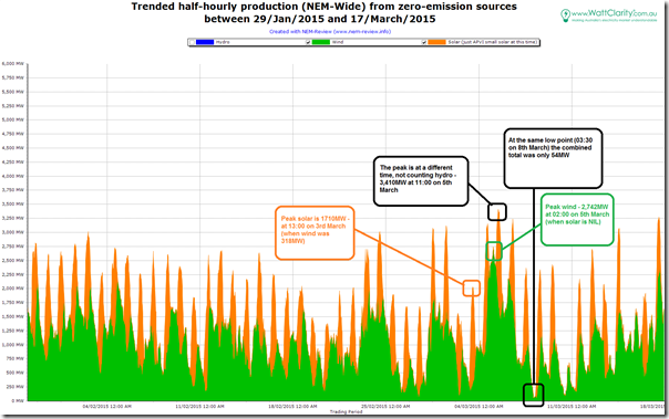
(b) The lowest point being approximately 680MW at 03:30 on Sunday 8th March, with other low points also seeming to be in the depths of the night (unsurprising, with the sun resting at the time).Removing hydro from the chart above to focus on the two more intermittent (and less controllable) energy inputs, we see the following trend:
The low point is at the same time as when all three were considered together (but, considering wind + solar only, we see the contribution was virtually NIL at that time). The high point was at a different point in time (at a level of 3,410MW).
What’s perhaps more surprising (at least to me, given I have only had access to solar output data for a short period) is to see a NEM-wide peak solar production as high as 1,710MW on 3rd March. Keep in mind that this maximum is from a small sample of only a few weeks over this extended summer period, so it’s certainly possible that there would have been higher-output days earlier.
It’s also of interest to me that this peak in solar output occurs when wind output was relatively low.
I also noted that peak wind (in the time-range studied) was 2,740MW – and that this occurred in the depths of the night when solar output was NIL, and NEM-Wide demand was at the bottom of its daily cadence. Compare this level to this earlier note about peak wind over summer 2014-15, with respect to our competition give-away (competition #7).
2) Distribution of half-hourly wind and solar
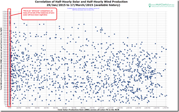
In the two charts above, we can see periods when solar was high when wind was low (and vice-versa) – but we also can see periods when both were high (or both were low). I wondered – again noting that this is a small historical data range to sample – what the degree of correlation is.
Hence I used this internal beta version of NEM-Review to produce the following correlation:
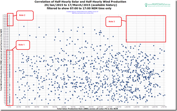
The first thought that jumps out in this plot of all half-hours over this 7-week history is that there are obviously (night-time) periods when the solar plant will be producing NIL – so we updated the same query to include only half-hours in the time-range 07:00 to 17:00 NEM time:
In this chart we see what appears, to the eye, to be close to a “perfectly” random distribution. If this is the case, what it will mean is that the NEM will need to cater for both:
(a) Periods when both wind and solar are producing near maximums; and
(b) Periods when both wind and solar are producing near minimums.Thinking this brings to mind previous comments about doomsday predictions about security of supply, and prior comments about the challenges of implementing an efficient and effective capacity market for the NEM. This is something I will continue thinking about, as time permits. For instance, a logical (and interesting) third variable to add into the mix would be demand – though this will have to wait for another post…
For the present time, I wanted to just comment on the three areas highlighted in the chart above:
Note 1 = there are still some data points in the filtered (daylight hours) time range shown recording zero solar production. Our collaboration with APVI to add their small-scale solar data feed into NEM-Watch (and possibly into NEM-Review in future) is early days at present, so we are still ironing out the data feed. I suspect these points stem from disruptions to the data, as it’s not logical that the aggregate output (NEM-wide) would be zero during the day.
Note 2 = I also noted that, removing the night-time data points removed the times of peak wind output, which happened to be at night. This is not the first time I (or others) have noted this, and is one of the reasons why prices plunge below zero in the South Australian region overnight on (windy) occasions.
Note 3 = also of interest is the area to the top-right of the chart, which shows no peaks of wind output at the times when solar output is maximised. This does seem to make sense at first glance, given that we had also seen (on other occasions) that the wind tends to die away at times of extreme temperature, which I am presuming would have correlated with peak solar output.
3) Implied capacity factor of installed small-scale solar
The solar data above is published by the APVI following ARENA-funding of the creation of the solar map (more details of the ARENA project here). The current method used to derive the estimated production is to scale up a sample set of data by installed small-scale solar capacity in each region of the NEM.
I am not aware of the precise magnitude of the installed capacity used in the time-range above (this will increase over time – and my understanding is that this is still increasing rapidly).
However, if we assume that the installed capacity is only 1,710MW (i.e. the peak production noted above) and calculate an implied capacity factor from the volume of solar produced over these several weeks, the number produced should be an over-estimate of the actual capacity factor – i.e. the installed capacity will be more than this 1,710MW, so the denominator will be larger, so the percentage smaller.
Hence we complete the following calculation:
Average production (all hours) / Assumed installed capacity = Implied Capacity factor
435MW / 1,710 MW = 25% implied (over-estimated) capacity factor
This result seems plausible.
Using a 20% capacity factor (the number I have heard quoted most commonly) and working backwards this would imply an installed capacity of 2,170MW (perhaps one of our readers can chip in below with some real numbers?).
Assuming this is roughly correct, then 1,710 / 2,170 would mean peak production of only 79% of rated capacity. Obviously it’s not reasonable to assume that solar production spread across the NEM will all produce at maximum simultaneously. One of our readers might like to comment about whether peak production at “only” 80% of installed capacity across such a broad geographic area (and keeping in mind the nature of the assumptions in the APVI estimation method) is reasonable or not?
Given the newness of this new data source, at the importance of solar to some of the more challenging issues the NEM faces moving forwards, I will return to this on WattClarity as time permits.


Why does solar total 10 MW on the REnewconomy site? The column has only one entry for 2 MW.
Peter
Next time you see something like that please take a screenshot so we know what to investigate – it’s a bit hard for the customer service team to know what they are investigating otherwise.
Paul
Interesting analysis Paul.
A couple of points I’d like to make.
Looking at the lack of correlation between wind and solar on a 30 minute basis, it is worth mentioning that a lack of correlation is a lot better than a positive correlation. It certainly means that there are going to be much fewer instances of both wind and solar being simultaneously at near record lows (or highs) than just wind or solar alone. This will likely have implications for any estimates of storage requirements (or spillage from over-generation).
I’ve noticed that when looking at monthly averages of wind and solar, that there is a very small negative correlation. This is because wind tends to perform a bit better during winter than summer (and obviously solar performs better during summer than winter).
Regarding your questions about solar’s capacity factor.
The APVI website indicates that the overall average CF achieved at the PV peak on March 3 is a little over 50% (ie, a long way short of your preliminary estimate of 79%).
http://pv-map.apvi.org.au/live#2015-03-03
This would suggest that they are using an installed capacity of a about 3.3 GW, which would give an average capacity factor of 13% for this 7 week period. This seems a little on the low side to me, most reasonable systems I’ve seen are more like like 16%, however I have no doubt there may be many systems suffering from shading etc that would bring the average down.
Having said that, they are estimating 4.0 GW of installed capacity as of Nov 2014 (or reported installed capacity of 3.9 GW), so I’m a little confused with that discrepancy.
Given that it is rare for a single PV system to ever achieve close to 90% of it’s capacity (unless the system has an greatly undersized inverter relative to the panel capacity), having every system in Australia simultaneously averaging anywhere near 80% of capacity would be highly unrealistic.
Thanks for the comments, David – will review the information you’ve supplied.
In terms of degree of correlation, I would like to be able to understand how a big wind farm in north Queensland would match against the existing stock in the south-east of the NEM. Can you help me with that one?
Paul
I don’t have that info to hand at the moment, though I can tell you that when looking at 2014 wind output on a daily basis, the following average correlation coefficients between states apply (R value)
SA:SA 0.69
SA:Vic 0.60
SA:NSW 0.28
SA:Tas 0.16
SA: WA 0.08
Vic:Vic 0.77
Vic:NSW 0.42
Vic:TAS 0.36
Vic:WA 0.01
NSW:NSW 0.76
NSW:TAS 0.36
NSW:WA -0.01
TAS:TAS 0.57
TAS:WA -0.04
WA:WA 0.39
So you can see that (on a daily basis) there is essentially no correlation between wind farms in WA and the other states. And given the relatively poor correlation between wind farms in SA and those in TAS or NSW, I think we could guess that the correlation between SA and QLD is going to be pretty close to zero on a daily basis.
Total national PV capacity (includes ~50MW of large generators) as used in the map is 3,896MW, based on monthly CER installation data. That data is ~3 months old at present so it’s an underestimate: we’re certainly >4GW now.
Capacity per state is shown in charts at http://pv-map.apvi.org.au/historical
Thanks Michael,
however I remain a little confused. As 12:20 pm today (March 30), the live data page indicates that QLD solar is generating at 43% of max capacity, and also that it’s generating 497 MW. This implies a max capacity of 1156 MW. But this is in disagreement with what it has for QLD’s state total of 1249.7 MW of PV. Can you shed any light on this disagreement? Is it assuming a max capacity that is less than the generation capacity?
It is going to be interesting to see how the combination of PVT’s and Tesla Powerwalls are going to influence energy useage. I came to your site here to see if there was a relationship between the daily timing of PV and wind, and as expected wind lags solar with the daily wind peak being in the late afternoon. I’d be interested to know if the APVI solar data includes self use energy or is it the total rootop energy production? The powerwall is going to blur the data as it takes the dc from the panels and the inverter only sees the energy as it is drawn from the system. It is at the inverter that the wifi link reports the energy output from the rooftop system. So the powerwall will serve to better represent energy consumption timing. However as thermal energy from PVT’s can be estimated from the electrical output from the panels, the Powerwall will mask that energy throughput. As the thermal energy from PVT’s is more than double that of the electrical output of rooftop systems this is a significant influence which will then only be visible in the drop in offpeak energy draw from the grid.
Disclosure: BilB has been banned from commenting at websites such as BraveNewClimate and Catallaxy