Following from the discussion (online and offline) that ensued following our post of last week, I have been pondering further, and so have added here some further points of analysis:
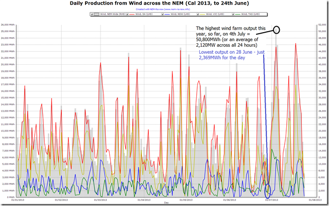
The chart above, generated through NEM-Review shows the variability in wind farm output on a daily basis.
As shown above, the “windiest day” so far this year was 4th July (or at least in terms of how it impacted on the output of wind farms aggregated right across the NEM). On that day the wind farms produced, collectively, the significant amount of 50,800MWh – which was 21 times the amount of energy generated just 5 days earlier (28th June, the “most becalmed day” in the NEM).
Also of interest is the “windiest day in SA” (at least for 2013 to date) just 7 days ago – Thursday 18th July – when total production from wind in the region reached 23,240MWh. More about this in a future post…
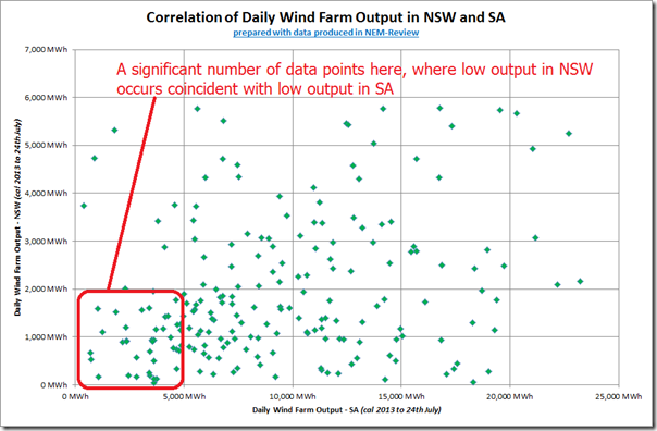
In the chart above it is possible to also see some correlation between wind farm output across all regions – for instance there are days we can see where it’s windy in SA and also windy in NSW – but, conversely, we can also see a significant number of days where it’s been becalmed in SA at the same time as in NSW. This is illustrated directly below (re-arranging the same regional data as from the above):
This correlation will be a challenge for the NEM as wind farm development continues to serve as the major source of RECs for the increasing MRET target.
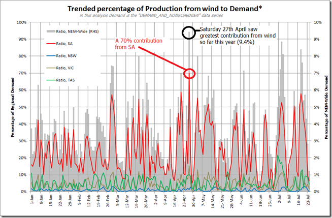
Taking into account the “DEMAND_AND_NONSCHEDGEN” data from AEMO (which, we believe, is the best data set equating to what AEMO terms “Operational Demand”*) and comparing with the daily wind farm output (by region and NEM-wide) we produce the following trend:
* For more information about the AEMO’s definition of demand, see here.
As can be seen, contributions in regions other than South Australia are very small (< 10% except for the rarest occasions), whereas in contrast we do see significant contributions on a number of days – spiking as high as 70% on Saturday 27th April. Coincident with this, contribution from all wind farms, NEM-Wide, peaked above 9% on that day.
Will look further into this later…


Thanks for this.
A common response by advocates of renewables to the criticism of “unreliables” is to propose wider diversity of the renewables. As an example, when SA wind may be becalmed, wind farms in Vic and NSW can contribute instead. Apart from the question of power transfer over long distances, and the question of whether the customers in Vic and NSW might also want the power, the assumption that Vic and NSW won’t be becalmed at the same time seems somewhat wishful – as your analysis suggests. While it’s not that common, a large high pressure system centred somewhere over the SA/Vic/NSW common border would seem to generate the right conditions for that.
I would be interested to see a graph similar to your second graph, but using half hour (or shorter) demand data (MW), rather than energy (MWh). This will give a better indication of the time-matched energy production in both areas.
As I see it, the main problem with renewables is that the energy they produce isn’t time-matched to the energy demand of consumers. In many residential houses without air conditioning, a reasonably sized PV installation will produce more kWh’s than the house uses; but you’ll get nothing – zero kW – from the PV during the evening meal.
When (not if) we get some practical large capacity energy storage systems, renewables will really come into their own.
Hi Phil
Thanks for the detailed comments.
I will add these suggestion to our growing list of potential future analysis – though keep in mind you’d be able to do this, yourself, with NEM-Review.
Cheers
Paul
Phil,
You don’t have to go to the expense or trouble of signing up to NEM-Review if you just go to the link below where its all done for you based on 5 minute SCADA data from AEMO, with historical data as far back as 2009
Leith Elder
http://windfarmperformance.info/
Phil Spencer,
This web site: “Windfarm Performance” may answer some or all of the questions you asked.
Sorry, I forgot to include the URL, but I see Leith Elder has provided it.
Phil,
You might also like to have a look at a paper I have been fortunate to have had published
recently. Properly, anonymously, peer-reviewed, by real engineers in charge of grid-control.
It looks in detail at wind farm performance for the full calendar year 2010.
The reference is: Miskelly P 2012, “Wind Farms in eastern Australia – Recent Lessons”,
Energy & Environment Vol 23 No 8 December 2012. It’s available at:
http://multi-science.metapress.com/content/f1734hj8j458n4j7/?p=3367b7f146d24db99c4ffb0a5361ab47&pi=4 .
As contributors Leith and Peter say above, you can do it yourself. I provide the methodology
with all links to relevant AEMO data in the paper.
Also, there is an earlier paper by two of my colleagues:
Miskelly A & Quirk T 2010, ” Wind Farming in South East Australia”, Energy & Environment Vol 21, Vol 20 Number 8 – Vol 21 Number 1 / December 2009 – January 2010. Available at:
http://multi-science.metapress.com/content/j2l218v143733536/?p=5b117ed08c1e43a7a3ae567df515f5f2&pi=13 .
Note that http://windfarmperformance.info/ was designed and is maintained by Andrew Miskelly,
co-author of this second paper.
Hi Paul,
I absolutely agree with your findings here, simple probability suggests that there must be occasions where total wind generation falls to zero. However no one is suggesting that we run a country with a single energy source. It wouldn’t be a great idea to run solely on coal/gas/hydro/nukes either.
Like Phil pointed out we won’t be able to have a very high proportion of our energy coming from renewable without storage. In the meantime we can aim for a lower proportion safe in the knowledge that we have an enormous volume of fossil capacity ready to ramp up when required.
Phil,
Tom Quirk and Andrew Miskelly published a largely ignored paper in Energy & Environment Vol. 20, No. 8, 2009/Vol. 21, No. 1, 2010 based on 5 minute data.
http://aefweb.info/data/Wind%20farming%20in%20SE%20Australia.pdf
Paul Miskelly has followed up with a more recent paper based on a much longer data set in Energy and Environment Volume 23, Number 8 / December 2012
http://multi-science.metapress.com/content/f1734hj8j458n4j7/
Someone might be able to help me, perhaps I have a misconception. The renewable power percentage is currently about half the 2020 target value, which should mean that about 10% of our electricity should currently be covered by RECs. The data in this blog suggest less than 5% on average coming from wind.
Is the RET under delivering?
James,
This Robert Gottliebsen article may provide some insight as to what is in store for us to try to achieve the RET, especially the cost implications:
“Prepare for an expensive energy future”
http://www.businessspectator.com.au/article/2013/7/24/resources-and-energy/prepare-expensive-energy-future
Hi James,
Most of our renewable energy comes from hydro. The RET has been more or less on track to the fixed GWh target so far. However the large retailers (at least Origin and EA) are refusing to buy into new renewable projects which will make the target hard to meet. They are hoping they can inflate the cost of the scheme by reducing supply of RECs vs demand and then ask the government to reduce the target to protect consumers. Oh and their profits. Don’t forget the profits.
The chart demonstrates the volatility of wind power. Most reading this web site would be aware of some of the consequence.
The purpose of the RET and the many other policies intended to give advantage to wind and solar generation is to reduce Australia’s CO2 emissions. But seldom do people consider the cost of these policies in terms of “what is the CO2 abatement cost?”.
A rough estimate is that the CO2 abatement cost is about $120/tonne CO2 – based on the following assumptions:
– cost difference between coal generation and wind generation = $60/MWh (perhaps higher)
– Average CO2 intensity of NEM coal plants = 1 tonne/MWh (perhaps higher)
– Wind generation effectiveness at reducing emissions = 50% (has not be determined for Australia). This means that 1 MWh of wind generation avoids just 50% of the emissions from 1 MWh of NEM generation. This is based on the Joe Wheatley (2012) study [1] which demonstrated that the wind generation in EirGrid in 2011 was just 53% effective at abating CO2 emissions. EirGrid and SA’s grid share many important similarities, including: high wind energy penetration, similar generation mix, small interconnectors and small imports and exports.
The volatility shown in the WattClarity chart is a cause – not the only one – of the reduced effectiveness of wind power (and solar power) for CO2 abatement. However, it is seldom discussed and as far as I know there has been no real attempt to determine the CO2 abatement effectiveness for Australia. Given the cost of the CO2 abatement polices it seems amazing that we have no well justified estimate of the abatement cost.
[1] Wheatley, J (2012) (submitted) “Quantifying CO2 savings from wind power: Ireland”
http://docs.wind-watch.org/Wheatley-Ireland-CO2.pdf
Hi Peter,
The chart shows volatility in wind generation over a significant period of time. You would be hard pressed to find many instances where short term volatility in wind power caused upwards market volatility. However it is a lot more common for large fossil plant to trip offline during elevated prices and cause prices to hit $12k+. Even so our current generation base is such that the loss of 500 MW is no big deal in term of system security. My point here is that it will require a hell of a lot more wind installations before we have to get concerned about system security.
Your CO2 abatement cost is also pretty inaccurate. The Irish grid has nothing to do with ours. The effectiveness of emissions reductions would be much closer to 1 given the generators that are usually limited to make way for wind; namely black coal, brown coal, and lower efficiency gas (Torrens). Also the actual cost borne is $35 for a REC minus a reduction in the pool price. I reckon the cost of abatement would be more like $40/ton.
Regards,
Tom
Tom,
What is the market mechanism by which brown coal generation is displaced by wind? I thought brown coal generation bids into the market bid stack at a lower price than gas generation. Wind will displace the most expensive alternative in the bid stack, which is most likely open cycle gas turbines.
The marginal carbon abatement due to variable wind generation does not appear to be measurable in Australia, hence conflicting claims from pro and anti wind lobbyists abound on the various blogs. Why don’t we all admit that nobody knows, reframe the problem in this context, and hold the wind industry accountable for providing evidence of displaced generation (gas or coal) due to wind generation.
Another misconception surrounds the ratio of wind energy to total supply. Retailers are accounting for about 10% via surrendered RECS, however only about 4% is being generated. This results in the cost of one MWhr of renewable energy being somewhat higher than the cost of one REC. The market would still appear to be awash with phony RECs created to support solar credits for phony rooftop solar energy.
Hi James,
It seems a bit unfair to tar wind with the solar multiplier brush doesn’t it? 🙂
Roughly speaking brown coal is displaced by wind when gas units are off or at their minimum capacity which is common during mediocre demand and/or high wind. If brown coal generators bid strategically above their marginal cost they may also be displaced at any other time. The interconnectors make it a bit tricky to pin down exactly what’s happening as one generator can be displacing another one 3 states over.
If we re-ran AEMO’s dispatch engine, with and without contribution from wind it would paint an accurate picture of the actual abatement.
For a more rough idea just look at the fact that gas and wind generation are rising, and coal generation is falling. Of course demand is a major driver but if wind was mostly displacing gas it would be taking a huge chunk out of gas generation.