All of our entrants in our “Best Demand Forecaster in the NEM” competition for summer 2012-13 have been very patient, in waiting for us to return to summer and confirm where the peak demand actually landed. Given that we’d previously published all the entries received, the entrants had a pretty fair idea of where they stood.
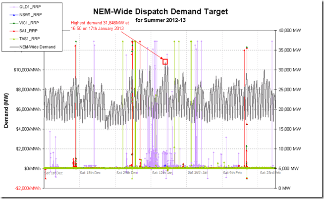
In the chart below we show dispatch (5-minute) data for the NEM-wide demand on a Dispatch Target basis (as shown in real time within NEM-Watch, and as used in judging the competition):
As we can see from the above, the hot weather in January drove demand higher to reach a peak of 31,846MW on 17th January 2013.
It should be noted that this peak was still 4,000MW below the massive peak of summer 2008-09. As we’ve noted before, both average and peak demand have been declining for a number of years – due to a significant number of factors.
Of particular interest this summer was an increase in price volatility in Queensland as can be seen in the chart above (at least compared with recent summers – especially summer 2011-12):
(a) Dispatch prices spiked above $1,000/MWh for a small number of dispatch intervals in the other regions:
i. 12 times in TAS
ii. 14 times in SA
iii. 12 times in VIC
iv. None in NSW(b) In contrast, we saw a significant 175 dispatch intervals with the QLD regional price above $1,000/MWh (and 2,519 dispatch intervals with the price above $100/MWh). Remember this analysis of the extent to which this was remarkable, posted part-way through summer.
We’ve already posted about some of the factors contributing to the volatility in QLD over that “Wacky Weekend” on 12/13 January (and which were also a factor for many of the other spikes through the month). More about this volatility later…


Leave a comment