Following the recent Clean Energy Week conference, we fielded calls from people interested in understanding the percentage of demand being met from renewable sources currently.
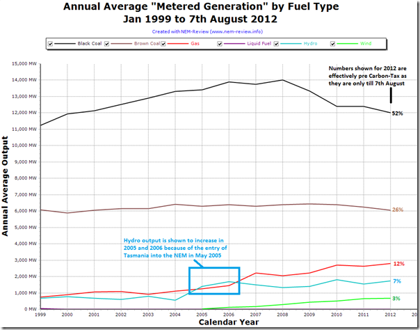
Given the topical nature of the question, we thought it would be of more general interest, and so have included this trend here (percentages have been added to show the market share of each fuel type for 2012 year to date):
It’s fairly clear from this chart that a number of trends have been developing over the 14 years of NEM history, including the following:
1) Most prominently, we see that production from black coal stations across QLD and NSW has fallen significantly from its high point in 2008 (by 15% over the 4 year period) after growing steadily in the 10 years prior. This has been driven by a number of factors, including:
1a) The flattening & decline of demand (a trend we’ve previously noted as beginning around 2006, and which we surmised has been due to a number of factors such as these top 7 factors contributing to decline of demand.
1b) We’ve seen a significant rise in production from gas-fired sources, driven by a combination of the QLD 15% GEC scheme, the availability of cheap ramp-up gas, and the choice of large new OCGT and CCGT plant for all new developments (except Kogan Creek in 2007) since Millmerran in 2002.
1c) We see that the output of hydro plant has increased from the drought-affected low point of 2008.
1d) We also see that the increase in generation from wind will also have had some effect.
2) In contrast, we’ve seen production from brown coal stations in VIC and SA hold relatively steady over the 14-year period. This is in spite of the recent announcements by Alinta of the closure and seasonal closure of the Playford and Northern Power Stations in SA (an illustration of how little they had been running in any case).
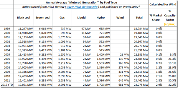
3) Because of other questions asked about the intermittency of wind, we have also included the following table to provide further detail about how the growth in wind production is trending:
4) From this table, we can see how the approximate* annual capacity factor for wind farms across the NEM has hovered around the 30% range, which is what is typically quoted for this type of intermittent production:
* Note that the lower numbers shown for 2005-2007 might be shown as lower than the actual values by virtue of the approximations of station capacity over time in the quick calculation performed for this post. Two simplifying assumptions have been made:
(a) That the registered capacity of the plant has not changed over time, and that this is the current registered capacity (this has not been the case with wind farms due to their progressive development and commissioning).
(b) That the capacity has been present from 1st January in the year in which it has been assumed.
These simplifying assumptions will have resulted in the figures above being somewhat lower than actuals, especially in the earlier years.With reference to these daily production figures we see that average daily output as high as 1540MW has been seen from wind farms in 2011, which would have represented a daily capacity factor of the order of 70% – clearly a windy day.
5) From this table, we can also see how peaking generation from liquid-fuelled plant has dropped almost to nothing as a result of the increased build (and conversion) of gas-fired plant for peaking (and energy) purposes.


Wattclarity – exactly as the name suggests
Would also suggests that rising power costs are a combination of infrastructure building, peaking demand leading to higher cost generation options etc etc. Carbon Tax may come into play with respect to cost increases but the data will reveal that in time.
Thanks John
It is nice to know when people appreciate how any of our products do help to “make the energy market more understandable”.
In relation to energy costs, you might be interested in a series of posts I started 2 years ago about the concerns of energy users, which included some indication of the drivers of higher costs that were apparent even at that time.
You’re not alone in pointing a finger at the rising cost of TUOS and DUOS charges, resulting from increased Capex allowance in the most recent AER regulatory findings. There are a number of reasons for this, some of which have been discussed by others elsewhere.
In addition, other factors are also at play, including the following:
1) The costs imposed this quarter by the introduction of the carbon tax (which we’ve started to look at recently); and
2) The rising cost of the various renewable schemes and subsidies (both federally in terms of the LREC and SRES schemes, and state-based in terms of attractive feed-in tarrifs).
3) Possibly there is still a hang-over from the period in 2007 when the drought drove up spot prices and retailers locked in hedges at these inflated prices which are still washing through into the retail space. We’ve not had time to investigate this.
As we’re striving to maintain our
Hope this helps.
Paul
You say:
“With reference to these daily production figures we see that average daily output as high as 1540MW has been seen from wind farms in 2011, which would have represented a daily capacity factor of the order of 70% – clearly a windy day.”
It would provide balance, and actually more important to point out, that there have been times when all wind farms in the NEM have produced no power. In fact, they have drawn more power than the generate.
In May 2010, there was near zero generation over a period of 4 days, under 10% capacity factor for 10 days, and 65 5-minute periods where the NEM wind farms were drawing more power than they generated. It is the minimum that is critical output that is critical, especially at times of peak demand.
Thanks Peter
The intermittent nature of wind generation means issues for the NEM at both ends of aggregate output:
1) As you note, some times the wind barely blows (even across multiple stations and regions) which means that, from a capacity point of view, only a small percentage of this capacity can be treated as firm at peak demand times.
2) At the other end of the scale, it’s often windy at night which has caused negative price events (mainly in SA) which has imposed costs on all generators – even the uncontracted wind farms.
These reinforce that wind power is primarily an energy-play, and not a capacity-play.
Paul