Back in June I made this post to highlight a chart we’d included on our “Power Trading Schematic” Market Map for 2011 showing (firstly) a flattening in the rate of increase since around 2006, and then a decrease in the past two years.
One of our readers asked if we had considered Non-Scheduled generation.
With the release of NEM-Review v6.3, we’ve provided our clients the ability to also analyse Metered Generation, and Metered Demand (in addition to the Target Generation and Target Demand that have been available since 2001).
Given the ease of availability of these two data sets, we thought it might be appropriate to continue the analysis highlighted in the previous post.
1) NEM-Wide Metered Demand
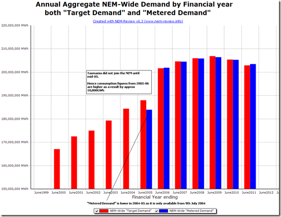
This chart shows the results, for each full Financial Year since NEM start, of the two measures for demand – Target (from the dispatch engine) and Metered (from the meters).
As can be seen, both sets of numbers show the demand growth levelling off in the period 2006-07 to 2008-09 (where it peaks) – followed by a decline that even appears to be accelerating.
The numbers shown for 2010-11 show that the Metered Demand figure (203,467,786 MWh) to be greater than the Target Demand figure (202,914,498 MWh) by 553,289 MWh – which averages out at 63MW of steady consumption.
2) NEM-Wide Metered Generation
To provide a greater degree of clarity, we’ve also looked at supply-side of the equation.
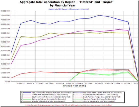
The chart here shows regional aggregate output from all generators in the region, and hence is comparable with the chart included on the “Power Trading Schematic” and copied into the original article.
A number of observations can be made in this chart, including the following:
(a) The “Metered Generation” in SA, TAS and VIC is certainly higher than the “Target Generation” in these regions over recent years – attributable to the increasing number of Non-Scheduled generators which are operating in these regions (compared with fewer in NSW and QLD).
(b) However, these differences are clearly seen to be of smaller magnitude than the reduction in generation from the NSW region (approximately 8,000 GWh over a three year period – or averaging 837MW flat generation (by Metered Generation) or 889MW (by Target Generation)).
(c) Despite the fact that output increased in other regions to compensate for the NSW reduction, we still see that the NEM-wide totals reduced by 4,400GWh MWh (when using Target Generation – averaging 500MW) and a lower amount of 2,700 GWh (when using Metered Generation – averaging 309MW).
Of course, there is other Non-Scheduled generation for which data is not published by AEMO, in any format.
Is it possible that these Non-Scheduled (and non-published) generation sources have increased by an 2,700 GWh (309MW average) over a 3-year period (in aggregate)? By way of comparison, this would represent a volume that is about 75% of the total volume of output of all the non-scheduled plant for which data is published in 2010-11 (421MW average).
Whilst plausible, it should not detract from the headline conclusion – that annual energy consumption in the NEM has been flattening for perhaps 6 years, and may even be declining (marginally) in the past 3.
3) NEM-Wide Target Demand, by time-of-day
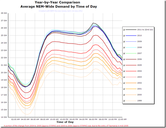
Out of curiosity, we generated the following chart – highlighting the way the average time-of-day profile has changed across 13 calendar years since the NEM started.
Because Metered Demand has only been published since mid-2004, we have had to use Target Demand to enable the comparison to be done across all years.
We’ve used colour-coding to highlight how starkly we can see a “tale of two NEMs”:
1) From 1999 to 2006, we can see a clear and consistent growth in demand, right across the day;
2) In contrast, from 2007 to 2011 (year to date) we see that the curves almost lie on top of each other (in relative terms), and that 2010 and 2011 are very slightly below the curves for 2008 and 2009, apart from the peak evening demand for 2011 – which might wash out of the average over a full calendar year.
Both scenarios are remarkably consistent, right across the day – leading to the assessment that whatever factors are causing this are reasonably consistent – across the day and (probably) across the year.
4) NEM-Wide Target Demand, by month
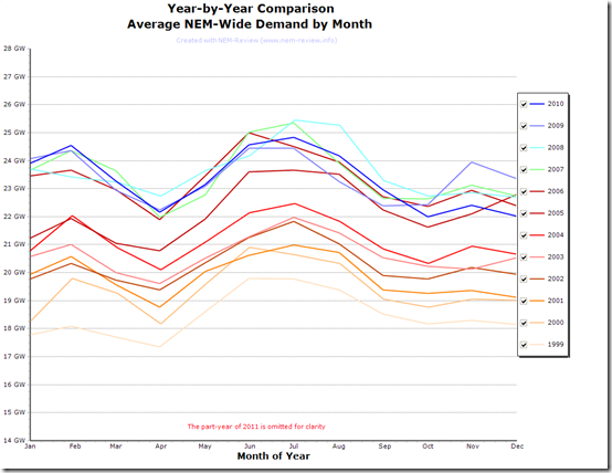
Similarly, using Target Demand, we show how the 12 full years of NEM history compare on a month-by-month basis:
The same colour coding is used for each of the years in the chart above, to enable ease of comparison with the earlier chart by time-of-day.
In this chart, a similar change can be seen (though not quite as regular) from consistent growth year-after-year (until 2006) to fairly consistent levels of demand for 5 years until 2010.
The step-change of approximately 1GW when Tasmania entered the NEM in May 2005 can also be seen.
For those who want to see the same data in their own copy of NEM-Review, here’s the NRF file – just double-click to run (once downloaded and unzipped).
We’ll see what we can do to analyse this further, when we have the time.


Leave a comment