One of our clients recently reminded us that we had not yet announced the winner of our “Best Demand Forecaster in the NEM” competition for summer 2010-11. Please accept our apologies for this oversight.
In order to do this, we’ve prepared the following analysis of how summer shaped up.
1) Trend in NEM-Wide Demand
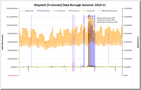
The first chart shows the trend of raw NEM-Wide demand (measured on a Dispatch Target basis):
One of the first observations that can be made from the chart above is that the NEM-wide demand rarely rose above 30,000MW – with the exception of one working week out of a total of twelve over the duration of summer, where demand was as follows:
Monday 31st January 2011
The demand peaked at 34,484MW at 15:25
We recorded the first day of the demand spike in this article.
Tuesday 1st February 2011
The demand peaked at 34,873MW at 13:30
We recorded what happened on this day (including a new record for NSW demand) in this article.
Wednesday 2nd February 2011
The demand peaked at 35,004MW at 15:50 – this was the highest demand experienced this summer (and 2nd only to the peak in demand experienced in summer 2008-09).
Coincidentally, we recorded what the market was like at the time of this peak in this previous article on WattClarity.
We also noted how demand in North Queensland was later being powered down pending the approach of TC Yasi.
Thursday 3rd February 2011
The demand (which had begun to decline) peaked at 33,631MW at 16:00
We captured this instance (at 15:40, slightly earlier in the day) of when the supply/demand balance was exceptionally tight in the NSW region as a result of constrained interconnectors and high regional demand.
It’s significant to think that demand in North Queensland was very low during this day, following to TC Yasi. Had this not been the case, NEM-wide demand would have been higher by about 750MW.
Friday 4th February 2011
The demand (which had declined further) peaked at 33,616MW at 15:45
We did not post any articles about this day.
As can be seen, this was easily the most eventful week in the NEM – with activity much more modest in the other weeks.
Hence it could be said that the “Bears” in our competition were even a bit aggressive, in terms of where the demand would end up (excepting that one hot week).
2) Demand Distribution
Hence, this summer was a perfect illustration of the exceedingly peaky nature of demand in the NEM.
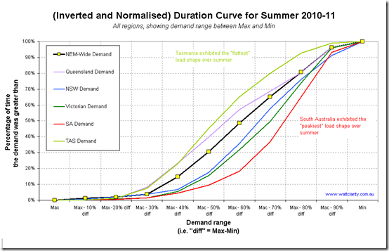
The following chart shows this – not just for NEM-wide demand, but also for demand in all of the regions. In order to make the curves comparable, we have taken two steps:
(a) We have normalised the curves to end at the peak demand experienced in each region over summer (this is typically done);
(b) We have also taken a step further and started the chart at minimum demand (which is less typically done) and divided the chart into 10 equal slices of demand intervals.As noted in the chart, we can see how the South Australian demand is the “peakiest” of load shapes in the NEM with Queensland and Tasmania being the flattest. These factors are primarily a result of weather patterns in the regions.
NEM-wide demand
The main take-away here with respect to NEM-wide demand was greater than 29,130MW for only 4% of the time this summer. Specifically, this was 957 dispatch intervals (amounting to only 79 hours and 45 minutes) – most of them occurring in the single week shown above.
In other words there needed to be generation, transmission and distribution capacity built to meet almost 6,000MW of peak demand that occurred only 4% of the time over summer – and, correspondingly, less in percentage terms over a whole year.
On a regional basis
Another way to look at these numbers is in the table below:
NEM-Wide
QLD
NSW
VIC
SA
TAS
Peak Demand
35,008MW
8,894MW
14,649MW
9,624MW
3,402MW
1,358MW
Average Demand
23,109MW
6,095MW
8,768MW
5,616MW
1,578MW
1,051MW
Peak / Average Percentage
151%
146%
167%
171%
216%
129%
Minimum Demand
15,414MW
4,028MW
5,722MW
3,702MW
869MW
786MW
Peak / Minimum Pecentage
227%
221%
256%
260%
392%
173%
.
Whatever way we look at it, the peakiness of the NEM (and the fact that all signs show that this is increasing, over time) points to an increasing opportunity for demand-side response (DSR) to provide a means to mitigate the costs of this.
We provide assistance to people providing DSR in the energy market currently, but we don’t currently provide assistance in terms of DSR reducing the burden on network infrastructure.
3) Demand Diversity
On aspect of the demand that is not shown in the analysis above is that of demand diversity.
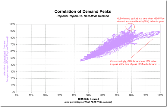
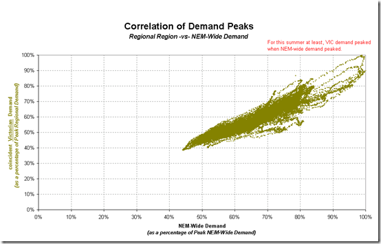
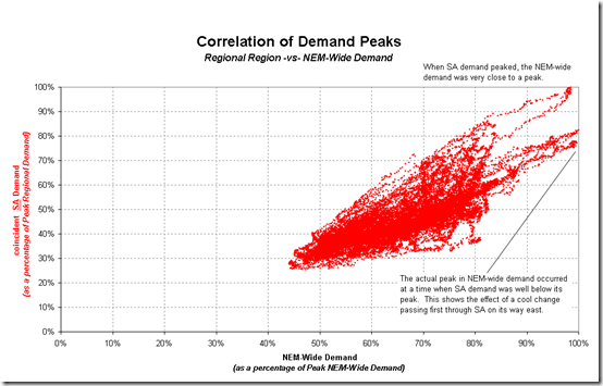
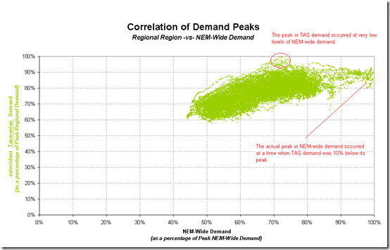
Specifically, the question is the extent to which peak NEM-Wide demand aligns with demand peaks in each region. This is shown for each region in a series of charts below.
Queensland Region
The following chart shows a correlation of Queensland Regional demand (as a percentage of the peak demand over summer) compared against the coincident NEM-Wide demand (as a percentage of peak demand over summer).
As shown in the chart, there was a fair degree of diversity displayed between the peak in demand in QLD and the peak of the NEM-Wide demand.
This provides benefits in terms of reserve sharing between regions.
NSW Region
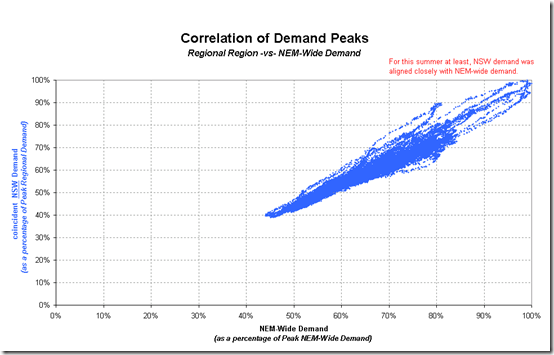
A similar chart is provided below for the NSW Region:
In this case, we see how the peak in the NEM-wide demand (at least this summer) was closely driven by the peak in the NSW regional demand.
Victoria Region
The same chart is provided for the Victorian region:
As was the case with the NSW region, the NEM-wide demand peaked at a time very close to the peak for the Victorian region.
It’s of interest to note here that the highest Victorian demand this summer (9,624MW) was approximately 900MW below its all-time maximum (10,496MW – set on 29th January 2009 at the time of the heatwave and bushfires).
SA Region
The same chart for South Australia is shown here:
This chart provides another view of the extreme peakiness of demand in South Australia – driven by the extreme heat that occurs for a few days each year, and the relatively low percentage of constant industrial load.
Tasmanian Region
Finally, the same chart has been included for Tasmania:
In this chart, the shape of the bulk of the data shifts upwards on the chart, reflecting the high load factor in the state (a function of the relatively large industrial load base, and cooler summer temperatures).
In summary, we can see that the NEM-wide demand was driven by peaks for this summer in NSW, Victoria and South Australia.
In contrast, weather and hence demand patterns in Queensland remained independent, resulting in peaks for those regions occurring at other times (when demand in NSW, VIC and SA were correspondingly lower).


In section 2 you state that the difference in peakiness is primarily a result of weather patterns in the regions. I’d add (as you state in the final bit on Tasmania) it is also quite strongly influenced by the proportion of load being consumed by our major industrials. And maybe rather than Tassie having cooler summers we can say ‘less extreme weather changes’ 🙂 Hey, I’m looking for a job for Tourism Tasmania! And being a bit pedantic – it is not the cooler weather but the lack of air conditioners that impacts on consumption – the cooler weather makes it less important to buy a/c in Tassie but the lower average income in Tasmania also impacts on the number of people with a/c. Just some patriotic thoughts!
Tim
Hi Tim,
Thanks for the pointers.
With respect to electricity, Tasmania is a fascinating place. Four big loads account for about 60% of the average demand shown in the table above, all with some flexibility to provide some form of DSR to varying degrees. Predominantly (zero SRMC) hydro with relatively large storage plus a single interconnector that is very large in relation to the demand in the region.
In terms of a tourism ambassador, sign me up as well. Lost count of how many times I have been there, and have enjoyed every minute.
Cheers
Paul
Paul
Note that the NEM demand you use (TotalDemand in MMS) is actually a 5-minute forecast rather than an actual, and excludes demand served by significant non-scheduled wind farms in SA. If you include those, and use the half-hourly average demand then you will find that the NEM-wide peak summer demand was 35,568 MW which occurred for HH ended 13:30 on 1 Feb 2011.
Just a thought
Thanks Ross,
The demand data we show in NEM-Watch (and hence use in the competition) is the dispatch target, as you note, for a couple of reasons:
1) The time stamp of the demand target aligns with the time stamp of dispatch pricing and the decision was made back when we first built NEM-Watch (in 2000) to ensure these were aligned.
2) In these early days, there were fewer other measures of demand available, as well.
The other difference you note is between 5-minute data and 30-minute data.
I know that the different measures of demand can confuse NEM observers, so I’ve tried to explain this a bit here.
We’ve made a note to look into what we can do to also include the metered numbers, as well, in some way.
Thanks, once again
Paul