It was with interest that I read the article by John Breusch “Emissions have fallen” in the AFR this Monday (22nd March).
In the article, John reports a drop in emissions seen over summer 2009-10 in comparison with summer 2008-09, as reported in this report by the Climate Group.
John extrapolates from this to postulate that “There are tentative signs that Australia’s greenhouse gas emissions may be nearing a peak”.
This perspective is reported to be echoed by Rupert Posner at the Climate Group, who is quoted to go on to state that the magnitude of the reduction seen over summer is of the order needed successively each year to meet the 2020 target (which is not clarified in the article, but is presumably the government’s stated 5% reduction target).
This prompted me to fire up my beta copy of NEM-Review v6 and have a further look to see what I could see. The following are a few charts that explain a little more about what’s happened in the NEM:
(A) Charting of Emissions:
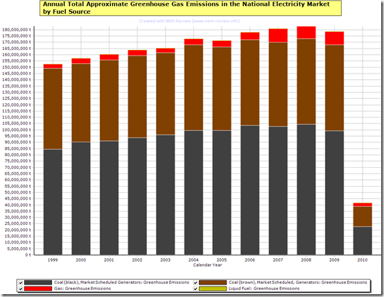
The following chart has been automatically calculated directly from NEM-Review v6 (one of the added benefits of the new version), using heat rates and emissions factors quoted in public reference documents (such as this report by ACIL Tasman).
Emissions have been aggregated over each calendar year since the NEM started at the end of 1998, in order that we can more clearly see if any trends have been emerging over time. As can be seen, emissions have been increasingly fairly steadily each year (with the only other drop recorded being from 2004 to 2005).
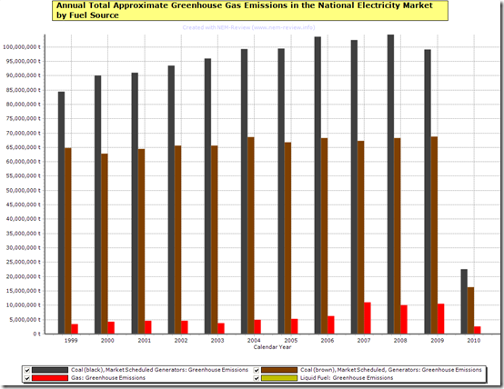
The bars from the chart above are un-stacked below to highlight how emissions have trended by fuel type.
As can be seen, there was a significant drop in emissions from black-coal fired stations (operating in QLD and NSW), whilst emissions from brown coal stations has been fairly steady since about 2004.
(B) Charting of Underlying Demand:
The report by the Climate Group was referenced to only the summer period, but noted that demand in summer 2009-10 was lower than was the case in the previous summer, when new record levels of demand were set.
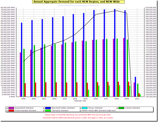
The following chart highlights how the whole-of-NEM annual aggregate demand has trended over the 11 years of NEM history:
As noted in the chart, keep in mind that Tasmania joined the NEM in mid-2005 and hence skews the results in this chart from that point forward. This is not such a factor in the emissions charts above, because of the predominantly hydro (i.e. zero emissions) nature of generation in Tasmania.
As can be seen in this chart, demand in 2009 dropped by approximately 1.1% over the year (or 2,340GWh) in comparison with the demand seen in 2008.
Why has demand dropped? That’s an excellent question – to which there may be a number of partial answers:
1) Impact of the GFC
Back in July 2009 we did some preliminary analysis that seemed to show that the GFC had (at that stage) not had much impact on electricity demand in the NEM. In the table shown in that article, we can see how the demand growth (as a percentage of each previous year) had been trending downwards since 2004-05.
However we have not followed up with any further analysis, so it may have been one of the influencing factors.
2) Reduced Demand due to Energy Efficiency Measures
With the increased government focus on energy efficiency measures at both a federal and state level, it would be hoped that the NEM is becoming more energy efficient.
Hence, we would hope that this would have contributed to the drop in demand (though we have no way of ascertaining the degree to which this has occurred).
3) Weather-Related Factors
We have previously noted how Winter 2009 was fairly non-eventful, with moderate temperatures meaning that the peak NEM-wide demand over winter reached only 31,873MW on a dispatch demand target basis (or several thousand MW below the record reached in previous winters).
More recently, we have seen how Summer 2009-10 was milder than was the case for the previous summer – specifically that the extreme heatwave experienced in Victoria and South Australia in January 2009 did not re-occur, thankfully. However, by the same token, the extremes experienced in January 2009 would have contributed to the aggregate consumption for the year.
On balance, it is probable that milder weather had some effect on reduction in overall level of electricity demand over calendar 2009.
4) Other Factors
It’s possible that there were other factors at play, as well – however I do not have time to think this through in any detail.
Editor’s belated note – we proposed this longer list of contributory factors 18 months later.
(C) NEM-Wide Emissions Intensity:
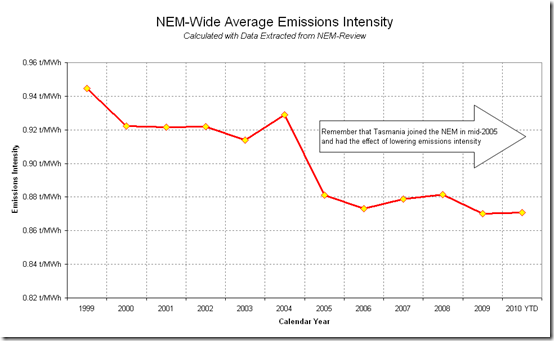
In addition to the drop in demand throughout 2009, it is important to note that the overall level of emissions intensity in the NEM also decreased slightly from 2008 to 2009, because of the increase in production levels from gas-fired generators (particularly combined-cycle plant).
The following chart has been developed in Excel with the above data extracted from NEM-Review:
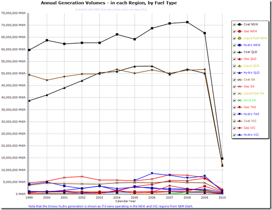
The Climate Group report names lower production levels in coal-fired stations over summer 2009-10 as a contributing factor. The reduced production volumes at black-coal-fired stations in NSW can be clearly seen in the following chart (also generated from NEM-Review):
Some interesting observations can be seen in this chart:
1) The reduced production at coal plant in NSW is partially offset by increased production from gas-fired plant in the region (Tallawarra, in particular).
2) Brown coal production in VIC remains very steady.
3) In QLD, there is a slight decrease in production at black coal stations from 2008 to 2009 (but not as significant as the reduction seen from 2006 to 2007 with the drought).
4) We can see since as early as 2003 (at the bottom of the chart) the downward trend in production levels for hydro in NSW and VIC, mainly driven by lower water levels in the Snowy Hydro scheme, and a changed bidding behaviour as a result.
5) We can also see the rising output from gas-fired generation in QLD. For an industry kick-started by a government-mandated gas scheme, it has turned into a multi-billion dollar industry for the state.
All-in-all, the article in the AFR was a topical article, given that Earth Hour is occurring this weekend – at which point in time media attention will be focused, again, on the “diabolical dilemma” of climate change.


With Australia’s expanding population it is very hard to imagine that this reduction in emissions would turn into a trend. For this to happen the inevitable increase in demand for electricity would need to be more than offset by improvement in efficiency (unlikely) or by improvement in emission intensity. To my knowledge we haven’t closed any coal plants so presumable the drop in emissions has come from reduced capacity factors. As demand rises capacity factors for coal plants will increase again. New gas plants will reduce the emission intensity further but I would bet that emissions will return above 2008 levels before long.