
1) The NEM reaches 10
For those who are unaware, 13th December 2008 marked the 10th Anniversary of the inception of the NEM. We released a short review of NEM history on that day to commemorate.
Given the occasion, however, we thought it would be useful to have a look, in more detail, at what has happened over the past 10 years.
Taking a slightly different approach, we’ve opted to review each month at a time – hence, this is one of twelve articles posted on this site at the same time.
2) 10 years of February
Through the NEM-Review software, we have prepared this illustration of how (average and peak) NEM-Wide Demand for electricity has grown over the past 10 years.
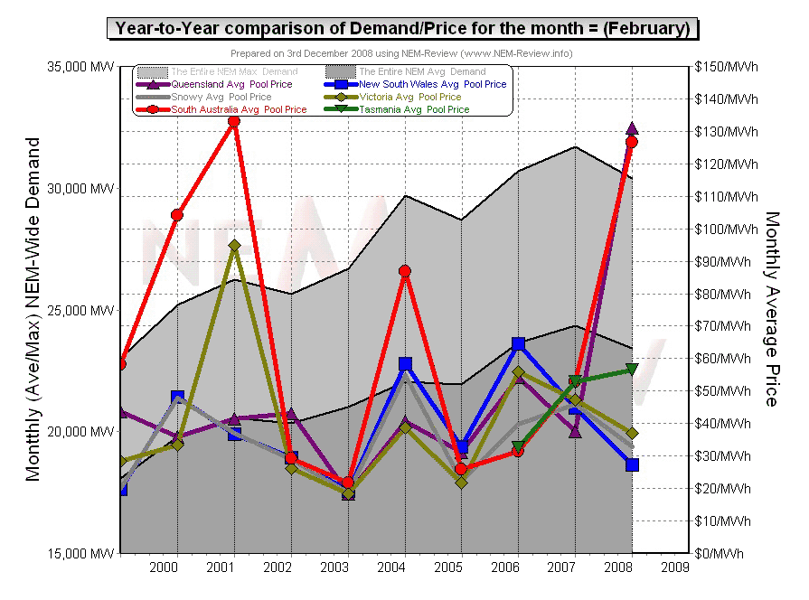
With respect to this chart, two things in particular need to be noted:
- Tasmania only joined the NEM in May 2005 – hence the data for February 2006 shows the effects of Tasmanian region demand for the first time.
- The measure of “demand” calculated in NEM-Review v5.3 is the (30-minute) Trading Demand Target, which is the time-weighted average of the (5-minute) Dispatch Demand Targets over the half hour:
- Hence, the demand shown here is an output from NEMMCO’s NEM-DE (Dispatch Engine) and not a metered demand. In most cases, the numbers will be very similar, but they will vary from figures quoted elsewhere for “maximum demand”
- This is further explained in the glossary on the NEM-Review portal.
3) Quick Links
As the following table is quite lengthy, we’ve included here Quick Links to each of the 10 years included in the table below:
- February 1999;
- February 2000;
- February 2001;
- February 2002;
- February 2003;
- February 2004;
- February 2005;
- February 2006;
- February 2007;
- February 2008
4) Each Year at a time
In the following table, we touch on the highlights of some of the February months that have passed, since the creation of the NEM.
|
February 1999 |
As highlighted in the diagram above, February 1999 saw prices in SA higher than in the other regions of the NEM (including QLD, which was not interconnected at the time).
The chart included above (from NEM-Review) illustrates that:
This is confirmed in the second chart, included here, which also serves to illustrate:
|
||||||
|
February 2000 |
The main chart above illustrates that prices in South Australia had climbed significantly higher in February 2000, whilst prices in the other regions remained subdued. The chart included below (from NEM-Review) illustrates that:
It is important to note that the average price over a month could have been influenced, so heavily, by price spikes occurring for only a relatively small percentage of time. This illustrates the massive opportunity for demand-side response in the NEM. |
||||||
|
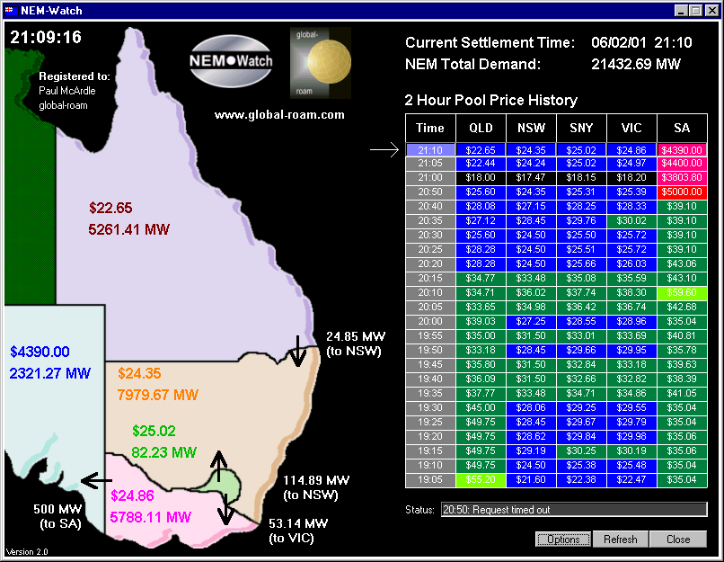
February 2001 |
February 2001 saw:
From the above diagram (from NEM-Review version 5.3) we can see that:
It’s one of only a few snapshots we can still find of how NEM‑Watch version 2 was showing the market, at the time. |
||||||
|
February 2002 |
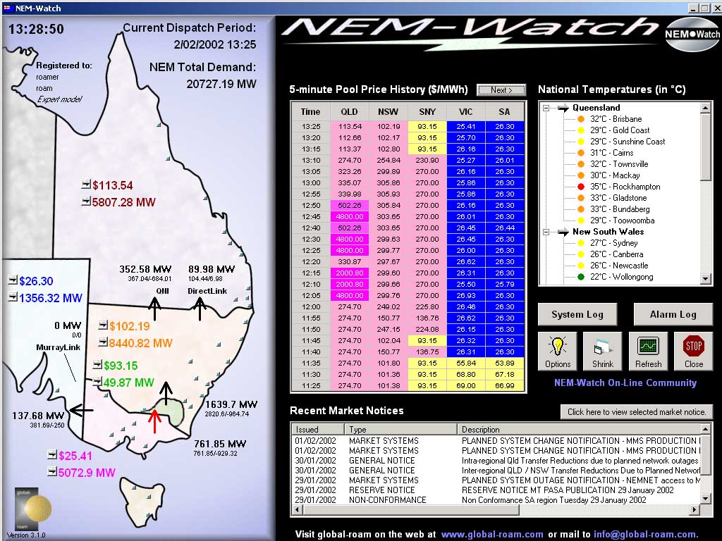
As was also the case in January 2002, prices dropped considerably in February 2002 (compared to the previous year). These subdued prices were due to a number of factors, including:
However, this did not mean that volatility was avoided completely over the month – as is illustrated in this snapshot from NEM-Watch version 3 showing high prices in QLD on the 2nd February 2002.
|
||||||
|
February 2003 |
As noted in the chart above, prices were astonishingly low across all regions in February 2003. |
||||||
|
February 2004 |
As shown in the main chart (above) prices in February 2004 were significantly higher than in the previous 2 years – particularly in South Australia.
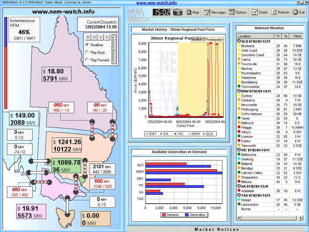
We’d like to particularly draw attention to the situation that occurred on Friday 20th February 2004. As noted above, SA was exporting to VIC over a period when prices were high in both regions. The following chart from NEM-Watch version 5 highlights more details of this event.
As can be seen, with the NEM-wide demand nudging up to 29,695MW (driven by high temperatures in the south) the Instantaneous Reserve Plant Margin IRPM dropped to a low of 15% (NEM-Wide). As shown in other analysis, the lowest the IRPM had dropped to until February 2004 was 12.2%. As would have been expected, with relatively low reserves available across the market at the time, prices were nudging upwards in all regions. Note in this snapshot that we had been preparing for the Basslink interconnector, and also had made provision for SNI (which did not eventuate). |
||||||
|
February 2005 |
As noted in the chart above, prices were relatively subdued across all regions in February 2005. As can be inferred from the chart above, this would be due (at least in part) to the lower level of (peak and average) NEM-wide demand seen in this month, compared to the previous year. We could not find (in our electronic library) any snapshots from NEM-Watch of great interest for the month. |
||||||
|
February 2006 |
As the main chart above shows, February 2006 featured an increase in price volatility, driving average prices up (compared to February 2005) – especially in NSW, QLD and VIC. By this time, we had begun documenting some of the market events online (in a precursor to this WattClarity® service). We’ve since shifted this commentary into this site, and have linked a few interesting comments below:
|
||||||
|
February 2007 |
As shown in the main chart (above), prices in February were reasonably subdued – especially in the light of the high levels of peak and average demand experienced that month. This is interesting, given that many other months in 2007 exhibited higher prices, as a result of the drought – as discussed in the review for the month of April. In particular, we thought it worth illustrating what was happening across the NEM on Monday 5th February 2007, as captured here in NEM-Watch version 7:
The NEM-Wide demand shown here (31,841MW at 15:25) was actually the peak NEM‑Wide dispatch demand target for summer 2006-07. We can see here that prices were high across the board, as the high level of demand drove IRPM to the low levels that would be expected at a time of peak demand (but still nowhere near as low as what was experienced later in the year, in June 2007). |
||||||
|
February 2008 |
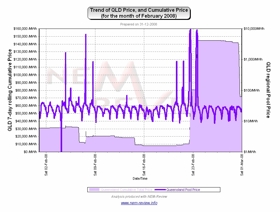
Summer 2007-08 was a mild summer (for QLD). However, 2 consecutive hot days in February (Friday 22nd and Saturday 23rd) provided all the opportunity that generators needed to force prices high, capitalising on constrained flow on QNI at the time, creating an Economic Island within which QLD generators controlled the price. At the time, we prepared this analysis of what was happening in the QLD region over these two days. We followed this up, when asked to speak at a conference in March, with further analysis highlighting how prices in QLD were high even though the QLD region enjoyed significant surplus of available generation capacity. It was this incident, in particular, that prompted us to develop the “new” Gold Model of NEM-Watch v8, incorporating a real-time view of what Economic Islands are present, and the Instantaneous Reserve Plant Margin applicable within those Economic Islands. Hence, should such a situation arise again in future, you can watch the situation much more easily with NEM‑Watch v8! Purely out of curiosity, we generated the following trend of the QLD Cumulative Price over the month (with NEM-Review), and thought the chart worthy of note: |
.png)
.png)
.png)
.jpg)
.png)
.png)
Be the first to comment on "February in the NEM (a review of 10 years of history)"