This shortish post picks up just one of the many themes arising from Friday 31 January’s extraordinary events and outlined in Paul’s overview. It builds on his subsequent post covering the sudden islanding of the South Australian system after the 500kV backbone connection running through southwestern Victoria was severed by six transmission towers west of Geelong collapsing in high winds.
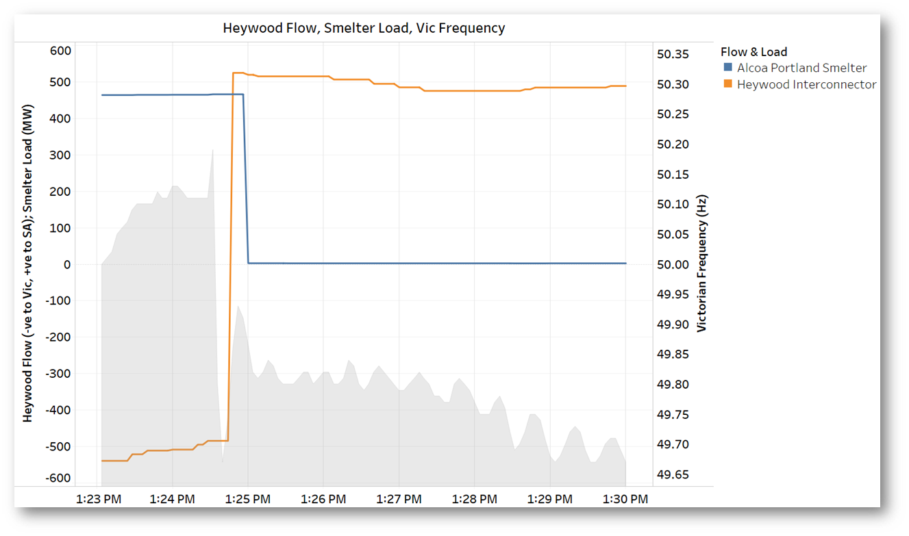
This separation led to a near-instantaneous swing of over 1,000 MW on the Heywood interconnector between South Australia and Victoria, from exporting 500 MW out of South Australia to suddenly importing over 500 MW from Victorian generation remaining connected on the western side of the collapsed lines. Contributing to the size of this swing was the tripping of the nearly 500MW load of the Portland aluminium smelter.
How did the South Australian system, with demand at around 2,600 MW, manage through this sudden forty percent shift in supply-demand balance, a larger mismatch than the swing that brought down the system in September 2016 (albeit in the opposite direction)?
The grey area series in the above chart shows system frequency in Victoria dropping to below 49.7 Hz due to the net loss of generation and imports from the south west. Paul’s post also included South Australian frequency data showing a jump to nearly 51 Hz within a few seconds of separation, as the initial energy imbalance caused an increase in the speed of synchronous generators and motors connected to the South Australian + south-west Victorian electrical island.
To see just how high frequency climbed, we’ll need to wait for detailed high-resolution data in an incident report no doubt currently being prepared by AEMO, but it’s clear that without near-immediate mechanisms to address the oversupply, the situation could have cascaded very rapidly into continuing frequency rise, protective tripping of generators and loads and possibly even frequency or voltage collapse – another system black.
AEMO’s report will yield fuller details of how the overfrequency was arrested, but the 4-second operational data published daily by AEMO, from which the chart above was drawn, also allows us to look at generator responses to the event. I’ve grouped these responses in four classes:
- non-scheduled generation, typically older windfarms
- semi-scheduled generators, the bulk of SA’s windfarms and its large-scale solar farms
- scheduled generators – conventional generation and also the three utility scale batteries
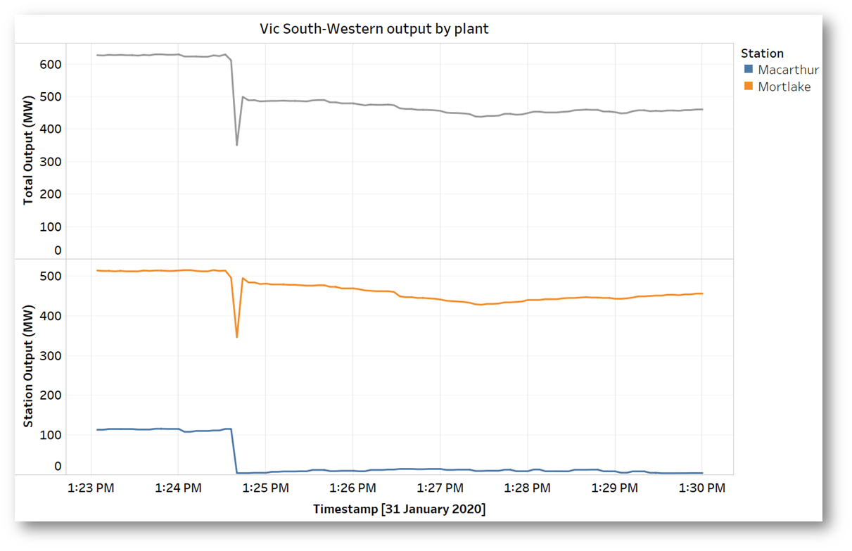
- the “adrift” Victorian generators on the western side of the line collapse, now effectively part of the South Australian system
The following charts show how output from these generators, as groups and individual stations, behaved in the seconds following separation.
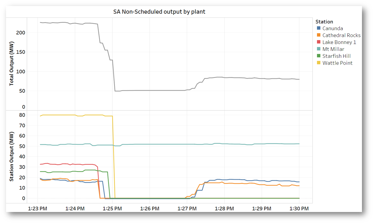
The response of the non-scheduled generation – older windfarms – was almost uniform. With the exception of Mt Millar, they all tripped to zero output within seconds of the separation, removing about 170 MW of now-excess generation (note that the timing on the AEMO’s 4-second data is not precise, being subject to collection and processing delays, and timestamps on individual feeds may vary by quite a few seconds from actual time of measurement):
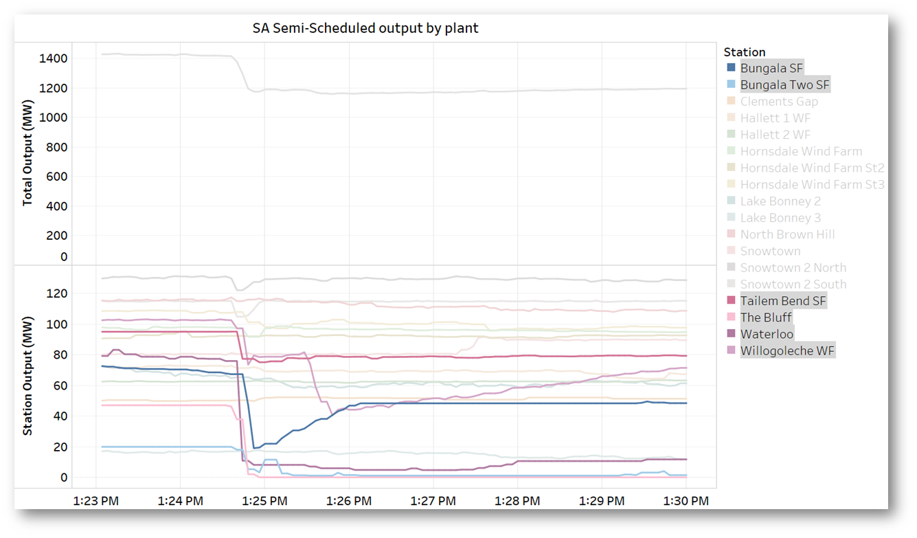
The larger fleet of semi-scheduled wind and solar farms showed a more mixed response – the next chart highlights the six stations which contributed the bulk of the aggregate ~200 MW reduction across this category. Those stations which did react appeared to follow a more controlled, partial response, although varying as a proportion of their pre-incident output:
It’s worth noting (so this ‘more mixed response’ is not misinterpreted) that a limited, controlled reduction would have helped to bring the supply/demand back into balance – hence frequency back to 50Hz – whereas full interruption of supply from all of these plant would have crashed the frequency, led to under-frequency load shedding, and possible another system black.
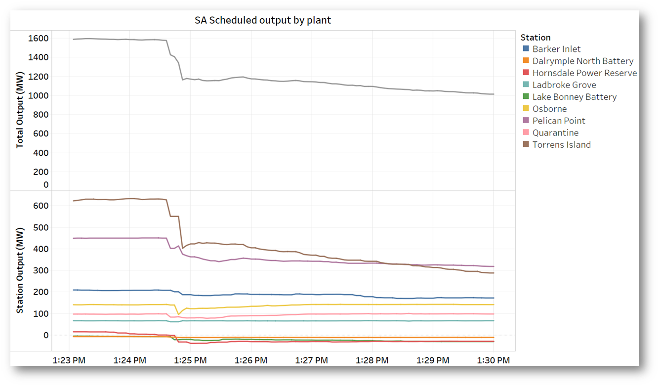
Similarly the scheduled generators – older thermal generation (and AGL’s new Barker Inlet plant) plus the three new grid-scale batteries – showed a mixture of responses, but as a category delivered the largest output reduction of around 400 MW. The largest contributor was Torrens Island. The batteries’ response was delivered via switching into charging mode to absorb energy from the system – collectively about 75 MW:
Finally, the “adrift” Victorian generators left connected through Heywood to the South Australian island grid also reacted to the high frequency they were now seeing:
(not shown on this chart is the Portland Wind Farm, for which AEMO 4-second data is not available). Its output also fell to near-zero but the precise timing is not clear.
Lots more to be said about how the smelter’s restart was managed and how the SA + SW Vic “island” system is being run by AEMO, but that’s for another possible future post.
About our Guest Author
 |
Allan O’Neil has worked in Australia’s wholesale energy markets since their creation in the mid-1990’s, in trading, risk management, forecasting and analytical roles with major NEM electricity and gas retail and generation companies.
He is now an independent energy markets consultant, working with clients on projects across a spectrum of wholesale, retail, electricity and gas issues. You can view Allan’s LinkedIn profile here. Allan will be sporadically reviewing market events here on WattClarity Allan has also begun providing an on-site educational service covering how spot prices are set in the NEM, and other important aspects of the physical electricity market – further details here. |


Thanks for the insights Allan. I presume that there is some requirements as to how generators react to this type of situation, and that these requirements have become more detailed over time as grid management matures?
Chris – there has certainly been a lot of work done on protecting the South Australian system in the case of “islanding” events where AC connection to the rest of the NEM is lost, for example an over-frequency generation shedding scheme (OFGS) that starts to disconnect generation when frequency exceeds 51 Hz (and corresponding schemes dealing with under-frequency). However the circumstances of the 31 Jan event fell well beyond most scenarios explicitly considered – because the loss of both 500kV circuits in Victoria would have normally been viewed as extremely improbable. It will be very interesting to see AEMO’s detailed report on exactly how the SA system survived the event as well as it did. Allan
The main reason the SA system formed a stable island is because SA was exporting at the time. If SA was importing from VIC at the time, things would have been more challenging. The portland load connected to SA following loss of the 500 kV lines would have actually helped limit the over frequency event in SA.
Agree that exporting pre-event likely made things easier Winodh – however the 4s data on the first chart above indicates that Portland tripped off very close to the time of the 500kV fault (as indicated by both the Portland load trace and the 1000 MW reversal in Heywood flow). We’ll need to see AEMO’s detailed report with high resolution data to know the exact sequence and timing.
What is interesting is that Mortlake Power Station has stayed online and this seems to be the main contributor to the Westerly flows across Heywood post the trip (the 500 kV system was severed east of Mortlake). The Portland load should have been able to be maintained under this scenario so suspect there is something else that has resulted in Portland load tripping. The answer to this might sit in the first plot where the Portland load hasn’t reduced as soon as the Heywood flows reversed, but need the smaller timestep data and sequence of events data to confirm. Looking forward to the AEMO operating incident report
PS: This information and plots are great, no doubt a bit of effort goes into putting them together, but they tell us a good story.