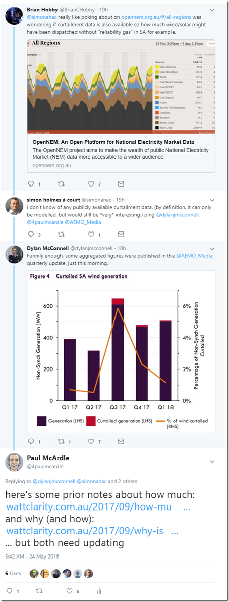
This morning over on Twitter, I was pulled into a discussion that had started with respect to volume of wind energy curtailed in South Australia:
The genesis of this twitter conversation was the AEMO’s “Quarterly Energy Dynamics – Q1 2018” (which seems to be getting better each quarter as a core reference document). As noted in my tweet this morning, both of the links I mentioned (listed below for interested readers who want the back-story) need updating.
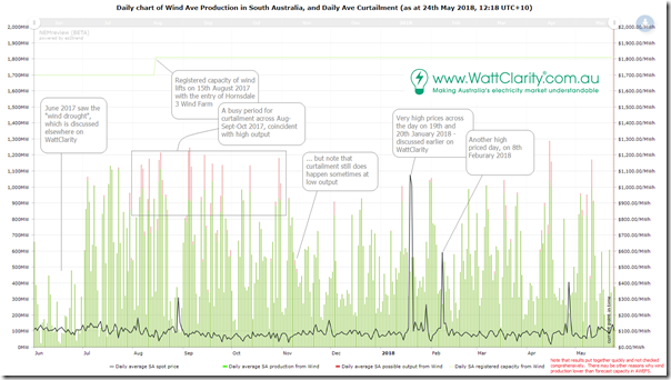
Taking a bite at lunch I noticed that Giles had also posted on the same topic here today (Giles also mentions a report by Tilt Renewables which is probably one of the ones here, but I’ve not had time to check), hence having a half hour at lunch I quickly threw the following chart together using my copy of NEMreview v7:
As noted at the bottom of the chart, the results have not been comprehensively checked (have to get back to my real job) – but clients can use what I have done as a starting point here and drill in for more details with their own licence to NEMreview (or ez2view at the higher end).
Quick notes on the chart:
1) We see the stand-out effect of the wind drought of June 2017;
2) This was followed by a period through July/August/September of particularly strong wind harvest, with AEMO’s System Strength constraints kicking in from August and so constraining down output from there – most notably when winds were strong across the day, which makes sense. As noted in my tweet this morning:
2a) I did this analysis on 15th Sept 2017 of how much volume had been constrained; and
2b) I posted on 17th Sept 2017 about why this was happening – with a bit of detail about how (though note that the specifics of the constraint has since changed).
3) I note that others had made the comment that the volume of constraint had reduced over time – but it seems clear from the chart above that this is (at least in part) because harvest volumes are lower. Often pays to go back to more granular data to double-check conclusions, and we can help with that through NEMreview.
That’s all for today folks!


Hi Paul,
I did use NEMReview to get a bit more granular and looked at hourly average data from 1st April. It gives another great perspective. It does show that the Rule has effectively put a floor under the spot prices during periods of high wind generation and low demand. It would be interesting to model how much this has increased average wholesale prices in SA, that ultimately also flow into retail prices, and the shift in wealth from end users to generators.