On Tuesday 7th November (almost 2 weeks ago) I posted some initial observations on (the monitoring of) our own small solar PV power station on the rooftop at home.
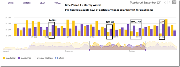
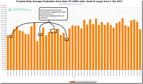
In that post I flagged a “Time Period 4” in which our own residential solar harvest was buffeted by stormy weather as the rains finally came back to Brisbane – highlighting 5 days in October (2nd October, 12th October, 16th & 17th October, and 21st October) as ones of particularly low output. I’ve copied the image here for ease of reference:
In that article I also (in anticipation) flagged that I had also taken more of a broader look in order to understand what these kinds of reductions looked like at a macro level:
(a) however ran out of time to finish that analysis on the day;
(b) and since that time have been fully focused on particular client needs in the lead-up to a high-profile summer – hence
(c) please accept my apologies that it’s taken me a while to return and finish this post.
With the benefit of days in between, on reflection I thought it might be beneficial to expand the time horizon for this analysis – so I have extended it out to cover the a longer time range in order to provide a broader range of insights.
(A) Trending Solar Production, NEM-wide
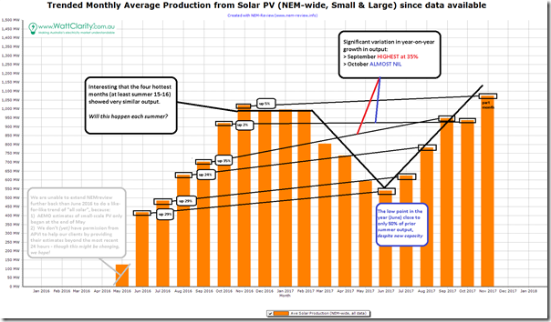
Powering up NEM-Review v6, I generated the following trend over 18 months, which happens to be the entire range(see Insight #3 below) where like-for-like data is available for solar PV production (both small-scale and large scale):
There’s more discussion below, but there are three things to flag, as highlights:
1) There is a clear seasonal variation in output across the year, which is as we’d expect. It was the scale of the variation that more stood out for me – I’m not sure I expected winter to be as low as 50% of summer;
2) Given the growth in solar that is occurring, it was expected that we would see year-on-year growth (and that this will continue for the next decade or more). However the lacklustre Oct16-to-Oct17 case flags caution should be applied to implicit assumptions that production must go up with regularity;
3) It also surprised me that the 4 hottest months of the year (at least for 16-17) saw almost identical output, and it would be pure speculation if I was to pose a possible hypothesis as to why. I wonder whether some of our more learned readers might comment on the underlying reasons for the similarity?
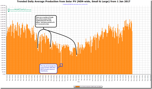
From the broader trend (above) I’ve zoomed down to average daily output, but only from 1st January 2017 – where we can see both this underlying seasonal variation but also (layered on top) some day-on-day variation in output that is, on a number of visible occasions, quite substantial.
On this chart I have flagged (as it sticks out like a sore thumb) the amazingly low output NEM-wide seen on Friday 19th May 2017 (it’s already discussed previously on WattClarity here, with underlying reasons noted here).
In my post on 23rd August, I highlighted that intermittency delivers challenges over several timeframes, flagging the day-to-day transitions as a challenge from a scheduling and operations perspective. In the chart above, I’ve noted how most dips in output tend to be for only a single day – but that there are a couple of occasions where output is down for 2 consecutive days. This is an important observation when thinking through the design for system-wide measures to allow the grid to ride through these dips as penetration of solar continues to climb.
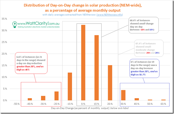
Taking the data above a few steps further, I calculated the day-to-day change (increase or decrease) in output and then, to normalise across the year to (I hope!) remove the effect of the seasonal variability, expressed that change (in MW) as a percentage of the average output across the NEM for the month in question. Then, for the 10-and-a-half months shown here, I plotted this distribution curve:
Naturally (and, to some extent, sadly) different readers will focus in on the parts of the chart that suit their own pre-set beliefs and perspectives about this multi-faceted energy transition:
| The Optimist
Some extreme optimists would include those at the “loopy left” extreme of the Emotion-o-meter. |
The Optimist might view the above and note that 87% of the time there is only a small-to-moderate change (i.e. ranging from a 20% decrease to a 20% increase) in production levels from one day to the next.
Remembering that this data is the best available data(Insight #3) for NEM-wide production, this seems to show that the variability is less extreme than what one might infer it to be if that person were to be exclusively reading from certain Pessimists. My sense is (though I have not checked) that the variability would be greater if zoomed into a particular region, for instance – because of the reduction in diversity. |
| The Pessimist
Some extreme pessimists would include those at the “rabid right” extreme of the Emotion-o-meter. |
There will also be a sizeable number of readers who will focus in on the outliers and note that there are a non-negligible number of instances where the increase (or decrease) is as great as 50% NEM-wide from one day to the next.
Unfortunately, there would be some Optimists who’d not understand, or choose to ignore, the significant challenges these outliers might represent at a macro level as solar PV penetration ramps up to what might be 10x within the next decade or so. |
| Others | With a nod to Gary Larsen’s “Four personality types”, there will be other responses to the above, of course… |
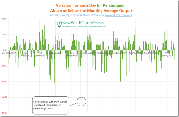
Taking the same daily data across the year, and again normalising each month it’s also worth highlighting that the daily variation (percentage above and below the monthly average output) seems to be fairly consistent across the year:
In this chart (like the 3rd one from the top), the 19th May is a significant stand-out.
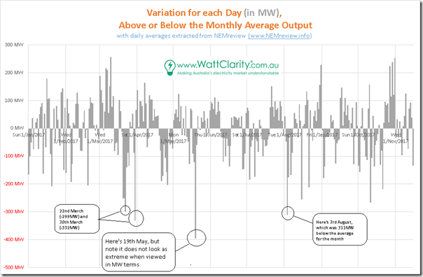
Showing the same data, but in MW terms, shows a picture where the 19th May does not stand out by such a large margin – making us realise that these sorts of reductions (300-400MW average over the day) have occurred a couple of times through this year and that it’s because this is off an already low average for May that it makes it stand out even moreso on 19th May. The fact that these large reductions (300MW-400MW lower, averaged across the day) can happen off such a low base represents a design challenge when building the grid of the future that will operate under all credible scenarios.
The fact that (apart from the odd extreme, and the separate challenge of seasonal cycling) there is no significant change in variability through the year of 2017 gives some confidence that there is not an additional challenge to be thrown into the mix.
(B) Relating back to my personal experience
Finally, drawing this back to a comparable basis with my initial observations about our home solar power station (where the data focused in on October in particular) I’ve re-set the NEM-wide chart above to just show data over the same time period:
In the chart copied in at the top of this article, I had highlighted 5 days in October when my own production was low. For comparison purposes, I have flagged them on the chart above to indicate from a NEM-wide perspective – and discuss this below.
(C) Summary Insights and Observations
In addition to the notes above, here are a number of overall observations:
Insight #1) Alignment between micro and macro
It does not really surprise that there is some degree of correlation between the micro (my home), and the macro (the grid) at the level of physical output of the PV system(s) – but neither is it a surprise that this correlation is not perfect. What it does bring to mind, as I write this, is the likelihood of declining incremental value as more solar PV is installed because of the correlation.
> On the five days noted where my household PV production was low, we see that the NEM-wide solar production was also at average or below over the period. We believe (though have not checked, in these instances) that the average wholesale price of energy on these “low solar” days would be higher than average, as a result of the lower volume of zero marginal cost energy being injected. Of course the implicit assumption here is “all else being equal”, which is often not the case in a multi-variable market.
> Conversely, one supposes that the days when my solar was at peak output, the system would also have been seeing higher than average outputs NEM-wide, hence lower than average spot prices.
1a) Corporate PPAs linked with specific large-scale projects
In writing this, I wonder what effects this might have with the current push to corporate PPAs linked to the output of some particular solar farm (still located in a single place, albeit one larger than my rooftop). I wonder whether as solar share of production increases and is increasingly relied upon to do a large share of the “spot price suppression” during the periods of good output, (at least on some occasions) periods of low output at a particular site will share a correlation with low output NEM-wide, hence reduced price suppression and hence higher spot prices.
My question, then, revolves around the best way for these energy users to hedge these “low solar days”, given that the spot price might be higher on these days as a result of lower solar, system wide? Something for the corporates (and their retailer broker advisors) to keep in mind in structuring the necessary “whole of load” contracting arrangements for a particular energy user. Indeed, with much noise being made about the rapidly declining costs of solar PPAs, at some point the primary focus will need to change to the costs for thee contracting consumers on the low solar days.
1b) Determining a “fair price for solar” for newer system Feed-in-Tariffs
At home as noted here I am one of 400,000 or so Queensland residential users enjoying a very, very generous long-dated feed in tariff. Newer installations are not able to enjoy such bounty (like Jamey, noted here), with the resultant keen interest in the periodic “fair price for solar” reviews linked to government-mandated minimum feed-in-tariff for newer customers.
This correlation of micro with macro production – and hence through to wholesale prices (hence to retail) will also increasingly factor into analysis used to determine this “fair price for solar”.
Insight #2) Significant variability, across several timescales
I’ve previously flagged that intermittency delivers challenges over several timeframes.
In this post, I have further explored the day-to-day variability that is apparent in solar PV even on a NEM-wide basis. On this day-to-day basis, we obviously can’t change the physical capacity installed on the ground, but we can think through ensuring the right market incentives are in place to ensure that other technologies and approaches(see Insight #4 below) are able to address the variability – both:
2a) A large number of day-to-day variations between –20% to +20% in output over the day; and
2b) Rarer variations of up to 50% (up or down) from one day to the next.
In the chart above, I’ve highlighted how most dips in output tend to be for only a single day – but that there are a couple of occasions where output is down for 2 consecutive days. This is an important observation when thinking through the design for system-wide measures to allow the grid to ride through these dips as the installed capacity of solar continues to climb and it becomes increasingly a dominant form of generation.
Insight #3) Challenges in the “measurement” methodology
Back in June 2016 I posted about the opacity of small-scale solar PV output. Through analysis since that time (including in this post) I hope I have begun to illustrate why it is essential that we reduce this opacity over time – ideally at a faster rate than new solar PV is added to the system. Unless we do this (whilst at the same time recognising and addressing the the security and privacy implications of such personal consumer data), it would be much harder – or perhaps practically impossible – to systemically manage these points of variability.
3a) Down at the “small” producer end
In my post of June 2016 I noted how we didn’t have permission from the APVI to include a history of their estimates for the injections from small-scale PV in historical analysis products like NEMreview. We still don’t – however we hope that this might be changing soon. When this happen, we will be able (for instance) to extend this analysis back before mid 2016 – which will help us see (for instance) whether there is any marked year-on-year variation in results.
I am also concerned, longer term, for what happens to “sample and extrapolate” methodologies like these (used by both AEMO, and the APVI) when the incentive for registration via the SRES dries up with the sunset of the RET. With less incentive for households to register their smaller systems (including on upgrades) there will be less knowledge about the installed capacity in the mix, probably leading to more difficult (and poorer quality) strategic and operational decisions.
3b) The missing “middle”
It is also worth noting that there is what might already be a significant, and certainly is a growing contribution of solar PV injections from medium-scale solar PV systems that are both too large to the SRES system under the RET, but also too small to have their specific metered data seen (and hence republished) by the AEMO. My understanding that there is some rapid growth happening for projects in the range of hundreds of kilowatts, up to tens of megawatts. Except on rare occasions (like with Gatton solar) the production at these facilities is not generally visible – and yet will have a growing contribution to system security, and price.
Insight #4) Beware the “Magic Wand”
In reading the above, there will inevitably be some readers who drag out their own favourite magic wand (Villain #6) and proclaim that “[Insert magic wand here] will be key to overcoming the growing challenges evident in the data reported above!”
Whilst each of these measures will help, none are a Magic Wand – and caution should be triggered when any “solution” is presented as one (with alarm bells triggering especially loudly if they make it sound like it will be easy, or that a singular measure will ride in to save the day).
Wand A) Geographic Diversity
The data above, notwithstanding the earlier comments about its quality/accuracy(Insight #3), already accounts for a high degree of geographical diversity in solar PV productions – especially because the totals are significantly influenced by the much larger share of small-scale (residential) PV to large scale PV across all regions through 2017, which is the year of the data above.
Whilst we (as an industry) should continue to pursue geographical diversity of future solar installations (small, medium and large), we also need to be cognisant that the evidence suggest that the challenges of substantial variability will remain with us for as long as the extent of the interconnection is limited to just “the NEM”, which is already a very large geographic area.
Wand B) Demand Response
As a company we have been actively supporting large energy users involved in this method of demand response for more than a decade (and others operating under this second method, as well). In the process the load we support in this way has expanded to be hundreds of megawatts across each region of the NEM. We’ve learnt a lot in dealing with these corporate clients along the way.
I’m also very interested in understanding how demand response might work at a residential level – so have been thinking this through, especially in the light of collaborations like this initiative between Wattwatchers and Future Grid.
With respect to day-by-day variability noted above, keep in mind that this represents significant variability from one day to the next during daylight hours (i.e. making the instantaneous figure for variability during peak daylight hours several times higher than that noted above on a 24-hour average basis). Starting at this point, we then layer on two other insights:
1. Firstly, many (but not all) households show peak demand occurring in evening hours, with very little consumption at home during the day – like mine show here. In these cases, these householders would have little to offer in the way of demand response during daylight hours to cater for the odd days when solar harvest was lower than average.
2. Secondly, in the NEM it’s commercial and industrial load that consumes approximately 70% of the electricity delivered through the grid each year by volume. Peak demand is a different story – but, as noted above, residential peak demand often occurs in the evenings. Hence any call for demand response to deal with “cloudy day low harvest” scenarios would need to be mainly met by business users.
In our experience:
2a) business energy users might (and that’s a big “might”) be able to trigger demand response for the handful of times each year that the solar was 20%-50% down on average on a particular day (noting that this might effectively amount to them turning off for the entire day, depending on the response required and numbers of providers, etc…)
2b) my general sense is (based on our direct experience) that it would not be possible for demand response to trigger as frequently as would be required to deal with the variations down to a 20% drop below average.
Wand C) Battery Storage
Likewise, we’ve been actively involved in several aspects of residential battery storage for a couple years (with some details provided here), and have also begun assisting some proponents of large-scale battery systems in the NEM.
We’ll post more thoughts on battery systems later, but for now keep in mind that these “cloudy day” problems seen in the variability above are whole-day challenges, and in rarer cases might last for 2-3 days NEM-wide. Hence this challenge needs to be understood in terms of what volume of energy storage is required, and when (i.e. ahead of time) these storage systems were to be charged.
One useful academic exercise, for instance, would be to look at the significant number of days above-or-below monthly average by 20% or less, and ascertain the size of the storage that would be required to store those bigger days, to enable the storage to discharge on the lower days. Food for a later post that I will link back in here (LINK TO COME) later, if time permits…
Wand D) Baseload
As I have noted before, this is a term that would be best retired in the near future – both because it does not directly reflect the prime growing need for dispatchable supplies in future, and also because “baseload” has become a lightning rod in the shouting match between both extremes of the Emotion-o-meter.
Insight #5) A question being asked internationally
Whilst in the process of putting this article together, I came across this FT article “Fickle British weather poses threat to future electricity supplies” talking about similar challenges (but with a more provocative/sensationalistic title) , quoting BNEF studies done for the energy transition in the UK.



at first I thought that reduced residential PV installation data after the end of the RET would be a huge problem. I am a data geek too. but then I thought, PV is really a negative load (at least until it gets to a very large portion of the daytime load).
similarly we don’t have good data every time someone installs an airconditioner, but in aggregate we see their effect with the electricity demand increase on the very hot days. won’t cloudy days impact on PV be just the same as aircon on hot days but in reverse?
A suggestion: try looking at cumulated data. A first cut would be simply to subtract the overall average from the daily production, and cumulate the daily differences. The difference between the highest and lowest points on the chart show how much storage is required if you assume that demand is constant and you are depending only on solar+storage. The next step in sophistication is to subtract instead daily demand, scaling solar to the same annual total, and once again cumulate the differences. You can then look at various percentages of overbuild. You should also account for the round trip loss in any energy stored – probably 25% is a sensible starting point. Of course, you need to add in the storage required to meet overnight demand on the biggest demand night of the year – that has to be in store at dusk.
I think you may find that the storage equation starts looking more formidable – particularly if you look to cover worst cases. The real killer is that seasonal storage only gets used once a year – not 365 times as in storage to cover overnight demand – which makes it 365 times as expensive. Worse still, if you want to cover a 1 in 20 bad year, the added storage you need to do that only gets employed 1 year in 20 on average – which makes its economics another 20 times worse. You can reduce the storage requirement by also including either other renewables such as wind, or varying amounts of dispatchable generation. You may be surprised how much you have to add back to deal with those pesky worst cases.