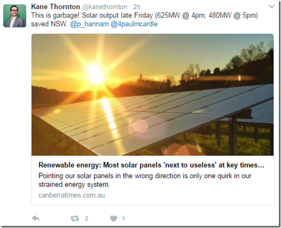
Thank-you to Kane Thornton at the Clean Energy Council for alerting me to this particular article in the Canberra times (so I presume also showing elsewhere) today with this tweet:
Alerted by Kane, I read the article and was a bit surprised to see the following quote attributed to me:
“At around 5pm, these panels are next to useless,” Paul McArdle, chief executive of energy software firm, Global-Roam, said.
Amongst the many journalists I spoke with on Thursday and Friday, I did speak with Peter Hannam, and I did amongst other things:
1) talk about how solar rapidly declines through the afternoon; and
2) provide my perspective that solar PV has done a great job of reducing peak demand but, because the “duck curve” effect has shifted demand peak later in a summer day, more solar PV (if incentivised the same way – i.e. to maximise kWh harvest) would have diminishing returns; hence
3) suggested that, if a motivation of adding more solar PV in the future would be to continue to reduce peak demand, thought might need to be given to helping solar developers align panels west (i.e. so these new panels might help more in situations like experienced today and yesterday in NSW) – in addition to, or instead of, just north;
4) of course, a further improvement would be the introduction of battery storage (and we are working to help this happen), but it is early days in this respect, and there are still a number of challenges to work through in terms of crossed incentives to operate storage at the “optimal” times (however that is defined).
However I don’t recall making the specific comment that they would be “next to useless” at any particular time. If I did, then I do apologise as that was not my intent to be derogatory..
As noted earlier today, there is a “glass half-full” and also a “glass half-empty” perspective in terms of solar contributions through these stressful recent days. Both are correct – and just two of a large number of factors that would need to be considered in better managing this energy transition. I hope that, on WattClarity, I have been able to highlight a broad number of them.
I do hope that this clarifies my perspective?
Of lesser importance, I would highlight three things:
1) Data for how solar did perform through that day:
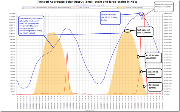
Out of interest, I’ve used NEM-Review to generate the following trend of aggregate solar PV output across Thursday 9th February (a more “normal” day) and yesterday, Friday 10th February – where the system was placed under all sorts of strain.
For those who are numerically inclined, I have annotated the solar curve with the aggregate numbers from the AEMO (historical small-scale solar data from AEMO and not APVI as noted here).
It is also worth pointing out that this data is shown in NEM time, given that it comes from the AEMO – hence 4pm NEM time would represent 5pm Sydney time in daylight savings, and so on…
2) Nothing, in particular “saved NSW”
I note Kane’s comment that solar PV “saved NSW” – which is in the same vein as Mark Bailey’s tweet implying that imports from QLD similarly “saved” NSW . As I have noted here and on Twitter in response:
1) every MWh (every kWh) of generation mattered (every kWh of conservation and demand response mattered) in keeping the lights on in NSW;
2) none were any more important than the other; and
3) I can’t see how it helps to single out any particular kWh as particularly special, compared to any other – they all helped (and all were really needed yesterday, and today).
For those who particularly want to know, total supply across Friday 11th February in NSW came from:
- Black coal = 179,724 MWh
- Gas = 21,203 MWh
- Liquid fuel = 116 MWh
- Hydro = 27,369 MWh
- Solar (small and large) = 8,661 MWh
- Wind = 6,797 MWh (with this I was pleased to see a better correlation between wind output and peak demand than was the case in South Australia on Wednesday).
- plus imports from QLD and VIC that I have not taken the time to add up.
3) NSW was not really “saved” yesterday in any case
Yes, I understand that it could easily have been a lot worse – and for that we can be grateful to all the hardworking people across all parts of the industry who toiled to ensure that was not the case.
However I certainly don’t think NSW was “saved” – my perspective is that it was a dire situation that could have been calamitous. Friday was a sign of energy-sector failure, not success.
I’m pretty sure that the people at Tomago aluminium smelter, who could also think they “saved” NSW because of their large-scale demand response certainly won’t be feeling like they were saved these past few days, for instance.
This is just another example of an energy supply sector in crisis – wouldn’t it be better if we all just knuckled down, put the parochialism to one side, and worked out how to make this energy transition work properly?


100% agree Paul! The sooner the industry infighting stops, the sooner solutions will be delivered. If it doesn’t, political solutions will override correct, ecominc and efficient outcomes.
Sorry, that should be economic
Most of the many large-scale solar farms soon to move into construction across the NEM are proceeding with horizontal single-axis tracking, and will be generating large volumes of power facing west during the afternoon peaks (just as the Moree Solar Farm has been collecting lately with NEXTrackers, last Thursday being a prime example). It’ll be interesting to see the extent to which just 1GW+ of these projects impact the shape of the duck curve.
Solar data on the Aneroid Energy website shows that the Moree Solar Farm was still producing at more than 80% of capacity until shortly after 6 pm (I presume this is local time, not NEM time). So all the new solar farms with tracking should be producing well right through the summer peak hour. However in the winter its decline in output commenced at 4 pm.
G’day Paul, hoping you can help resolve a bit of confusion. The first graph is headed ‘Trended Aggregate Solar Output (small scale and large scale), while the annotation is “the aggregate numbers from the AEMO (historical small-scale solar data from AEMO…) (my emphasis). If the latter is *only* small-scale solar, why are the numbers almost identical to what would be obtained by simply reading off the graph? Shouldn’t they be appreciably smaller, if they omit the large-scale input?