I’m slated to speak at the All Energy conference in under 3 weeks about what role Demand Response might play in a future environment where intermittent generation sources supply a significantly higher percentage of the energy mix in the NEM.
To be able to have anything meaningful to say, I have started crunching the numbers about some scenarios for how the future might unfold.
In reading the following I would ask that you keep in mind what I wrote here about models compiled by others pertaining to what a “future grid” might look like.
Of course it’s easy to shoot holes in the underlying assumptions of any particular modeller about how the future might pan out. However that approach is a bit like shooting the messenger to spite the message, and perhaps just as dangerous (in my view) as blind acceptance of “so-and-so said this, so it must be right”.
Echoing what others have already said – models are always wrong, but sometimes they might be useful.
I hope that you find the following of some use.
If, indeed, you do find it useful, then I look forward to hearing more from you. If you’re able to come to All Energy to engage during that session, I’d be very interested to hear your input.
1) Constructing “future” scenarios
In doing this analysis, I’m side-stepping any consideration about two particularly contentious aspects of the future:
1. I am not considering how quickly this can happen (given various constraints) or should happen (given concerns about climate change, etc…)
2. I am also not considering anything to do with what it might cost in arriving at the destination outlined in the scenarios below (or the other costs that might be avoided in that way). I’ve already commented on various aspect of the inclination to socialise costs whilst privatising profits.With this in mind, let’s just assume we arrive at the following destination – and explore how different (or similar) it might be from current reality …
1a) Assumptions about Demand (Consumption)
In the creation of any model, one must make certain assumptions about what the shape of demand might be.
Unlike the case 20 years ago (around the start of the NEM), or even just 5 years ago, there’s so much more going on behind the meter.
1. For instance in this report here, Hugh Saddler concludes that the rise in “behind the meter” generation is one of the significant factors contributing to why “demand” (as it’s commonly thought to be) has been declining.
2. So much so that several years ago the AEMO started to talk about three different measures of demand. The following is my paraphrase of the three categories (so it does not exactly match the AEMO’s formal definition):
Native Demand = perhaps most similar to “Consumption” (i.e. probably closest to what a layperson might think of as how much electricity is actually used)
Operational Demand = a mid-measure that’s not so much relevant to my analysis.
Scheduled Demand = what’s at the forefront of the operation of the market itself – i.e. what’s left over of Consumption (not covered by self-generation) that needs to be balanced by dispatch of generators in the market.
My general hypothesis is that the ratio of Scheduled Demand to Native Demand will continue declining as increased volumes of electricity are supplied behind the meter. This should not be controversial, I believe.
(i) A starting focus on Consumption, not “Net Demand”
Hence to present a “truer” picture (and hopefully avoid unnecessary debate) I have opted to start with a view of Consumption (i.e. total electricity used).
The catch is that the AEMO does not publish any data representing this Consumption, or Native Demand. Hence I have had to manufacture this.
Since the start of 2015, we have been pleased to work with APVI to incorporate their estimate of the (live) aggregate production of solar from small-scale generation facilities across the NEM states, and in WA, This is shown:
1. On the (freely available) LiveGen Widget available here and here; and
2. In broader detail in the NEM-Watch installed software product.(Again) with the permission of the APVI, we have constructed a series approximating NEM-Wide “Consumption” for every 5-minute interval in the 2014-15 financial year by adding this estimate to the best data the AEMO supply for Operational Demand.
It’s not perfect, we know, but (we believe) it’s the best we can get our hands on.
(ii) A focus on 2014-15
Normally, a modeller would need to make some assumptions about how this demand consumption trace would change at the point out in the future under consideration.
We’re also ducking that point of contention, by just focusing on the 2014-15 year itself and looking at what would have been the case had the supply scenarios (below) already been a reality in 2014-15.
This does mean, then, that there should be no debate about the demand side of the model, as we are using “actuals” (to the limit of the accuracy noted above)
1b) Assumptions about the Network
I’m also ducking any consideration about what the form (and role) of the network might be at that un-dated future point in time.
I’m doing this by focusing exclusively on NEM-wide numbers for everything – NEM-wide consumption, and NEM-wide supplies of generation.
Hence it should go without saying that nothing in what I am doing provides a guide for what might be the cost in network development (nor how it should be charged) to facilitate the future supply scenarios.
1c) Assumptions about Supply
My primary point of interest (in terms of the analysis for All Energy) is to understand the role that Demand Response might play in a future scenario with loads more intermittent generation.
It seems to me the next step in this process, then, would be to determine what the curve for “Unserved” Consumption might be – i.e. what’s left for the market to supply, for every 5 minute period over
So I took the actual aggregate trend of wind output for 2014-15 as one input data stream, and the aggregate trend of (small + large) solar output* SEE CORRECTION BELOW trended (small-scale) solar for 2014-15 as a second data stream, and simply grew them by a number of different multipliers – effectively creating 100 different scenarios, all being permutations on what actually happened in 2014-15.
* CORRECTION in preparing for the analysis, I had envisaged creating a “total solar” trend for 2014-15 by adding the (APVI) small-scale series to the (AEMO) large-scale series, but decided against that on the basis that the large-scale series only began in March 2015 when Nyngan was commissioned. I reasoned that it was better to just use small-scale numbers so as not to overly bias production in April/May/June months because of the large-scale capacity in those months only.Implicit in this approach is that the future will represent “more of the same” – in terms of outputs, and standing behind this more of the same (just bigger) in terms of policies, and relative costs, etc…
In other words, it’s assumed that this happens without new technology (nuclear, or solar thermal, or geothermal, or wave, etc…).
Even seeing more diversity in terms of siting (for wind) or orientation (for solar) would change these scenarios, somewhat – following on from previous comments several years ago.
For each of the 100 scenarios, then, I looked at the total consumption (the same across all 100) and subtracted total intermittent generation (different for all 100) to produce the total energy “unserved” as a remainder.
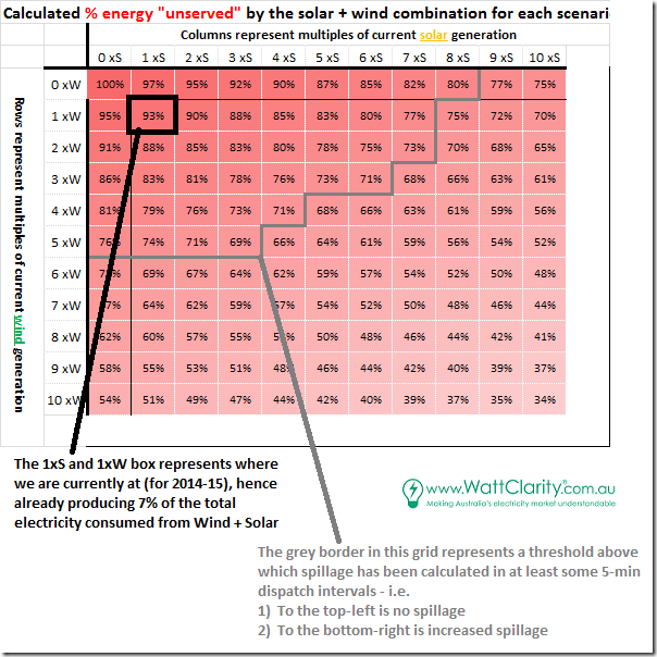
This remainder is then expressed as a percentage of total consumption in the following grid:
It should be obvious that, as penetration of wind and solar increases, it supplies more of the total consumption.
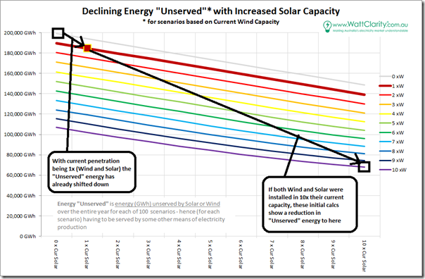
It should also be reasonably obvious that there will be some declining efficacy of this type of approach because (at the root) there are three data series (consumption, wind and solar) that are not correlated – hence there will be increased spillage (all else being equal) as we move down to the bottom-right in the grid.
This is also shown in the following chart (where the curves can be seen to flatten out, somewhat, towards the bottom-right):
Different people will view these results different ways – some will view the 10W + 10S scenario as a “66% full glass” whilst others will view if as “34% empty”. In reality both are true.
However the above is really not the main story in terms of my current focus. It’s just summary data that helps to set the scene.
2) A Duration Curve – in three parts
To understand what the role Demand Response might play in the future, we really need to get into the detail of the time-series trace of the Consumption “Unserved” – to understand how that “Net Demand” trace looks.
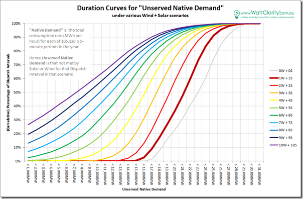
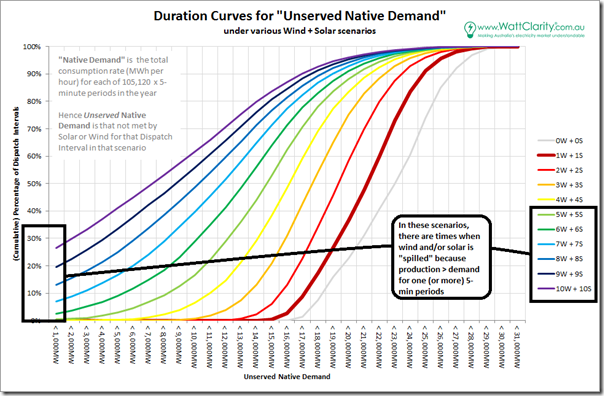
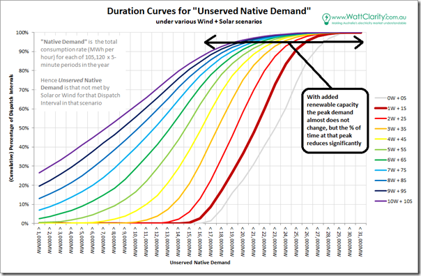
However 100 scenarios is too many to start with, so I opted for a diagonal slice through the matrix above – i.e. from 0W+0S through to 10W+10S. For each of these (now only 10) scenarios, I derived a load duration curve – as shown here:
The 0W+0S scenario is presented to provide a reference point, though it is not possible in reality (i.e. it implies that existing wind and solar capacity was to disappear – something some particular people might like to happen, but not likely).
It’s clear to me that there are three different stories that can be seen in these curves:
2a) More energy supplied by intermittent sources
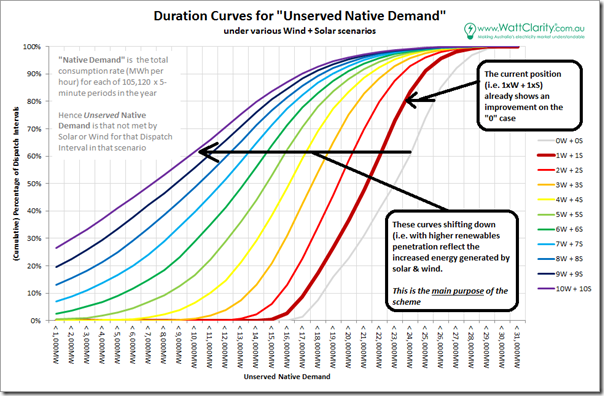
The headline news is that more intermittent supplies would reduce the “unserved” energy that needs to be served from other sources:
These “other sources” are currently predominantly coal-fired sources (with some gas, and some hydro added in). What they might be at this un-dated future point in time is not really relevant to this particular analysis.
2b) Energy spillage
A second story shown in this duration curve is that increased penetration of intermittent sources (beyond a certain threshold we are still some way from) will lead to increased spillage of energy:
This increased spillage will have flow-on consequences in several areas.
One of these will be the declining production volumes for incremental addition of new capacity, which will compound the declining spot revenues available (as these have already been seen to be “penalised” in some locations) to make projects harder to finance.
2c) The peaks get peakier
Finally (and most interesting to me, given the current focus for this analysis) is that the peak demand gets much, much peakier with increased penetration of intermittent sources (where “demand” is thought of as the consumption unserved by intermittent sources).
This will obviously present its own challenges – which is what I am trying to work through with respect to the role of Demand Response.
Back to the number crunching, for now (and looking forward to seeing those who are interested at All Energy).


Paul McArdle,
You might find the summary post of interest:
“Renewables future: A Summary of findings”
http://euanmearns.com/the-renewables-future-a-summary-of-findings/
This post begins:
“Since February 2014 I find that I’ve published 24 posts on renewable energy here on Energy Matters (linked to in order of appearance at the end of the post) . In them I’ve written about wind, solar and tidal power, hydro, biogas, hydrogen and methane, CO2 emissions, interconnectors, exports and imports, energy storage, load management, backup capacity and ramp rates, the UK, France, Germany, Norway, California, remote islands like Eigg and El Hierro, the world as a whole and even mythical places like Atlantis and the Island of Denmark. I’ve reviewed “energy future” plans formulated by others, such as DECC, the National Grid and France’s ADEME and even come up with some plans of my own. I can’t think of any stone I’ve left unturned, or for that matter anything more I can write about for the time being.
So, time to sum up.
The ongoing transition to renewables – is it leading us into a clean, green, sustainable energy future, or will it leave us freezing in the dark? Or will it do neither?”
This post, and some of the other more recent ones listed in the 24 previous posts may prompt so thoughts you may not have otherwise had.
I found posts 18, 19 and 23 especially interesting. No 23 is:
“Decarbonizing UK Electricity Generation – Five Options That Will Work”
http://euanmearns.com/decarbonizing-uk-electricity-generation-five-options-that-will-work/
Thanks Peter, there’s certainly a few linked there.
Paul, what value do you use for our present (2014-15) energy output for wind (1W) and solar (1S), in GWh?
Hi John,
Numbers requested are as follows:
1) Wind in the W1 (i.e. current for 2014-15) totals 9,406GWh
2) Solar in the S1 (i.e. current for 2014-15) totals 5,068GWh. Note the correction I have added above to clarify that it’s actually just the small-scale series I used as “solar” to avoid the bump late in the FY when large-scale begins.
Paul
Nice one Paul. It seems to me that we are likely to start having significant amounts of battery storage in the coming decade, particularly in homes with PV. As a first guess, say 1 million homes x 10kWh = 10 GWh.
It would be interesting to see how the flow duration curves would change if you model this storage. A simple battery algorithm such as store whenever energy would otherwise get spilled, and release as soon as generation reduces below consumption. Since spillage only starts around 6W+6S, you’d only have to model this scenario upwards.
Perhaps repeat with 20 & 50 GWh of storage.
Of course, some of this could also be done with existing pumped hydro instead.
cheers
Thanks David
Yes, this type of “next step” is already underway.
There are virtually an infinite number of permutations for how storage might be used (especially considering all the different actors who will have a finger in the pie, and their various incentive). I had already opted for a simplistic approach, such as what you suggest, but realise that it will be quite different than how it will play out in reality.
Paul
Another simpler suggestion is that when looking at larger wind capacities, you use a much larger scale factor for NSW than for SA. It is certainly unlikely that SA will increase capacity by 10x, but that may be quite possible for NSW (and you could also use NSW as a proxy for QLD additions too).
This will help increase geographic diversity, which is currently dominated by SA & Vic
Because my focus is on “NEM-wide” in this analysis, I had already decided not to do this kind of thing. Fundamentally it would open up another degree of freedom in the analysis that would make it even harder to produce some useful results in the time available.
Thanks for the suggestion,though, David
Paul
If you scaled the renewable generation as a function of state demand, then you wouldn’t add an extra degree of freedom. ie, if NSW has 35% of annual NEM demand, then scale NSW wind so it provides 35% of wind generation and likewise for solar. Unfortunately that still leaves a problem of how to model QLD wind, perhaps using NSW wind as a proxy may the best you can do.