For a couple of reasons today (including the hot weather forecast for today, and the release yesterday of another interim upgrade to NEM-Watch v10 ) we opted to invest some time today to look at the level reached for Queensland demand today.
What’s happened thus far in “extended summer” 2014-15 to date
Back on 24th December, we posted these general comments about what might be expected in the Queensland region over the extended summer period for 2014-15. At that time, the Queensland demand had already peaked at 8,472MW on 17th December 2014 (a high level, but still 500MW or so off the record). In that post, I wrote about whether the increase in upstream compression would result in Queensland defying the overall trend of declining demand.
In particular, we noted how it was of interest that this peak occurred later in the day than would have been the case several years ago, with solar PV hollowing out scheduled demand when the sun shines strongly.
On 14th January, we also noted about the mysterious jump in Queensland demand observed (late 2014) by our friends at Pitts & Sherry.
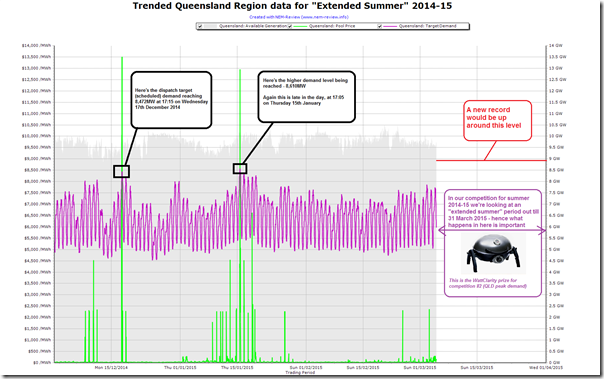
Hence, we thought it useful to recap, in the following chart from NEM-Review, what’s actually happened with respect to QLD demand so far over this “extended summer” period through until 31st March 2015:
The key takeaway, at least from the perspective of those in the running to win competition #2, and those more generally interested in the peakiness of electricity demand in the National Electricity Market, is that the result on 17th December has since been exceeded – with the new “highest so far” demand being 8,610MW. This occurred on Thursday 15th January 2015.
Again, we note this was achieved later in the day – as aggregated solar PV injections was in its end-of-day decline.
A detailed look at Thursday 5th March 2015
Hence this brings us to Thursday 5th March – a day on which I indulged my natural curiosity to have a closer look:
Forecast on Monday 2nd March
This curiosity was peaked on Monday this week, when we noticed weather warnings – and so posted these early comments about what was forecast to be a high demand day today. In particular, under the 50% POE weather scenario in ST PASA, the forecast peak was only around 8,250MW.
Forecast on Wednesday 4th March
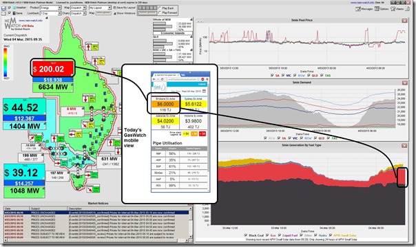
Wednesday morning we looked in NEM-Watch v10.0.1 and GasWatch mobile and prepared this mashup highlighting how gas prices on Wednesday were helping to explain the high prices seen in the electricity market (and vice-versa).
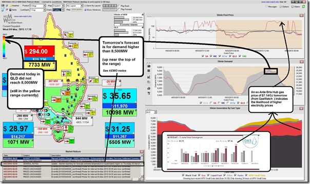
At the end of the working day, we looked forward into the following day and saw that the forecast peak demand for Thursday was in excess of 8,500MW (so higher than the 50% POE forecast had been in PASA on Monday).
I tweeted this annotated image from NEM-Watch v10.0.2 (with a chart from GasWatch added in for the broader picture) to highlight potential issues:
However we’ve lived through many instances where forecasts have not quite worked out in reality – hence we were uncertain what would actually happen on the day.
As it unfolded on the day…
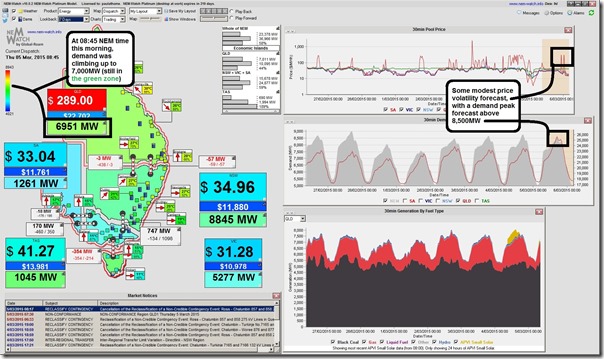
It was of interest that we arrived at work this morning to see what was then forecast, as shown in the following snapshot from NEM-Watch at 08:45 NEM time:
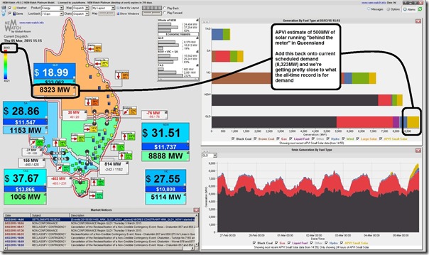
At that point we’d resolved to invest some time today in digging further, and preparing this post. At 15:15 we took (and tweeted) this snapshot of the market highlighting how (adjusting for approximately 500MW of solar PV injections behind the meter) the Queensland demand was very close to the historical record:
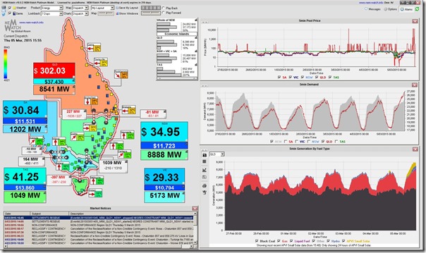
As 15:55 the demand had passed the 8,500MW mark and was on its way higher (with temperatures high but solar output already well down from its peak* of 710MW at 11:40 this morning):
* incidentally, the peak QLD solar output today (710MW at 11:40) was not far off the highest we’ve seen through summer (747MW a couple days ago).
As the afternoon progressed, demand continued to grow.
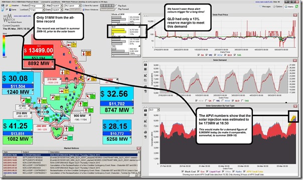
This snapshot from 16:50 shows a massive QLD Dispatch Demand Target of 8,892MW which was only 51MW below the all-time record. This is even more remarkable when considering that the solar injections into the grid at that time were estimated by APVI to be about 173MW – meaning that, adjusting for solar, a new peak in demand (9,065MW) was achieved at this point.
It’s also worth pointing out in the above, with respect to demand levels being achieved, that there’s plenty of demand response activity we’re seeing as well in response to price volatility (though this was also the case in the peak reached in 2009-10).
Given that solar has been progressively declining through the afternoon with the path of the setting sun, we’ve stuck around for a while to see what eventuates in terms of dispatch target demand
As a brief PS to the post completed yesterday …
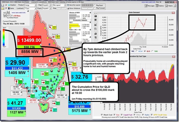
By 18:00 on Thursday, demand was well and truly declining, so I headed home for the day – so it was with some surprise that I saw that, by 19:00 (as shown here in this snapshot from NEM-Watch v10.0.1 ) that demand had climbed back up, almost to that same level again:
As noted on the image above, we presume that home air-conditioning load contributed significantly to this significant jump in after-work demand.
One further outcome of the volatility yesterday is that the Cumulative Price for Queensland (the rolling total of 7 days of trading prices) had risen at that time to almost $100,000 (on Friday morning it’s above $110,000) – hence well on its way to the Cumulative Price Threshold (the level at which AEMO steps in to cap prices for the region).
What this means for those in the running for a BBQ prize
With respect to our summer BBQ give-away (and in particular competition #2 in this instance) we have a few entrants sweating on what happens to the lucky forecaster who is closest to the mark with their forecast for the maximum Queensland regional demand over this 4-month “extended summer” period.
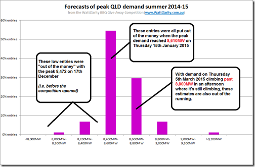
This chart sums up the situation, with most entrants already out of the running as a result of the high level of demand experienced today:
This leaves a much smaller number of entries (under 10%) still in the running for the BBQ. Those entrants will have to wait for April to see who gets the prize…


Great write up, just a couple of thoughts
I think the Pitt and Sherry “mysterious jump on Queensland demand” is answered in AEMO’s last two editions of Energy Update February 2015 edition page 2 and December 2014 edition page 3.
Quoting “Queensland experienced record breaking temperatures in late October and November last year. The November 2014 mean maximum temperature was the highest on record for the state, leading to some very warm nights for Queenslanders,” said Ms Pimentel.
Secondly, In addition to PV behind the meter there is also the price triggered demand side diesel generation embed in the distribution networks to consider. Some of these embedded generation sites can be quite large >1MW and there surprising number of of them out there. Looking at yesterday’s spot price some these embedded generators may have potentially run well into the evening. So if we were adjust for both solar PV and embedded demand side generation what is the underlying demand?
And finally is anyone tracking the number of failed and “abandoned in place” solar PV systems that the owner cannot afford or be bothered to repair. There are plenty of anecdotal stories of failed PV systems where the installer has gone out of business (no warranty) and home owner is faced with the cost of replacing the now ~5 year old inverter, if you haven’t yet recovered the install cost on the original PV system, then paying for a major component is bitter pill to swallow for many.
Cheers
Thanks Paul
In terms of the “mysterious jump” I think what AEMO has noted is part of the answer, but have not had the time to really dig further.
In terms of embedded generation behind the meter, solar PV has been (as much as I understand) the biggest growth factor in between 2010 and now. That’s one reason why we have focused on it, in particular – to provide a more integrated view in NEM-Watch v10 complete with that data.
In terms of price-responsive demand changes, either by diesel gensets starting or by actual demand reductions, there was some of that happening yesterday we know (some are our clients).
In terms of anecdotal evidence of solar faults, I have yet to delve into that – but I know that Tristan and others have commented. If you know of other sources of published data, in addition to the CER, please list them here so I can check them out as time permits?
Paul
Interestingly, the generally higher/more volatile wholesale electricity prices are also coinciding with a generally rising domestic gas price.
So I wonder if the volatility is purely demand side driven or perhaps due to some supply side constraints from the gas turbines