We’re straddling a few different quarters at present:
1) We’re working to complete the systematic review of 2024 Q2 for a looming deadline;
2) We’re also aware that we still have a couple things to polish (belatedly, with apologies to clients) for 2024 Q1
3) And we’re being distracted by 2024 Q3 as well … in particular, it’s been volatile the past couple of days:
(a) Particularly in South Australia on Sunday evening 28th July 2024;
(b) Across all regions on Monday evening 29th July 2024;
(c) Across all regions on Tuesday evening 30th July 2024 … but particularly (and persistently) in South Australia.
(d) Across all regions on Wednesday evening 31st July 2024;
(e) And also on Thursday 1st August 2024 …with:
i. Some brief volatility this morning (06:55) in VIC and TAS; and
ii. A blip in TAS at 10:55
iii. And perhaps this evening.
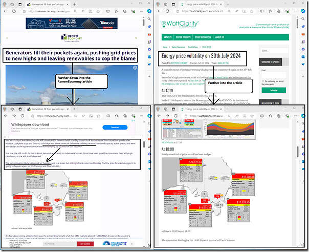
That’s led to a number of articles here on WattClarity … and also the article ‘Generators fill their pockets again, pushing grid prices to new highs and leaving renewables to cop the blame’ on RenewEconomy, which featured a familiar image from the ‘NEM Map’ widget in ez2view:
With respect to the image above:
1) On the left is Giles’ article, including the ez2view image …
2) Which came from Linton’s earlier review ‘Energy price volatility on 30th July 2024’ (which was updated on-the-fly through Tuesday evening 30th July 2024).
3) Linton followed that yesterday with ‘An initial pass over ENERGY bids during price volatility of 30th July 2024’ :
(a) Linton chose to focus particularly on South Australia, given that was where most of the volatility had been seen (and pressure on the Cumulative Price).
(b) But our intention is that we’ll also do something similar on a NEM-wide basis … just need to wait until we’ve finished a few other things first!
4) But what particularly jumped out to me was Giles’ comment above the ez2view image, which I’ve copied in here for ease of reference:
‘Yes, wind output was down, but the AER chronicled in forensic detail how big players took advantage of the competitive power after multiple coal plant trips and failures, to indulge in a whole series of deliberate bidding patterns, removed capacity at low prices, and were also caught in the apparent deliberate slow ramping up of units for this situation.
Not that the AER could do much about, because apparently no rules were broken. Must have been good for consumers then, although clearly not, as the AER itself observed.
The same situation likely happened on Tuesday, and to a lesser but still significant extent on Monday. And the price forecasts suggest it is going to happen again on Wednesday, and Thursday too.,’
Giles is either referencing:
1) the AER’s review of Q2 (which was published this time at the same time as the AEMO’s QED); or
2) the AER’s earlier >$5000/MWh report
… and wondering what bidding behaviour might show for the current week. So (remembering that we envisage looping back around to do something more systematic when more time is available) I thought I’d make a very quick/brief start here.
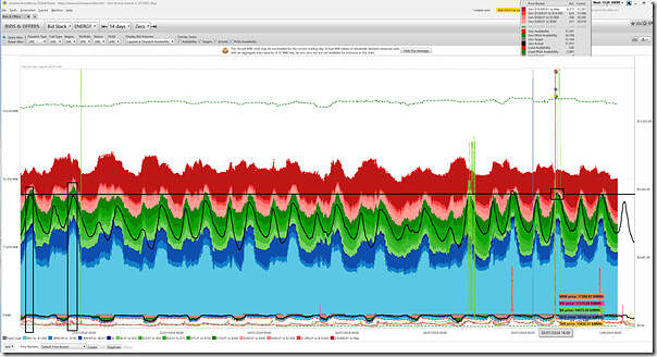
Using the ‘Bids & Offers’ widget in ez2view I’ve added this quick snapshot in here, looking back 14 days:
(Remember to click on the image to open a larger size one in a separate tab)
As noted before, the NEM’s a complex place … and with complex data sets like bidding behaviour the devil is in the details (i.e. including a review of behaviour of individual participants, which we don’t have time to do here) – but, at a high level in eyeballing this chart, it appears that:
1) There was more volume bid from $300/MWh down to the Market Price Floor (i.e. the green and blue colours) through the evening period on Mon 29th July 2024 and Tue 30th July 2024 than there were in any day back to Friday 19th July 2024:
(a) The ‘cheap price energy’ was higher on Thursday evening 18th July and Friday evening 19th July:
i. days where prices were subdued;
ii. but no time to look at what else was going on for those days … or anything in between (from 20th July to 28th July).
(b) For a more systematic review of volume bid in various price ranges, refer back to this ‘Updated trend of ‘ENERGY’ bids in red, green and blue’.
2) What’s clear in this chart is that (despite a higher volume of cheaper energy bid across all supply-side participants) one of the primary drivers of higher prices in times when it’s spiked across the NEM has been higher demand levels:
(a) these are shown in the black line (and a grey line that’s also underneath as well, for those who want the details)
(b) this higher ‘Market Demand’ level is driven by (amongst other things) the colder weather at present.


Giles is a hack. He always blames fossil fuel generation for every outage or price spike despite them actually being caused by the lack of renewable energy generation.
Glad to see you shining a light on his lies but sadly his true believers will likely never see your rebuttal.
It’s fascinating how people will see what they want to see in any given piece of data or analysis.
Take the dispatch interval highlighted in Paul’s bid chart, ending 18:00 on 30 July. Putting aside how much supply capacity was renewable or not, there were 37,281 MW offered to the market and only 31,144 MW needed to be dispatched. However the proximate reason that the spot price went over $15,000/MWh in every region was that of those 37,281 MW offered, 6,273 MW (17%) were priced above $10,000/MWh.
Maybe the technical and competitive dynamics leading to this bidding behaviour would be more worthwhile subjects for commentary than whether Giles Parkinson is a hack or the level of renewable generation at the time?
I thought it was the downramp of solar @ 5~6PM in South Australia that initiates the price volatility. Maybe I have to hate fossil fuels more in order to properly understand.