In the first article of the four-part series we looked at how the cheapest electricity is the electricity that you do not use and the many opportunities to capture the low hanging fruit of energy efficiencies.
In the second article we looked at how savings can be achieved through purchasing electricity at wholesale market pool prices and then achieving further savings by employing Demand Side Management or Demand Response strategies.
In the third article we looked how large innovative energy users are locking in long-term electricity prices at well below current market prices through using Corporate PPAs.
In this (possibly) final article we will look at the power of analysing your electricity usage data to understand where and when you use electricity so that you can identify cost saving opportunities.
The article is based on Step 2 (Chapter 9) of the 9-Step electricity cost reduction framework covered in my book “Power Profits – A Comprehensive 9-Step Framework for Reducing Electricity Costs and Boosting Profits”.
It’s critical to fully understand how electricity is used in your business. You need to be able to thoroughly and accurately answer questions such as:
- What time of day, day of week, and month of year is electricity use at its highest and lowest?
- What is the maximum demand and when does it occur?
- What drives maximum demand?
- Which equipment has what load?
- Which equipment needs to run all of the time?
- Which equipment does not run at capacity?
- What is the site power factor?
Without knowing these answers, you cannot significantly reduce electricity costs. One of the common mistakes in electricity purchasing is not knowing the electricity usage profile of the operation and not understanding the operational flexibilities of the equipment.
Retailers need to make assumptions about your load profile when providing supply offers. Most commonly they use your last 12-months of half-hour interval data to model your annual peak, shoulder and off-peak consumption and their pricing algorithm will be based on that profile. If you expect your load profile to change in the future, or you have the ability to change the profile, then you may be able to achieve sharper prices.
Analysing the data
If your business is serious about reducing energy costs, then it is important to know how to collate and analyse your energy data. There are all sorts of different techniques you can use to do this. Different analysis techniques will reveal different information, but my favourite method is to use box plots.
Box plots
The amount of data that is available at the operations level can be overwhelming when it comes to analysing electricity usage. For this reason, one of the best ways to analyse and represent the information and provide some context is to look at box plots for the data.
Box plots are a method of representing data that show the distribution of the data at a glance and not just over a time series average. Averages are not very useful when looking at electricity usage data as they obscure crucial information like the highs and the shape of the distribution.
Box plots are simple percentile plots where a box represents the 25th to the 75th percentile of the data, and “whiskers” either side indicate the expected variation in the upper and lower quartiles.
For most box plots, the upper whisker extends to the highest data value within the upper limit range where the upper limit is 1.5 × the difference between the 25th and 75th percentile added to the 75th percentile. The lower whisker extends to the lowest data value within the equivalent lower limit range.
The median, where 50% of the data values are less than or equal to this number, is shown as a horizontal line across the box. We also show the average value in most of the charts as a solid dot with a line connecting them.
Data points that sit outside the extent of the whiskers are regarded as outliers and not within the expected distribution. They are due to special cause variation and are often pointers to abnormal operations that are pushing your costs up.
The following diagram shows a simple representation of a box plot for a set of data.
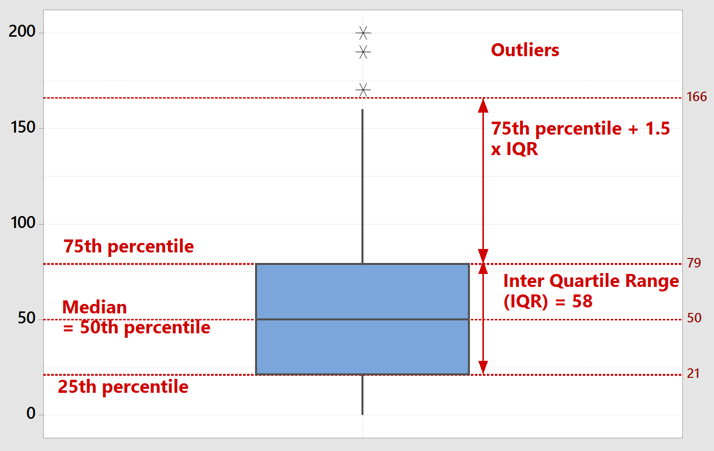
Figure 1 – Box Plot
Interval data
Medium to large electricity users will have meters that are read remotely and record the electricity consumption in 30-minute intervals, although sometimes this data will be in 15-minute intervals. This data is known as “interval data”, and each customer can request this data from their retailer or sometimes the network provider.
It is common to look at 12 months of interval data, although I would usually analyse 24 months of data to get some more historical context. This is a lot of data. For 12 months this is 365 × 48 data points or 17,520 data points for each field. The data that we need is the time stamp, the kW and the kVA, which gives us 52,560 data points. (The data set that is provided in the interval data actually has more data than this.) We then need to do some calculations and then present the data in a way that can be easily interpreted.
In Excel we will calculate the following from the data provided:
- power factor
- time of day
- day of week
- month of year
We then slice and dice the data a few different ways to look under the hood of the business in terms of how it uses electricity in terms of:
- usage over the long-term trend
- usage distribution by time of day (separating week days and weekends if appropriate)
- usage by day of week
- usage by month of year
- drilling down to specific days
- analysing power factor.
Run charts
I love using box plots, but a simple run chart of half-hour load data can reveal a lot about what is happening at a business in regard to electricity usage patterns. It shows the variability in load, it shows some seasonality, and it also shows step changes. Step changes in load are very important. Often there is a step change in the load upwards and the business has no visibility of that data.
Electricity network supply charges may increase by an amount that the accounts payable person doesn’t notice and the responsible manager glosses over. However, when annualised, that amount becomes significant.
The below example shows two years of half-hour demand (kVA) data for a chemical manufacturing plant that runs on a 24-hour x 7 day week operation. This business is able to sell everything that it produces and so its profitability is based on maximising run time for as much as the year as possible, with short monthly stops for maintenance.
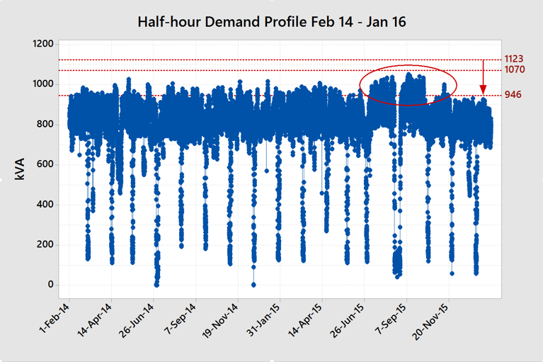
Figure 2 – Run Chart Example
The run chart shows a large step up in demand in July 2015 and then a step down again a few months later. The step down, if sustainable, would allow the client to apply to have their network demand charges reduced by $16,623/year. And that’s just from looking at one chart!
The cause of the increase in demand was solenoid valves leaking compressed air. This required the second of two large air compressors to be run, pushing up demand. The leakage was known about, recognised, and put on the maintenance plan to repair, but the maintenance team were oblivious to the potential electricity cost impact due to the increase in maximum demand.
In South Australia, a step up in the maximum demand will incur higher demand charges every month going forward, even if it was a short-term increase.
As it happened, the client was running below their existing fixed network peak demand level setting of 1,070 kVA and their anytime, or off-peak, demand level of 1,123 kVA so the step up would not have incurred additional cost. The $16,623/year cost saving opportunity was in applying for a reduction in Agreed Demand to 946 kVA.
However, after making the request to reduce the agreed demand to 946 kVA and realising the network savings, any subsequent large air leaks causing the second compressor to kick in again would have increased their monthly and annual charges without the client even being aware. That is why ongoing monitoring and analysis of the data is critical in maintaining any cost savings achieved.
Time-of-day data
Run charts are very useful as a first step but looking at usage distributions at different times of day yields other interesting information that can lead to reduced costs. The following box plot chart shows an example of where a time-of-day pattern was revealed with analysis that led to a cost reduction.
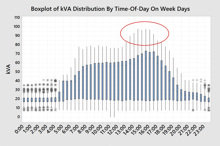
Figure 3 – Time-of-day Analysis
In this case the load was quite modest, but the time-of-day information revealed a cost-saving initiative that was completely unknown.
The site is a warehouse and uses very little electricity other than lighting and air conditioning. Every weekday in the late afternoon the demand increased. This load pattern was repeatable irrespective of the season.
What was even more unusual is that the increase in demand also coincided with when the employees finished work. When the cause of this increase was investigated it was found that it was the recharging of the electric forklift batteries. All the forklifts were being connected up at the same time at the end of the shift – during peak price periods. The solution to this was to install low-cost timers that delayed charging until the off-peak period and staggered the starts.
Day-of-week data
Day-of-week data can reveal other patterns that can lead to reduced costs. The following chart shows how day-of-week analysis can highlight what is driving annual demand costs.
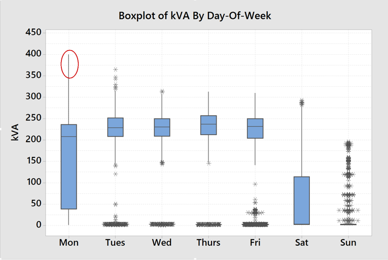
Figure 4 – Day-of-week Analysis
This chart shows that Mondays have a much higher maximum demand than every other day, but the distribution of half-hourly demand was less than any other week day. The factory operates generally five days a week, 24 hours per day, with some occasional market demand catch up on Saturdays.
It was quickly realised that the higher demand on Mondays, or Tuesdays if Monday was a public holiday, was driven by starting the factory up after being closed for the weekend.
This is evident in the next chart that shows a very high demand between 4:30 am and 7:30 am, followed by a drop-off in demand throughout the morning.
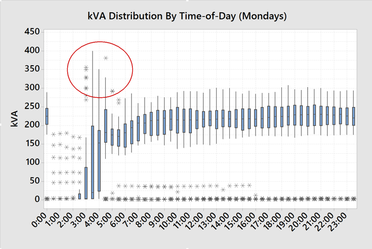
Figure 5 – Combining day-of-week and time-of-day analysis
In this example the “additional demand” charges were being driven by Mondays. “Additional demand” is the period outside of the “peak demand” period and so has a lower cost.
Each Monday morning an employee came in early to start up all of the equipment and heaters after the plant had been off for the weekend. Even though this time was during the off-peak period, it pushed the off-peak demand well above the peak Agreed Demand and resulted in higher additional demand charges. In this case, moderating the plant start up resulted in savings of $5,000 a year, which is substantial for a smaller operation.
Another important point is that if the start-up of the plant was delayed until the peak period after 7:00 am then this would push up the more expensive agreed demand charges. So, they were doing the right thing in regard to the timing of the start-up of the plant.
Month-of-year data
Another pattern analysis that is interesting is month-of-year analysis. Similar to the run chart showing all of the data, this chart simplifies the representation of the data and shows the distribution over each month.
Month of year data is important to analyse as it can show longer term trends in electricity usage and demand, seasonal patterns and one-off or repeating problems that are impacting costs.
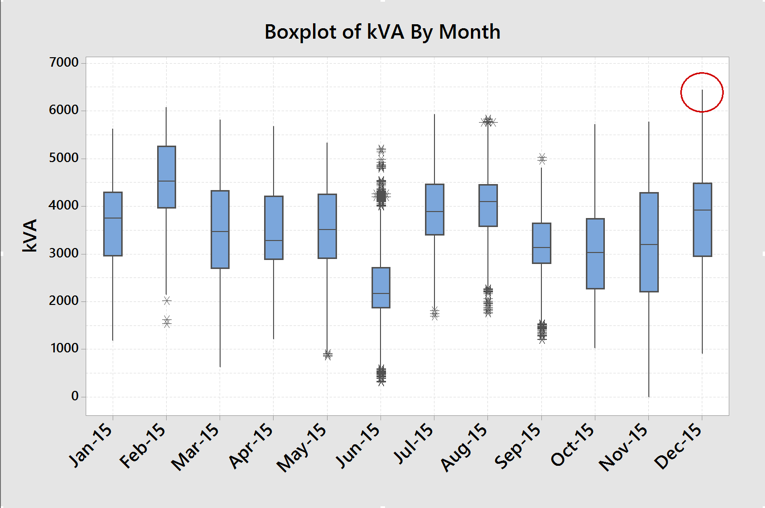
Figure 6 – Monthly Analysis
Figure 6 shows half-hourly demand data by month over a 12-month period for a relatively large factory. The data shows a significant spike in demand in December 2015, even though there was nothing unusual in the general distribution.
In order to identify the root cause we drilled down into the specific day to see what happened throughout that day, and then examined the operating logs to see what happened in the operations to cause that spike. We also examined the power factor by looking at the relationship between real load (kW) and demand (kVA).
The culprit was found to be that the power factor correction capacitors had failed, pushing the demand (kVA) significantly higher for the same load (kW). This failure caused the agreed demand charges in the network tariff to be ratcheted up by more than $60,000 per year!
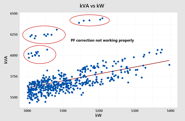
Figure 7 – Power factor analysis
In December 2015 the power factor correction capacitor banks failed for several hours pushing the maximum demand up far higher. This was a $60k/year failure that was unrecognised at the time.
Power factor correction is a subject for another article, but it is one of the important electricity characteristics of your business that is driving your network costs.
The electricity data used in this article was obtained from interval meter historical data for the supply point. It is also possible – and sometimes very important – to monitor real-time load for the site or at the sub-board level within a site.
Real-time monitoring allows you to alarm or control abnormal increases in demand such as when there is a problem with the power factor correction. Depending on the network in which your business is located, short-term abnormal spikes in demand can have long lasting effect on your network charges and you may not pick up those increases in your costs.
Sub-board monitoring can help to show what individual pieces of equipment or groups of equipment are running at any one time. This information is particularly useful in determining the actual run time of equipment loaded and unloaded, and is an important input into any Demand Response strategy, discussed in the second article of the series, that you may choose to adopt to further reduce your costs.
Understanding your electricity profile and usage patterns is an important step in any strategy to reduce electricity costs. Combining operational data analysis and market data analysis using the Global-Roam NEMReview software will give you great insights into opportunities to reduce your costs.
About our Guest Author
|
|
Michael Williams has 35-years’ experience working in resource based, energy and capital-intensive industries such as iron, steel, ferroalloys, cement, quicklime, mining and waste derived biofuels. His experience in operations general management and knowledge of energy markets has led him to become one of one of Australia’s foremost practitioners in energy strategy and energy cost reduction. In 2018 his book “Power Profits – A Comprehensive 9-Step Framework for Reducing Electricity costs and Boosting Profits” was published and was widely recognised as essential reading for those interested in how the Australian electricity market works and how to reduce electricity costs.
Michael has a Masters Degree in Applied Finance and Investment, a Bachelor of Engineering in Metallurgical Engineering, a Bachelor of Applied Economics and is a Graduate of the Australian Institute of Company Directors Course. He is a Fellow of the Institute of Quarrying Australia, a Graduate member of the Australian Institute of Company Directors and has memberships of the Australian Institute of Mining & Metallurgy, FINSIA, and the Australian Institute of Energy. |


Be the first to comment on "How To Reduce Electricity Costs – Part 4"