As early as 2011 and perhaps earlier, we’ve been posting commentary about how growth in electricity demand was slowing, and then began to decline. Across the NEM this trend does not appear to be slowing (and there are a number of reasons for this).
However, within Queensland we wonder whether what we’ll see this summer and next will buck this trend?
Earlier this week we noted articles (Gladstone Observer, Courier Mail and SMH) about the arrival of the first LNG export tanker in Gladstone. Billions of dollars of investment have been sunk into this new east-coast industry, a fair percentage of which being focused on the upstream tasks of releasing the coal-seam gas and delivering it to Gladstone. With the three projects each opting for electric compression of gas delivery to Gladstone, we’re looking to see a sizeable increase in demand for electricity as a result.
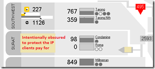
Particularly of note is that our clients using ez2viewAustralia to view Powerlink’s live data feed for a granular view of what’s happening within the QLD region will be able to see the demand in the new Surat zone progressively ramp up over time:
(and that’s not the only zone of interest, with changes in the offing for other zones as well).
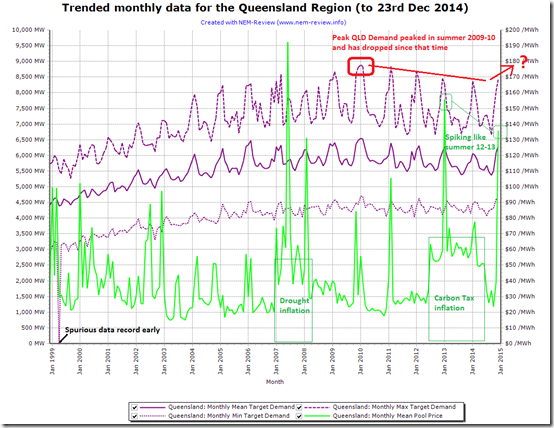
To put this present development in context, we power up NEM-Review to perform several queries to trend the Queensland region demand over the 16 years that have elapsed since the NEM began:
As we can see here, the Queensland region peak summer demand climbed through until 2006-07 at which point growth slowed and, after summer 2010-11, began to decline.
What does this mean the peak summer demand will be for QLD in 2014-15? If you think you know, get your entry in today.
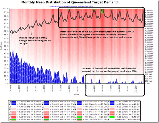
For a richer (and more colourful view) we use the distribution function within NEM-Review to draw a trended distribution of Queensland demand over time, as follows:
I have customised the colouring of this chart to highlight the instances of demand above 8,000MW (point of interest for our competition) and the instances of demand below 4,400MW (out of interest).
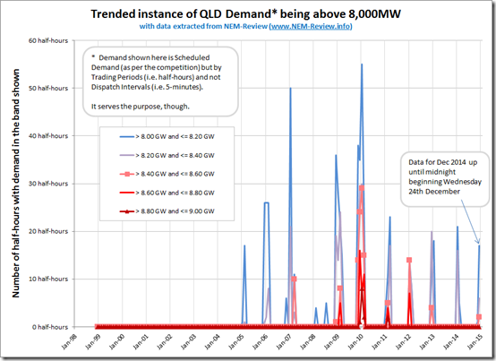
As we can see, since around 2008, QLD demand each year has been tracking fairly consistently between 4,400MW at the low end and somewhere above 8,000MW at the high end. Extracting the data above and manipulating in Excel to focus just on instances of demand above 8,000MW we see the following:
There’s a big hint here – with 2 half-hours of Queensland demand so far this summer already being in the range 8,400MW to 8,600MW you’ll need to be above those two marks to have a chance of winning yourself the BBQ prize.
It’s intriguing that we see that peak demand (just to 23rd December) is already higher than it was in 2013-14. Is this a sign that Queensland is bucking the trend of declining demand, due to the factors above?
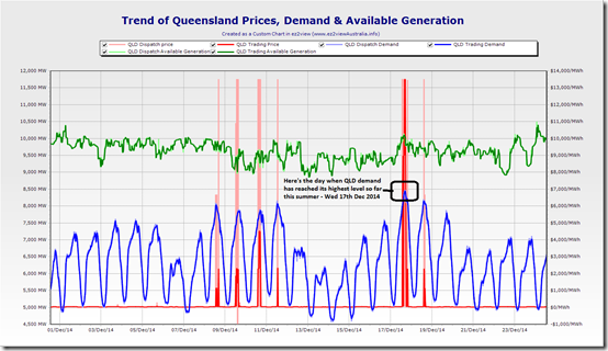
To make it really clear, we’ll extract the following chart from ez2viewAustralia (showing trended QLD demand on a 5-minute basis) and highlight the demand peaks thus far this summer:
We can see that last Wednesday 17th December was the offending day (when QLD region demand peaked to 8,472MW in the 17:15 dispatch interval).
Big hint, there (but note that two of our entrants – EP & RG – have already used that, as one of their allowable entries (one even with the decimals))!
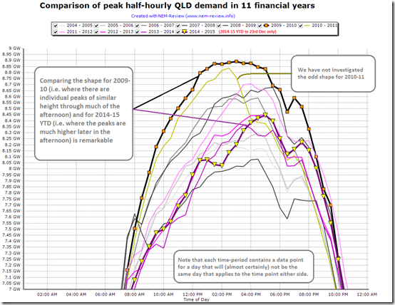
The fact that the demand peaked so late on that day is is quite remarkable – so we opened a new tab in NEM-Review to perform a comparison function for Queensland Demand across financial years, to ensure a unified view of summer:
Just to be clear here, this analysis has found the peak QLD demand throughout the financial year (separately) at each trading period – meaning that the data points “connected by lines” won’t be for a single day in that financial year (and may well be for 48 discrete days out of 365/366). Connecting by lines may aid in readability, but is not correct – strictly speaking.
Comparing the highest curve (for 2009-10) with the curve for the current financial year (2014-15 YTD) we see a distinct hollowing out of demand peak in the middle of the day, as increased solar penetration nets off what must be supplied from the grid.
Also noteworthy in the trend above is the fact that the Queensland spot price has spiked every day when Queensland demand has exceeded 8,000MW so far this summer – and sometimes when it has come close. Will make for another interesting summer (wondering how many of these factors will repeat).
To summarise
1) We can see that, in summer 2014-15, we have already experienced a higher demand in Queensland than was the case in the whole of summer 2013-14 .
2) Queensland demand (with respect to the competition) has already peaked to the level of 8,472.23MW (so your entries will need to be above that to have any chance at winning!)
3) That demand peak occurred as late as 17:15 on that day (hence as the effect of solar PV injections into the grid had receded). This is something we would not have seen several years previously!
4) We also see that price volatility is starting to look as something like what happened in summer 2012-13 as well.


The Boauhinia rail electrification project has just been completed, so rather than diesel trains carrying coal from the Rolleston mine all the way to the coast it will be electrics, which will no doubt further increase electricity demand. Queensland now has a total 4,000 KW of electric locomotives, so if all locomotives were at 100% load factor it would be 4 GW of demand !
http://www.aurizon.com.au/projects/bauhinia-electrification-project
4,000 kilowatts is only 4 megawatts. Each locomotive might be 3MW or 4MW and each coal train might need 3 of these
Another Queensland story of interest is the end increase in gas prices – today Brisbane trades are $4.21/GJ, which is higher than any other capital city. The arrival of the first LNG tanker in Gladstone Sydney prices to $4.00/GJ, but no obvious impact yet on Vic prices at $3.50/GJ.
So with higher Queensland gas prices, power prices from peaking gas plants would need to be higher. How much higher Queensland gas prices will go will be interesting, and probably not what the investors want to hear. The high prices for LNG landed in Japan now appear to be a thing of the past as new low-cost LNG producers such as PNG are joining the supply side, and there appears to be only modest growth in Japanese LNG demand.
“With the three projects each opting for electric compression of gas delivery to Gladstone, we’re looking to see a sizeable increase in demand for electricity as a result”.
This is not quite correct – althout QCLNG and APLNG are electrified using electricity from the NEM, the GLNG upstream project has gas turbine driven hub compressors and electric driven nodal compressors supplied by open cycle gas turbine generators so does not increase electricity demand on the NEM.
Thanks for the added point of clarification, Interested Observer
Paul
The excellent data available through NEM-Review tells me that a large new continuous load of around 400 MW came on line in Queensland on 27 October last. This suggests that the 2014-15 summer peak is likely to be considerably higher, for equivalent weather, than in recent years; this has already happened on 9 and 17 December. However, without knowing what the load is, it is difficult to be certain with such a prediction.
Thanks Hugh
We have begun to investigate – see in this new post
Paul
Oh and yes, it’s too late for anyone to take account of this in their forecasts for peak QLD demand in summer 14-15 (to win a portable BBQ) as entries closed on Fri 9th Jan.