Now that we’re through the first week of Australia’s new Carbon Tax, we thought it would be of interest to have a look at whether there has been any significant change in dispatch patterns across the NEM as a result.
We acknowledge that it’s really too early to make any significant observations about the merits (or not) of the Carbon Tax regime, in terms of its effects on reducing emissions – as noted previously, it will take some time for the supply-side of the market (and the demand-side) to settle into permanent adjustments to the new pricing realities of this arrangements.
However, given it appeared that the two most recent weeks were fairly similar (in terms of weather patterns) our curiosity got the better of us, so we opened up NEM-Review 6 and used the software to generate the analysis below.
For ease of comparison, all analysis below has been completed with respect to two consecutive weeks:
(a) pre-Tax = Sunday 24th June to Saturday 30th June (midnight to midnight)
(b) with-the-Tax = Sunday 1st July to Saturday 7th July.
As time permits, we’ll continue posting analysis about this topic on WattClarity®.
.
1) How comparable are the weeks?
Our first concern was to ensure that both weeks were as comparable as possible.
We ascertained this by looking at the total energy consumption across both weeks – reasoning that, if the demand was very similar (and with no other macro changes in the market – e.g. Yallourn being at reduced load the whole time) then a comparison would have some value.
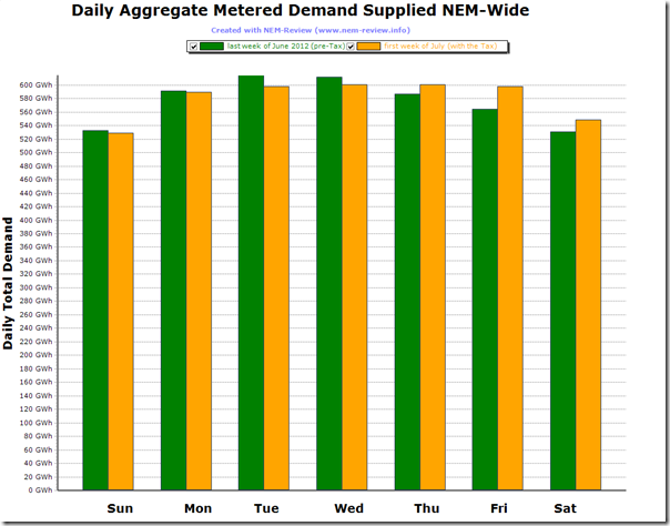
Hence, in the following chart, we show aggregate daily consumption across the NEM, measured with Metered Regional Demand, which is described here for those who really want to know these things.
In an eyeball comparison, we see that the weeks were fairly similar – demand finishing a little stronger in the 2nd week than the first.
In total, we see that the consumption was marginally higher in the 2nd week (by only 32GWh, so less than 1%) – hence we can conclude that the following comparison does have some value (within the limitations of such a short-term comparison).
.
2) Change in production by fuel type
We noted earlier that on Monday last week the wind did not blow, despite the support of the carbon tax and that this was one of the reasons the price spiked, so let’s look at this comparison first.
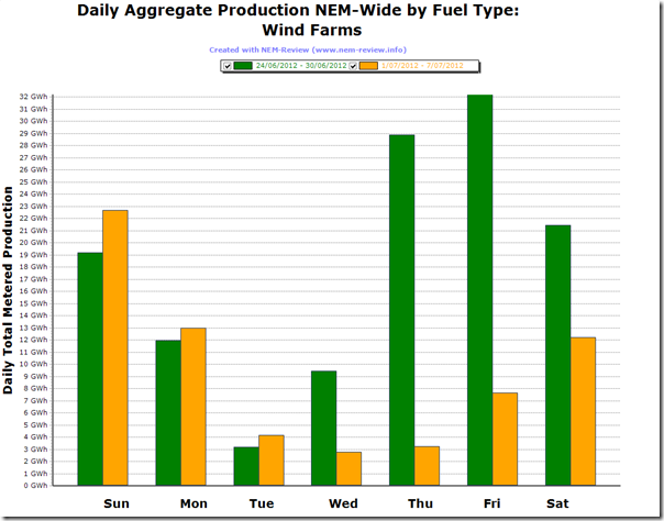
In the following chart, we aggregate all production by metered wind farms (no matter where they are located) for which AEMO publish data.
This chart highlights one of the reasons why wind farms are an energy-play, but have almost no effect in terms of supplying secure capacity to the market (from memory AEMO assumes only a 5% contribution of their registered capacity can be counted on to meet peak demand).
Purely coincidentally, we see how the wind production dropped significantly in the first week of the carbon tax following a windy period Thursday 28th June to Sunday 1st July.
However, it is worth noting that the volumes above as sufficiently small that they should not be considered as a significant factor in any change in carbon emissions from the first week to the second:
(a) In the first week, wind production of 126GWh supplied just over 3% of NEM energy consumption
(b) In the second week, wind dropped to only 66GWh, representing just over 1.6% of NEM energy consumption.
Next on the renewable side, we look at the change in hydro production (with no distinction made between pumped storage supply and natural supplies):
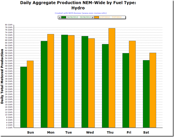
In the following chart, we can clearly see that the volumes of hydro production are higher than those for wind, and hence how the increase in production in the latter part of the week just past will have had a more significant benefit in terms of reduced emissions levels:
Indeed, we see that the generation from hydro is more than 3 times greater than that of wind:
(a) In the first week, total production was 433GWh (or 10.8% of NEM-Wide consumption); and
(b) In the second week, production rose by 35GWh (8% relative) to be 469GWh (or 11.5% of NEM-wide consumption).We will come back and analyse hydro production at a later date – as one of the factors we would like to assess is the extent to which hydro generators “banked” hydro resources in June to release it during July and hence generate higher revenues with the carbon tax adjusted spot price.
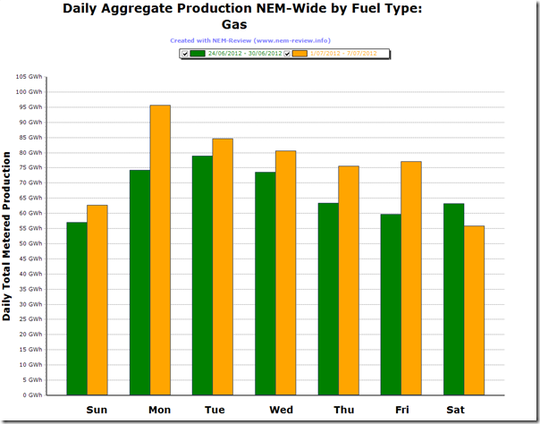
We next move to the thermal generation stock, to see clear evidence that gas-fired production increased significantly under the carbon tax, as was commonly predicted:
In particular, we see that gas-fired production increased significantly on Monday 2nd July in response to the price spikes in VIC and SA (discussed here).
With gas-fired production, we see that:
(a) In the first week, total production was 470GWh (or 11.7% of NEM-Wide consumption, so just ahead of hydro production); and
(b) In the second week, production rose by 62GWh (13% relative) to be 532GWh (or 13.1% of NEM-wide consumption).
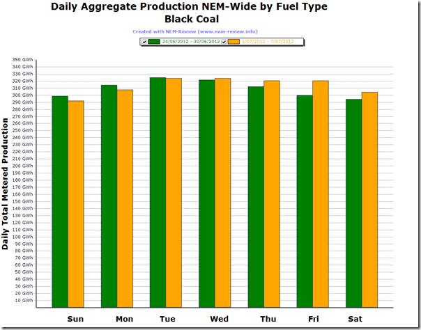
Moving on to the higher carbon intensity of black coal-fired stations (though keeping in mind a significant range of intensities from least efficient to most efficient), we see the following:
In summary, we see that total production from black-coal-fired plant increased in the first week of the carbon tax:
(a) In the first week, total production was 2,166GWh (or 53.7% of NEM-Wide consumption); and
(b) In the second week, production rose by 26GWh (1% relative) to be 2,193GWh (or 53.9% of NEM-wide consumption).
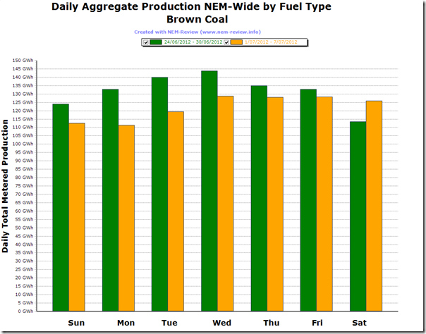
Finally, we come to the higher emission-factor brown coal-fired stations.
Running the same “before- and after-“ comparison we see that, as was generally expected, production from brown coal plant fell across the week:
In summary, we see the following:
(a) In the first week, total production was 922GWh (or 22.9% of NEM-Wide consumption); and
(b) In the second week, production fell by 67GWh (7% relative) to be 854GWh (or 21% of NEM-wide consumption).
3) Winners and Losers
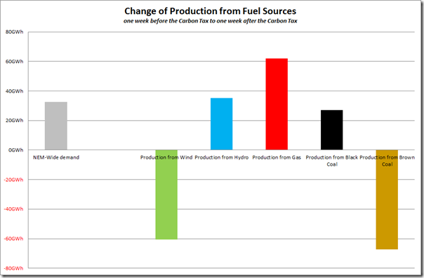
Taking the results above (in terms of production by fuel type) and charting together in order to highlight relativities, we can clearly see the winners and losers in this coarse before-and-after comparison:
To ensure we keep context, however, we have also included on the same chart the change in demand from one week to the next (which is related more to weather conditions than anything to do with the carbon tax).
Hence we see that demand increased somewhat over the period, whilst brown coal-fired production fell (due to the carbon tax) and wind production also fell (because of low wind). To compensate, we see that production from gas increased (most significantly), with hydro production and black coal-fired production also increasing.
4) Trend in Emissions
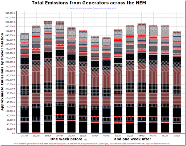
As could be expected by the decrease in production from brown coal above, aggregate emissions across the NEM did fall over that period – as is shown in the following charts and tables:
In this colourful depiction, we’ve stacked the output of the power stations, and coloured them according to fuel type. From this chart, it can be seen how emissions reduced slightly in the second week. The aggregate emissions are shown in the following table:
Last week in June 2012
First week in July 2012
Sunday 451,844 tonnes
433,325 tonnes
Monday 483,864 tonnes
466,735 tonnes
Tuesday 506,055 tonnes
486,434 tonnes
Wednesday 503,937 tonnes
493,287 tonnes
Thursday 477,370 tonnes
493,287 tonnes
Friday 463,113 tonnes
486,504 tonnes
Saturday 437,444 tonnes
457,926 tonnes
TOTAL for the WEEK 3,323,626 tonnes
3,310,262 tonnes
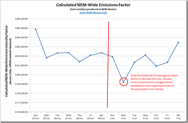
(down 13,364t – or 0.4%)Combining this data with the metered demand numbers shown in the top chart, we’re able to derive a NEM-wide emissions intensity factor by day – as follows:
This chart puts the relatively small reduction in emissions observed over the first week of the carbon tax (in terms of emissions reduction) into context.
As noted at the start, it’s far too early to judge the effectiveness of the Carbon Tax, in terms of overall reduction in emissions from power generators (or in terms of Scope 2 emissions amongst energy users).
Stay tuned for more analysis in the weeks, months and years ahead …


Paul
despite your accurate comment at the beginning “it’s really too early to make any significant observations”, it is still interesting to watch what happens. But, as you say, too early yet to read too much in to it. Will watch though, and hope others do too.
Agreed, Rupert
Just because it’s early days does not make it uninteresting. Indeed, perhaps the opposite is true, which is fine – so long as we don’t run ahead of reality with conclusions.
Paul
Hi Paul,
As always, very informative insights. Will be looking forward to a follow up review after a full month of trading.
Thanks Kenji
Will look forward to posting more, as time permits.
Paul
Nice work Paul … Interesting as the wind increases it’s voilitility will drive more cycling and higher costs and more emissions. Remember wind is not free. We calculate wind integration costs in terms of extra cycling costs. This can be done for the carbon tax effect too.
Steve Llefton. Steve.lefton@intertekmcom.
Thanks Steve
Have not had time to look, yet, at which of the thermal plant are cycling more because of the intermittency of wind.
Had not thought of the increased emissions (from the cycling thermal plant) that would result from running at sub-optimal heat rate, but it’s not likely to be of the same order as emissions saved from wind production (as it’s not the brown coal plants that are cycling).
Concerns about cost, though, have been raised by others – but more with respect to capex for other build required to provide capacity when the wind is still (whereas you’re talking about increased O&M because of more creep and fatigue degradation etc, I think?).
Paul