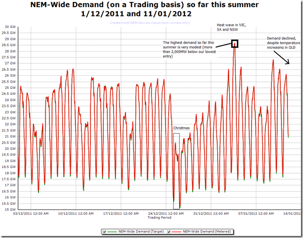
With the entries collated and published, it’s timely to publish this chart showing a time-series of demand so far this summer. Despite the heat, it has been fairly modest (as expected) and will likely remain so for another couple weeks.
Currently, Aden stands as closest to the mark with his lowest entry (the lowest for the competition).
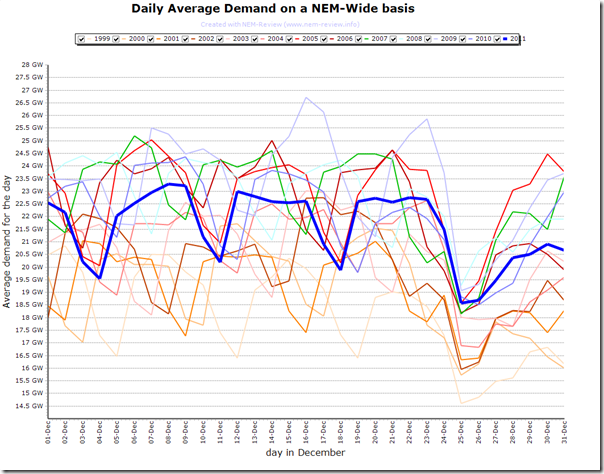
Looking at the level of demand in December, it seemed to be lower than I had been expecting – so, returning to an earlier theme about how demand has appeared to be declining in recent years (and adopting a similar colour scheme), we used NEM-Review to generate the following comparison of the daily average NEM-Wide Demand for every month of December since 1999:
As can be seen, the average demand in December 2011 was lower than in many previous years (notably December 2009).
What’s particularly interesting here is to see that the average demand on Christmas Day has been very similar since 2005 (the first year the Tasmanian regional demand was counted in the NEM-Wide total). There has been no growth in this demand, despite the growing population, number of households, rising penetration of air-conditioning and other appliances.
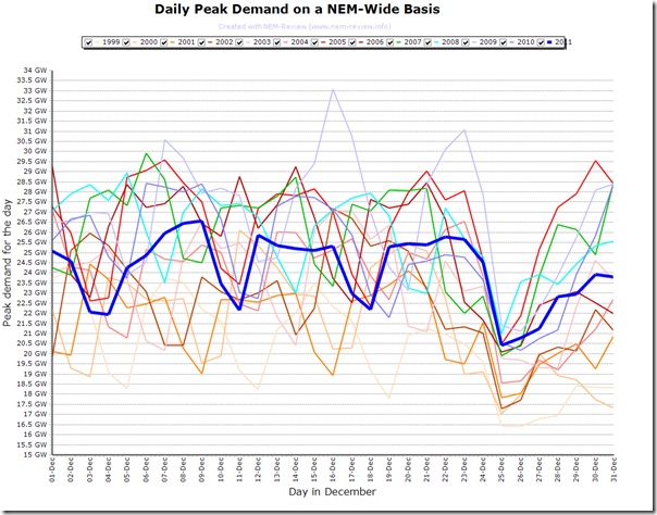
Generating a similar chart for daily peak NEM-wide demand for each December month since 1999 reveals a similar picture:
In some years (notably this week in December 2009) we can see some much higher peak demand levels than those experienced in the month just gone.


Be the first to comment on "How has demand trended, so far this summer"