Inspired by the price spike experienced this evening (discussed here), I have spent a little time to put together the background to winters in the NEM:
1) Trend in Demand Growth
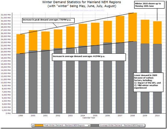
The following is another chart highlighting how the peak and average demands experienced across the mainland* NEM this winter compares to the same metrics for each of the previous winters in the NEM:
* I’ve done this analysis for Mainland NEM regions in order that the entry of Tasmania in winter 2005 does not show as a step-change that reduces the clarity of the trend
This chart (again from NEM-Review 6) highlights how the levels of demand (both on average and peak) have been relatively modest in winter to date.
2) Comparison with previous winters
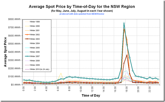
Given the price spike this evening affected NSW, I have chosen to generate the following analysis (through NEM-Review 6) for average prices across each winter in the NSW region:
CORRECTION Made 25th July 2010Please accept our apologies.In the chart that was previously included here, I’d forgotten to exclude the non-winter months. Hence the results were for entire calendar years. This has been corrected in the illustration below.A number of things can be seen in this diagram:
(a) In many years, there is a distinct spike in prices seen at the time of the evening peak in demand (such as we saw this evening) – especially in the winters of 2002, 2003 and 2007
(b) Prices were consistently higher across the day for 2007, as a result of the drought.
3) Previous discussions
With reference to the observations mentioned above, you might be interested to refer to previous posts made in a number of winters previously:
Year Commentary Provided 1999 The NEM opened on 13th December 1998 so this was the first winter experienced. However, we did not begin operating until February 2000, so had nothing to share at that point in time.
.
2000 WattClarity was not operational as a market commentary site until January 2007 – hence we do not have commentary we can refer to at this stage.. 2001 As above.. 2002 In 2005 we completed the analysis included here, with respect to winter 2002.When this WattClarity service was started, we included this analysis here. .
2003 No commentary provided.. 2004 No commentary provided.. 2005 No commentary provided.. 2006 No commentary provided.. 2007 As a result of the price spikes seen across the market in winter 2007 (and following the introduction of this site), we put together some analysis of what happened through winter 2007, and provided this here.. 2008 Our analysis of what happened through winter 2008 was posted under the “Winter 2008” topic on this site.. 2009 Several articles about winter 2009 were posted under this topic.Included in these posts are posts concerning our “best demand forecaster competition”, which we ran in winter for the first time. .
2010 We’ve created a new topic to contain the relevant posts about winter 2010.. In addition to the winter-specific topics linked above, these articles about particular months in the NEM might also be relevant to your research.
If there are further events we have the time to post about this winter, our posts will be made in the topic linked here.
4) Supply/Demand Balance
As we can see from the discussion above, winters 2002 and 2007 were particularly volatile years (in terms of price spikes occurring in conjunction with the evening peaks in demand).
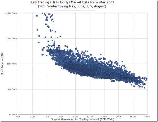
Selecting just NSW prices, and just the 2007 winter period, we can see, in the diagram below (from NEM-Review 6), that these price spikes were experienced at times when the surplus generation across the NEM was around its lowest point – which is what we would expect.
Note that the details shows how prices above $1000/MWh occurred with surplus generation capacity across the NEM (including TAS) being up close to 6000MW in some instances – highlighting the impact that transmission constraints can play (on some occasions).
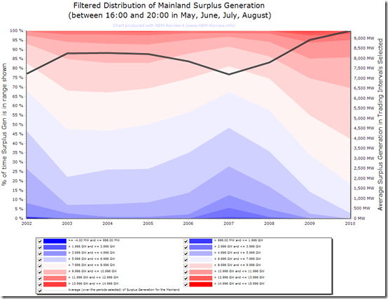
In order to provide more detail about this, I have (through NEM-Review 6) generated the following distribution which shows very colourfully how those years were years when the surplus generation around those times of evening peak in demand were lower than the levels experienced in all the other years* shown.
* Note that NEMMCO did not publish available generation figures in the early years of the NEM, so similar data cannot be shown for years prior to 2002.
As in diagrams included above, (for consistency) we have only shown aggregate surplus generation of mainland NEM regions. This has removed any consideration of Basslink.
In contrast to 2007, we see how the average level of surplus generation capacity for these peak demand time periods in winter has increased every year following from 2010.
This would be one driver that would tend to keep a lid on prices over this winter period.


Leave a comment