.
Tuesday 3rd November, and the temperatures that had driven prices higher in SA the previous day moved eastwards.
Whilst VIC demand was lower as everyone lost their shirts on a horse, demand climbed in NSW and QLD, dragging prices upwards as well.
A) The Intra-Day View
With the advantage of our NEM-Watch software, we were able to watch in real time yesterday as events unfolded.
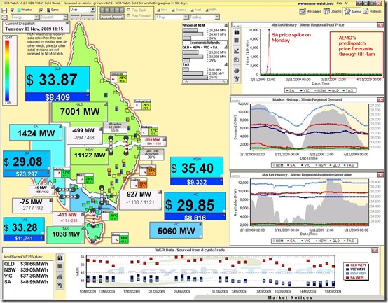
As seen below, the day began sedately, with prices modest in all regions (at 11:15 NEM time).
Note however that prices were already high around the Sydney area and demand levels in QLD and NSW were relatively high (seen through the sliding colour scale of the region colours, relative to all-time maximums)
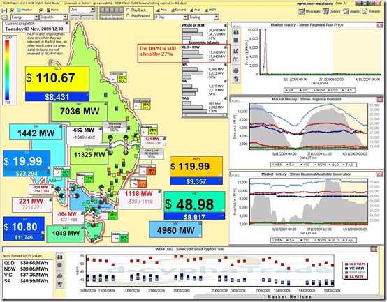
75 minutes later (at 12:30), we can see that prices had begun to climb in NSW and QLD, which had formed their own “Economic Island” by virtue of the constrained interconnector to VIC.
See that the Instantaneous Reserve Plant Margin (IRPM) of the QLD+NSW Economic Island was a healthy 27%
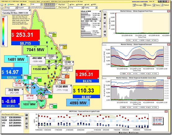
A further 65 minutes pass (to 13:35) and we see that prices continued to climb in QLD and NSW – and, conversely, that prices fell below $0/MWh in TAS.
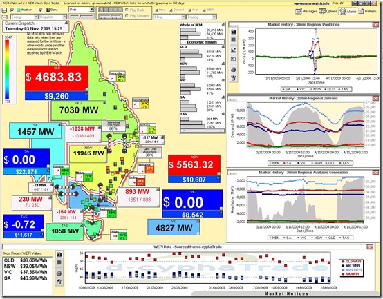
Skip forward 110 minutes (to 15:25) and we see an even more colourful pattern, with $5000/MWh prices in QLD and NSW and zero prices in the other 3 regions. Coupled with this, we see demand level in NSW creeping upwards.
For both the QLD Economic Island and the NSW Economic Island, note that the IRPM was still at healthy levels of 19% each (now separated by constrained flow between the 2 regions).
B) Insights on the Following Day
Through our historical analysis package (NEM-Review) we were able to delve into more detail to see how generators in NSW and QLD interacted with the high regional prices.
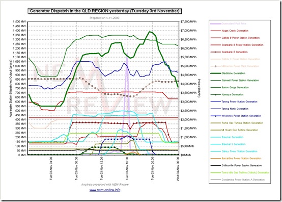
The first chart below shows generator production in QLD, in a similar manner to how I showed production in SA for the previous day.
In formatting this chart, I have chosen to show generators within a single portfolio in a common colour, and have highlighted some of the generators that will be of particular interest in terms of what happened yesterday.
A similar chart is included below for NSW:


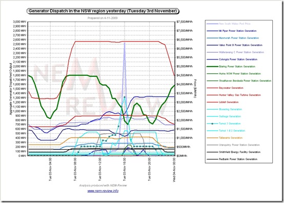
I was speaking to a client earlier today about this event. They indicated that VOLL was hit by a combination of very high temperatures in Sydney combined with the trip of a unit in NSW (I do not remember which one, though from the chart in NEM-Review I have to assume it was one of the Eraring units).
I also got the impression that as this is still September, there is a number of units that are still out for maintainance that would have helped with the load had this occurred in December or January.
And by September I of course mean November (actually I meant to type “Spring” but “September” came out instead).