
- Index
- Background
- The extremes of price volatility experienced in winter of 2007 – the content of which has been reported here:
- The depressed prices experienced in winter 2008 (to date) – the content of which has been reported here:
- As an aside to these separate pieces of analysis, Paul made a few points with respect to the implementation of the Emissions Trading System, scheduled for introduction from 2010, and specifically the possible emergence of a NEM heavily dependent on gas supplies, which might be unreliable – the content of which has been reported here:
- Introduction
- Peak Winter Demand in NSW
- TransGrid’s published data for the actual peak scheduled demand for NSW; and
- TransGrid’s forecasts for the peak winter demand over the 9 or 10 years immediately following
the publication year of the Annual Planning Review. - Note about Historical Demand
- 2008 Annual Planning Review
- It was noted that the actual growth in demand from one year to the next had been as high as 800MW on several occasions
- It was noted that the average annual (over the period 2008 to 2018) peak demand forecast in the M50 scenario was only 230MW:
- This average is below the 281MW seen to be the average annual growth in demand experienced over the past 16 years.
- This was further investigated, as follows:
- Trend in APR Forecasts
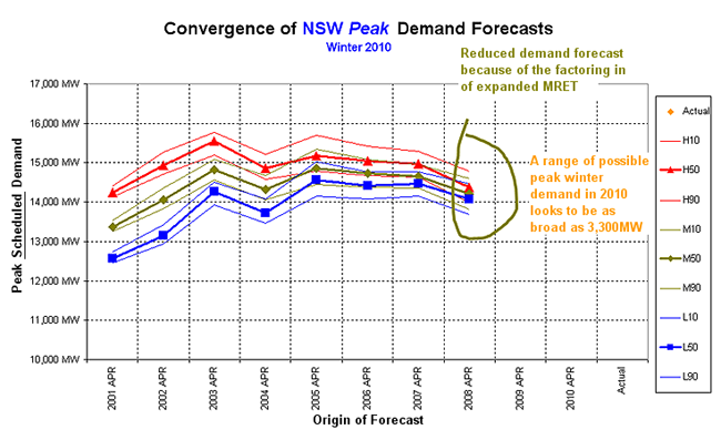
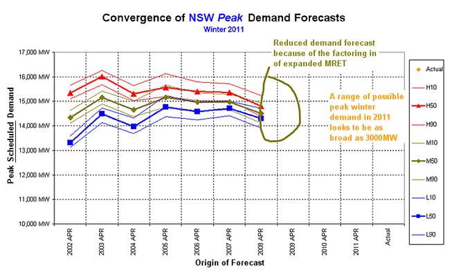
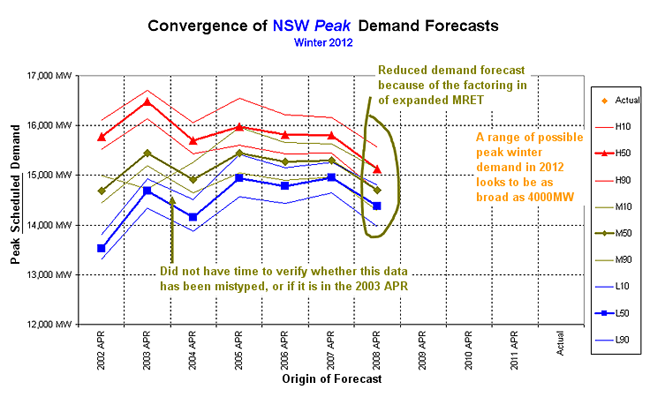
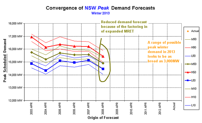
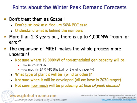
- The Impact on Expanded MRET
- The supply of this many RECs will require a massive development of new generation capacity;
- Because much of this new capacity might be embedded into the distribution system, it would work to effectively net off the “scheduled” demand, which is what TransGrid must forecast for its APR;
- This makes TransGrid’s task in the production of the APR each year more difficult, as TransGrid must make assumptions about:
- When this new capacity would be developed (i.e. the target is associated with 2020, there is no indication currently of how much would be required in each year);
- Where it would be developed (i.e. the expanded MRET target would be a national target, meaning that capacity could be developed anywhere around the country). To fulfil its responsibilities, TransGrid must make assumptions about how much of this capacity would be developed in NSW;
- Furthermore, the nature of much of this renewable generation will be such that it does not produce continuously (e.g. wind power only produces when the wind blows, and solar power only produces when the sun shines, etc…). Hence, TransGrid must also make assumptions about how much of this capacity would be actually producing at the time of peak demand (hence netting off the scheduled demand).
- Convergence of TransGrid’s Forecast
- Conclusions
Our Managing Director spoke at the “Australian Energy & Utility Summit 08” in Sydney on Tuesday 22nd July 2008.
In his presentation, Paul touched on a number of issues, including the following:
To balance the historical focus of much of the presentation, Paul made a few comments about the nature of, and difficulties associated with, the forecasting of demand in the NEM.
The timing of this analysis was opportune (but purely coincidental), as the various Jurisdictional Planning Bodies had recently released their Annual Planning Statements, and NEMMCO had followed this up with the release of their load growth forecasts (as a precursor to the launch of the next issue of the Statement of Opportunities in October).
Due to a lack of time available in the presentation, it was decided only to comment on winter peak demand forecasts for NSW (published by TransGrid).
This data set was chosen solely because the conference was in Sydney, and during winter.
If time permits, we might add to this analysis in other articles focused on both summer demand forecasts and annual energy forecasts for NSW, and then further afield into other regions.
To complete this analysis, 10 successive Annual Planning Report (APR) documents, published by TransGrid from 1999 to 2008, were accessed.
The TransGrid website provides links to the current Annual Planning Report, and several preceding copies. We referred to our own electronic library to access the earlier issues.
From these documents, two data sets were accessed:
This data was compiled in an Excel spreadsheet, from which this analysis was completed.
There were a few instances noted where records of historical scheduled demand in successive APRs did not line up exactly.
Due to insufficient time, these anomalies were not further investigated – and for the purpose of this analysis, the more recently quoted data was taken to be the correct data.
Firstly, we calculated the actual growth in peak winter demand over the 16-year period 1992 to 2007 (the limit of the historical records quoted in the APRs).
These growth rates are shown on the left-hand side of this chart (the horizontal black line shows the average growth rate in historical demand, at 281MW).
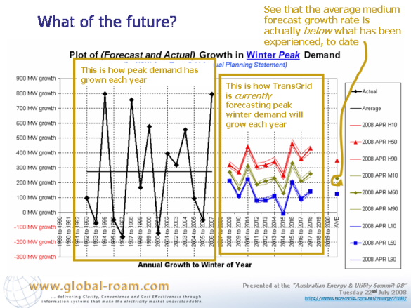
In conjunction with the historical demand, we also calculated the year-on-year growth in demand forecast over 9 different scenarios – being a High, Medium and Low economic growth scenario coupled with 10%, 50% and 90% probability of exceedence weather patterns. These are shown on the right hand side of the chart.
Several observations were made, contrasting between the two (historical, and forecast) data sets:
As the next step in the process, we assessed the average annual growth in peak winter demand across the 10 successive issues of the APR – for each of the 9 different load growth scenarios.
The results of this analysis were presented:
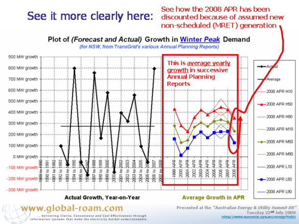
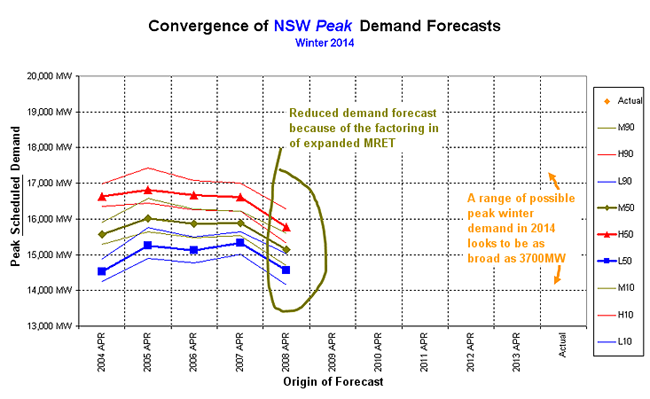
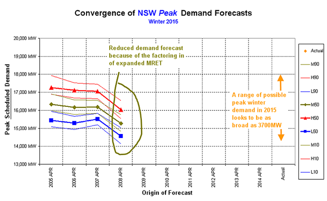
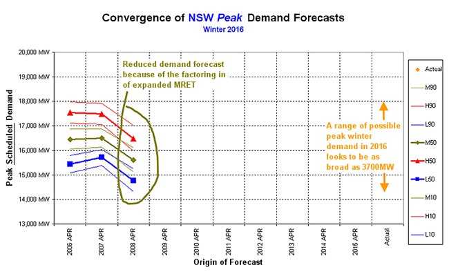
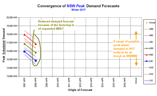
From this analysis, it can be clearly seen how TransGrid’s demand forecast for peak scheduled demand has been discounted because of the assumed increase in MRET supplied through the new Federal Government policy.
The following slide was presented to illustrate how the plan to expand the MRET target (from 9,500GWh in 2010 federally to 60,000GWh federally in 2020).
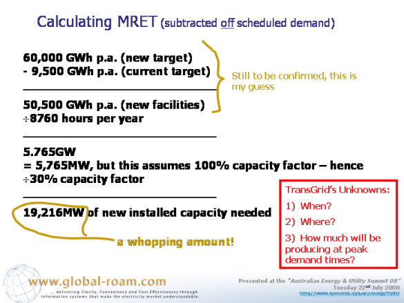
It was pointed out after the presentation that these figures might not be completely accurate, as they don’t take into account the various state-based regimes, however the general principles are still applicable:
With reference to the first point, above, about the large amount of new capacity that will be required to be developed, it was noted that a listing of wind projects at various stage of development compiled in 2005 (when the last issue of the “Power Supply Schematic” Market MapTM was compiled) totalled between 8,000MW and 9,000MW.
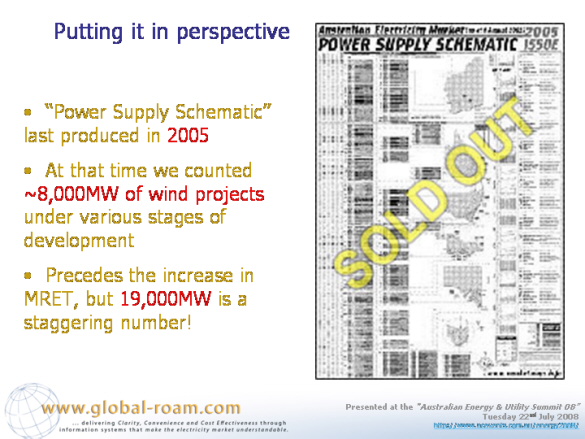
It was commented that even this total was a long way short of the total of 19,000MW or so (though it is recognised that it will be not only wind power that serves this need).
NOTE ADDED 13th AUGUST 2008
Following from the publication of this article, it was pointed out by NEMMCO that their summary report “2008 Energy & Maximum Demand Projections” provides (in table 21 on page 22) clarification that TransGrid had assumed that 5% of the installed capacity of wind farms would be available to net-off the peak demand forecast for both summer and winter periods in NSW.
This report is available here:
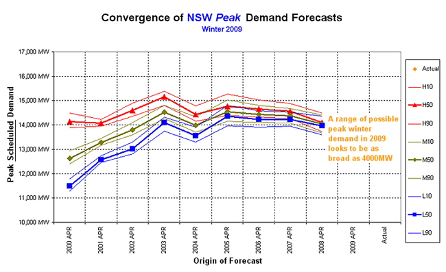
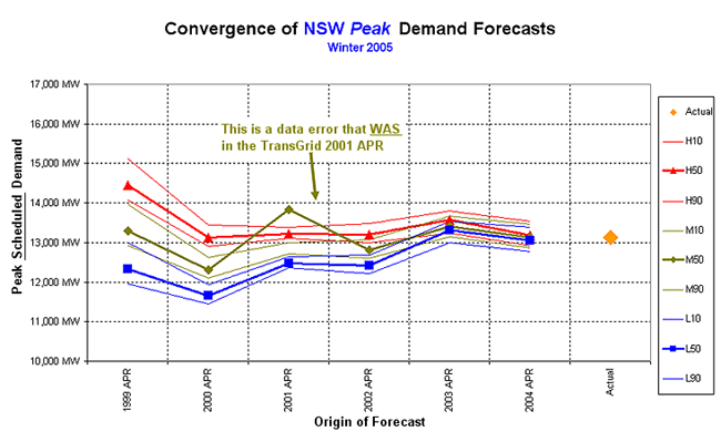
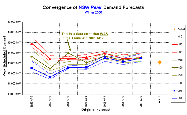
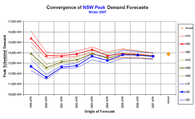
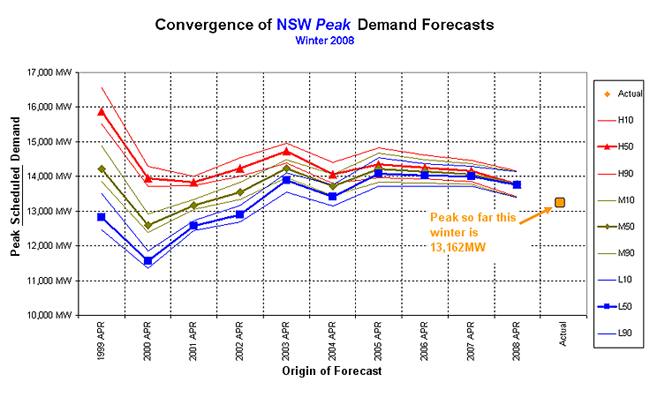
In the presentation, several examples were provided of the way in which TransGrid’s successive forecasts converged on the actual peak demand each winter.
For this online article, we have included trends of convergence on winter demand forecast for all years from 2002 to 2017:
| Convergence of successive TransGrid demand forecasts |
|---|
|
|
|
|
|
|
|
|
|
|
|
|
|
|
|
|
|
|
|
|
|
|
|
|
|
|
|
|
|
|
|
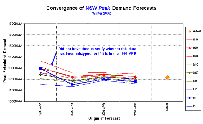
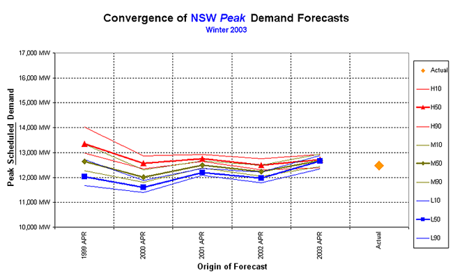
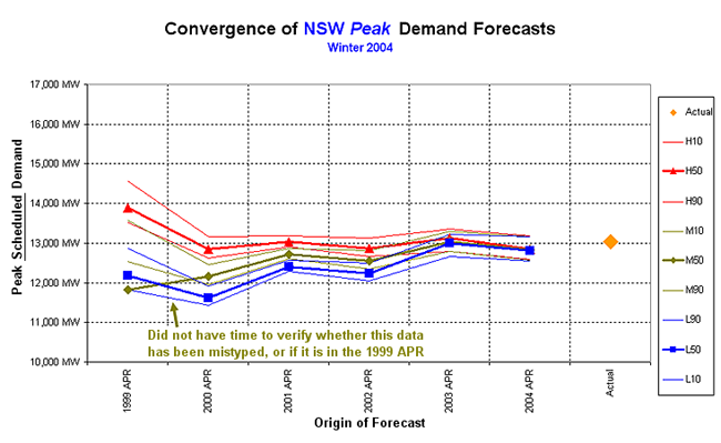
In summary, a few conclusions were made about the forecasts produced by TransGrid
Leave a comment