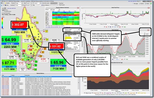
A quick observation today, emerging from other priorities – I note in NEM-Watch that the NEM-wide demand has climbed to almost 30,000MW on the back of high temperatures that are assaulting some of the NEM regions, as noted here:
We see NSW and QLD have both shaken off the green-blue colours and climbed towards the yellow range (with colours scaled dynamically based on a historical range of min-to-max demand). As an interesting – and very topical – comparison I note that this level is higher than the 29,134MW peak demand seen through the whole of summer 2014-15!
What does this mean to the professional (and amateur, and in-between) forecasters beavering away with their entries in our peak demand forecaster competition for summer 2015-16?
Note, for those who misread the prior article – entries close next Friday 27th November. YES, early this year for a change!


Leave a comment