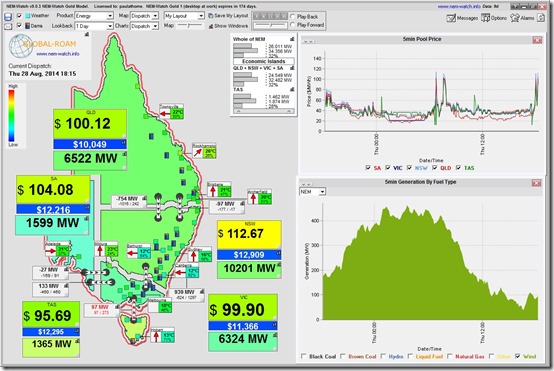
Something we have seen rarely in recent years, compared to the heydays when it was regular as clockwork (such as this record from winter 2009), was an evening spike* in price – as captured in NEM-Watch at 18:15 market time:
* ok, it’s a blip, and not a spike
Now the blip that appeared today would have been entirely unremarkable in past years, but has been remarkable today for a couple of reasons – including:
1) That prices were elevated in all five regions (albeit a blip, rather than a spike);
2) That, coincident with this (and one causal factor), wind output had dropped to just below 100MW across the NEM ; and
3) As a result of the drop in non-scheduled renewables output (low wind + solar not running with the sun set) the scheduled demand could at least limp up to the green zones for most regions. Nowhere near the heydays of yesteryear, though, where winter demand in 2008 peaked at over 34,000MW across the NEM (we see here that the demand was a little bit above 26,000MW – or 8,000MW lower, above 10x the size of our largest aluminium smelter).
The events this evening are especially noteworthy given the coincident release today of the Warburton RET Review.
I’ve not had time to read through the review yet, but there’s already a steady stream of comments from a range of parties on Twitter, LinkedIn and other social media about what’s included. Seems that what it recommends is not too dissimilar from what many renewables developers had feared.
Based on past experience, it seems that both sides could look on what’s happened this evening in the NEM and draw out different facts to justify their own prior perspectives on whether the RET is a good thing, or not.
One things seems certain – the see-saw on energy & climate policy is set to continue, to the detriment of all.
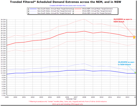
Opening up NEM-Review to trend over time, we see that (for NSW, and across the whole-NEM) the instantaneous “winter week-day evening peak” demand levels shown above are almost perfectly at the “average” level seen in the chart below.
The other regions are not shown as they are smaller.
As noted previously, there are a number of reasons why scheduled demand is declining:
(a) We first put this list of factors together in 2011; and
(b) Hugh Saddler then published this deeper analysis at the end of 2013.
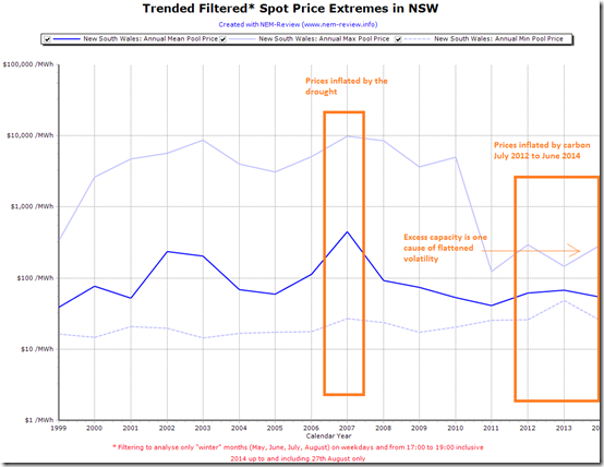
Using the same filtering, but looking at NSW prices, the following chart is also informative:
Note how volatility in winter evenings has been crushed since 2011, and average prices stepped down markedly after the drought year of 2007 and have been (largely) declining since then.
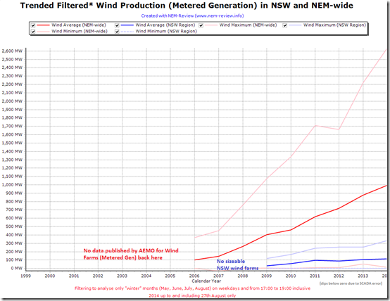
Finally, with the elephant in the room (at least for some) being the variability of wind production, we use the same time-filtering and look at trended wind farm output – both NEM-wide and just for NSW:
In the heated (blinkered?) environment of the current RET Review shouting match, it seems that both sides will be able to point to the above and highlight something that proves their perspective:
1) Average production levels have consistently increased (at these filtered times) – and peak levels quite markedly. The RET, after all, is an energy (i.e. volume-based) policy.
2) Minimum production levels continue to bump around zero at the time of peak winter demand – which means that wind production contributes practically nothing to capacity requirements (another example of socialising costs whilst privatising profits with the current wholesale market structure).
To me it seems the score is = 1 for each “side” (whilst the idealistic/altruistic cause of sustainable industry policy* is left on 0?)
* See FULL DISCLOSURE 1 about how we strive to remain technology agnostic.


Be the first to comment on "Winter evening price spike – like yesteryear (not quite)"