On Friday 31st January 2020 high-speed winds destroyed several transmission towers in western Victoria, leading to the islanding of a ‘SA + Western VIC orphaned’ grid from the remainder of the NEM. This was just one of the noteworthy events on the day, as captured here late that day.
(A) Recapping prior articles
On Sunday 2nd February, I wrote about these ‘13 headline questions and observations’ as an early attempt to summarise the significant number of noteworthy events that occurred on the day – many of which we will try to progressively explore through subsequent articles also to be aggregated under this Headline Event here.
Last week we also published two other relevant articles, which are worth recapping:
(A1) System frequency separated, and jumped dangerously in South Australia
On Monday 3rd February 2020 (7 days ago) I was able to post this article helping to answer the question of ‘What happened with System Frequency with the SA Islanding on Friday 31st January 2020?’.
1) In that article we were able to conclude that the trip occurred approximately 13:24:30 (NEM time) and that;
2) Frequency rose sharply in South Australia (with the highest point available in the data snaps I accessed being 50.96Hz, but the likelihood being it reached higher – will need to wait for AEMO or someone else to publish from high-speed data to know that), whilst frequency dropped in the ‘eastern NEM island’ – though not to the same extent, presumably because of the size of the grid in that island.
3) Recovery happened by 13:44 in the ‘eastern NEM island’ (i.e. after 20 minutes) but recovery took longer in South Australia, with
(a) the frequency remaining around 50.5Hz for the first 10 minutes, and
(b) only recovering back to 50Hz a lengthy 48 minutes after the separation.
(A2) Larger generation in SA backed off to brake the accelerating frequency
On Tuesday 4th February 2020 (the next day), guest author Allan O’Neil was able to help answer the crucial follow-on question ‘How did the lights stay on in South Australia?’, given that the frequency spiked so quickly, and remained high for so long. In Allan’s article he showed that:
1) Most registered but Non-Scheduled Generators in South Australia tripped off at the time of the Heywood trip, with the aggregate reduction being approx 170MW with most remaining off until at least 13:30:
(a) These trips would have acted as a brake on the accelerating frequency, which would have been a good thing on that Friday afternoon;
(a) Why Mt Millar WF apparently failed to trip has not been answered at this point (Question to answer, which some reader might help with?!);
(c) Some plant remained off for longer, but it appears that Cathedral Rocks WF and Canunda WF reconnected to the grid and started producing just with just 3 minutes. As seen from the frequency trace this would have been when the frequency was still up around 50.5Hz, so the addition of approx 40MW in total would have acted to prolong the frequency remaining too high.
(d) Readers should use caution when mentally linking between what would have been beneficial to the islanded SA grid (in this case) and how these generators are required to perform under their connection agreements. I’ve not thought specifically about the latter, other than the fact that it may well be different.
2) There was a variety of responses from the Semi-Scheduled plant that was operating at the time, but the aggregate response reduced approx 200MW and remained off until at least 13:30.
3) There was a variety of responses from the Scheduled plant that was operating at the time.
But this still leaves many things unanswered…
(B) What happened to rooftop PV?
… such as what happened to injections ‘behind the meter’ solar in both VIC and SA. I had guessed (in this article, and also on this LinkedIn thread) that a number of the rooftop solar PV systems in South Australia would have tripped with the frequency spike – but the key word there being that it was a “guess”.
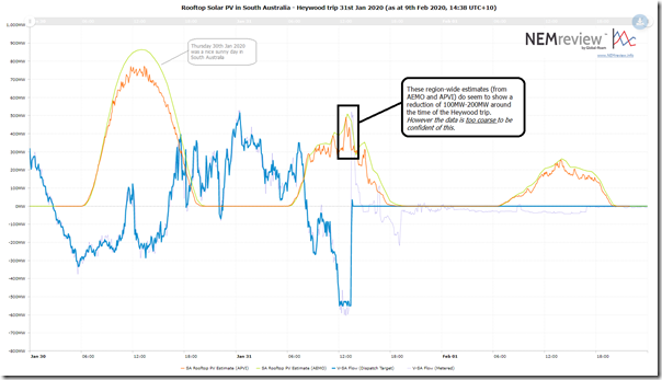
Using this trend query in NEMreview v7, I am able to look at both estimates (i.e. from AEMO, and the upgraded APVI estimate) for aggregate production from rooftop PV systems across South Australia at the time of the Heywood trip:
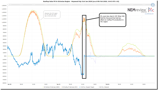
Here’s the same trend with estimates for rooftop PV production in the Victorian region:
We can clearly see that the aggregate production in both regions on Friday 31st was under half the smoother level seen the day before in South Australia (perhaps not as severe in Victoria) – but in both cases still better than the very poor aggregate level seen on Saturday 1st February. These factors are a result of the storm systems that developed on Friday 31st January and continued for the next day.
However, specifically with respect to the Heywood trip we see that the data is not granular enough* to really be conclusively useful – there is a reasonably sharp reduction (approx 100MW-200MW) in South Australia shown in both the AEMO and APVI estimates around the time of the Heywood trip, but it’s not clear enough to unmistakably attribute this to the trip. In the Victorian region around the same time we don’t see as much evidence of any real change.
* the AEMO estimate is of 30-minute granularity and the APVi estimate is of 5-minute granularity (whereas what we really need is something that captures readings every few seconds, or even at higher speed than that).
Ironically, what we do see in both regions is that for a broader period straddling the trip (roughly 12:00 to 14:30 NEM time) there is a spurt of additional solar production – suggesting (perhaps!?) that winds caused the clouds to part (boosting solar production across VIC and SA) at the same time as bearing down on those ill-fated transmission towers.
However all of this is a little academic in relation to the specific question being explored here – what happened with rooftop solar production – as the data is fundamentally not granular enough (plus I wonder what masking effect the ‘sample and extrapolation’ methodology might have on the results obtained with respect to this specific question).
(B1) Sampled response across VIC and SA, via Solar Analytics
We’ve referenced Solar Analytics here on WattClarity previously.
Back in November 2017 I’d written about ‘Some initial musings about my own rooftop solar learning exercise’, drawing heavily on data obtained via a deployment of Solar Analytics on my home rooftop PV system (and I note that this was echoed here in Jan 2018).
The monitoring we have at home is one of 10,000s of systems that Solar Analytics (I’m not sure specifically how many) currently has deployed across Australia, and we thank them for that visibility.
It’s these kinds of innovations we had in mind when writing that ‘Transitional challenges require greatly enhanced analytical capability’ in Theme 14 within Part 2 of our inaugural Generator Report Card 2018.
It was logical, then, that we reached out to Solar Analytics to obtain a sample of the data they have assembled for some randomly-selected rooftop solar systems across Victoria and South Australia. In short order last week, they were able to assemble me a data set of 151 ‘site phases*’ across VIC and SA, biased towards SA sites.
* some sites had data for multiple phases (i.e. inverters feeding onto three phases on the same site), which in this case are shown as discrete trends.
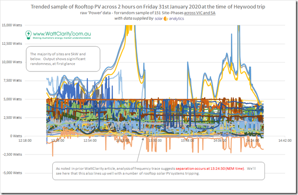
With a bit of massaging to avoid the traps of some missing data for discrete points in time, here’s a mashed together view of all 151 trends:
Of course there is much that is obscured in this cacophony of noise – but it is clear to see two things:
Observation #1) Most systems are 5kW and below (keeping in mind that on some 3-phase sites I should be aggregating 3 trends to form an aggregate view of system size); and
Observation #2) There is a fair degree of variation on output across many of the systems.
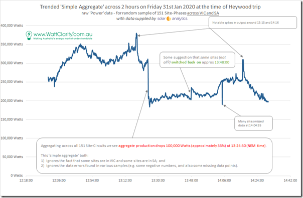
It gets more interesting when we look at the aggregate output across all these systems in the following trend:
There are several things noted on this chart, with the two big observations being as following … but readers need to keep in mind that these sites were randomly selected by Solar Analytics from their broader set of sites (filtered to only those with higher-speed data samples):
Observation #3) Trip of sizeable numbers of rooftop solar PV systems at 13:24:30
What jumps out first to me in the aggregated trend above is that there is a sizeable drop in aggregate production (approx 100kW) at the time of the Heywood trip and SA islanding. This sharp reduction represents 1/3 of the aggregate production we’d seen immediately before.
Worth noting, for clarity, that it was not all systems that tripped – indeed, across all the 151 ‘site phases’ shown I’ve manually estimated that this occurred at only 26 ‘site phases’ (so a much smaller number, in percentage terms, than aggregate drop in contribution).
This, then, seems to confirm that:
YES, some rooftop solar PV systems did trip systematically in conjunction with the Heywood interconnector tripping
Again, as with the reductions seen in South Australia with generation that AEMO can see in real time (Non-Scheduled, Semi-Scheduled and Scheduled) that this would have been a good thing … so long as the reductions occurred in South Australia and not in Victoria.
Observation #4) Recovery of some solar systems at 13:48
Also noted on the chart is that there was a noticeable partial recovery of rooftop solar systems approximately 24 minutes after the trip of the interconnector. This was for only a fraction (perhaps only 14 of the 26 site phases that tripped in the first place).
… however the size of the increase was disproportionately influenced by a three-phase contribution at Solar Analytics site number ****** (postcode 5106 in South Australia), totalling 12kW step change on just that one site (the AC capacity is quite a big one – bigger than a residential rooftop solar PV system!).
Remembering that the frequency in South Australia was trending downwards, but still above 50Hz at that time, any sudden injection of solar production into the SA grid would seem, on balance, to not have been a great thing at the time.
Mapping the site IDs to postcode (and hence region) through a mapping helpfully provided by Solar Analytics enables us to drill in further, both for the South Australian region and the Victorian region below… (noting that I have still not removed some noise inherent in some negative numbers in some series).
(B2) Results just for sites in South Australia
Firstly to South Australia, which was in a more precarious position as a result of the trip of the Heywood interconnector.
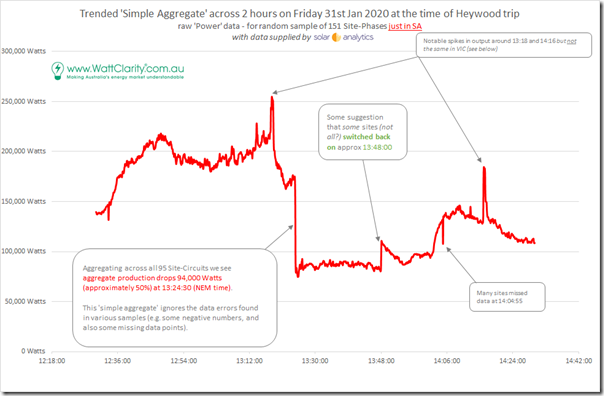
Of the 151 total ‘site-phases’ for which data was provided in the sample data set, a total of 95 were located in South Australia (leaving 56 in VIC) – so removing the data points for Victoria reveals the following trend for the sampled rooftop solar systems that are in South Australia:
From this, we can make the following observations
Observation #5) Reduced to a 33% capacity factor
Seeing that the aggregate production of the sampled set was roughly 200,000 watts for most of the hour before the trip, and making some simplifying assumptions(*) we can estimate that the sampled systems were running at a capacity factor of approximately 33% in the middle of the day. This helps to clarify the size of the storm event at the time across South Australia.
* these assumptions including keeping in mind that I have not cleaned up the data errors in the raw data supplied (e.g. some negative numbers), and assuming the self-reported installed capacity (aggregated to 605,570 Watts) is accurate!
Observation #6) Not all the sites in South Australia tripped
As noted on the chart above there appears to be a clear and significant drop in aggregate production simultaneous with the trip of the Heywood interconnector (perhaps 94,000 Watts from a total of 180,000 Watts at the time – approx 50%).
Hence it’s pretty clear that a sizeable number did not trip – despite the fact that the frequency remained high for some time.
Observation #7) Many sites in South Australia did trip
Those sites that did trip would have been doing a good thing at the time where frequency was high and accelerating due to the sudden loss of VIC as the export market. However in inspecting each of the 95 ‘site-phases’ individually, I note several things:
7a) Whilst some sites tripped outright, there are another set of sites that showed a marked-but-not-complete drop in output in the seconds surrounding the trip!
(i) Some of these show drops of 50% or more, followed some minutes later by a drop further to 0 watts.
(ii) I am uncertain as to the reasons for this, and am interested to know if any reader can help?
7b) Other sites did drop completely to 0 watts (perhaps totalling 24 ‘site-phases’ from the total of 95 ‘site-phases’ – so perhaps representing only 25% of sites for a 50% reduction in overall production in the sample set).
(i) The postcodes containing these systems (e.g. 5064, 5291, 5163, 5015, 5271, 5041, 5096, 5106, 5025, 5034, 5606 (slightly delayed), 5159, 5051, 5032, etc) mostly seem located in the area from Adelaide down to south-eastern South Australia so I wonder if location implies some link to ‘what tripped and what did not’ (or if this is more a random coincidence due to where the samples came from)?
(ii) Again, if any reader can help me understand, this would help me …
Observation #8) Two unexplained (and unexamined) blips
Particularly in South Australia, there are two sharp increases in production seen (at 13:18 and 14:16) which I don’t have time to explore and which may be unrelated to the Heywood trip and islanding.
However if any reader can help me understand what these might be, I would be appreciative?!
(B3) Results just for sites in Victoria
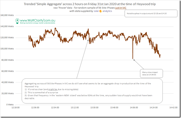
Flipping over to the other side of the separation, we have 56 ‘site-phases’ in the data sample supplied by Solar Analytics (totalling 335,100 watts aggregate AC installed capacity), as shown in this trend:
From this we make two general observations
Observation #9) Reduced to a 41% capacity factor
Remembering the caveats above, we see a capacity factor of approximately 41% in the middle of the day.
This helps to clarify the size of the storm event at the time across Victoria (i.e. not as severe as on output of SA small solar, though still significant – which thankfully aligns with the eyeball summary noted above with respect to the region-level estimated outputs from NEMreview v7).
Observation #10) Some sites in Victoria did actually trip!
As noted on the chart above there appears to be some drop in aggregate production simultaneous with the trip of the Heywood interconnector (perhaps 25,000 Watts from a total of 135,000 Watts at the time – approx 18%).
As noted in the image, this would not have been a good thing at the time where frequency was low, and trying to recover from the loss of imports from South Australia at the time.
I have inspected each of the 56 ‘site-phases’ that were left representing sites in Victoria around the time of the Heywood trip and see the following two very clear examples:
10a) Site ****** located in postcode 3844 (i.e. around the Latrobe Valley in eastern VIC) does clearly show a sharp reduction in a 4.5kW system (producing 1,230 watts at the time). Indeed (remembering that the time-stamps may not necessarily be synchronised) it may be that this actually occurred 5-10 seconds before the frequency was seen to separate.
10b) Site ****** located in postcode 3173 (i.e. Keysborough in eastern Melbourne) does also clearly show a drop in aggregate production from a 15kW system (producing 4,950 watts at the time).
(B4) More observations, about rooftop PV
Several other brief observations:
Observation #11) Some glitches in the data
Understandably, there are a number of glitches in the data which need to be kept in mind before drawing definite conclusions from the above.
11a) Missing data across multiple sites at specific times.
Across the 2-hour time range shown, there were some time points in which there was data points missing across multiple sites. The ‘worst’ instance is marked on the charts above, being around 14:05 when there was data missing for 47 ‘site-phases’ spread across both VIC and SA.
11b) Some sites have terrible data quality
Most sites showed 0 data points missing across the 2 hour time range – whilst a significant number had a couple of data points missing. A small number of sites had more data points missing:
(i) Site ****** in South Australia (postcode 5606) has a PV system only installed May 2013 but missed data for a whole half-hour from roughly 14:00 – but tracing backwards seem to have tripped in its output in response to the Heywood trip (so I wonder if the two are related?)
(ii) Site ****** in South Australia (also postcode 5606?!) has a PV system only installed August 2018 but missed data for a whole half-hour from 14:00
Observation #12) Some sites tripped at other times
Perhaps unrelated to the Heywood trip, other sites tripped at other times – for instance:
(i) At roughly 14:25 (i.e. an hour after the trip) we see that solar system ****** in South Australia (postcode 5573) tripped
————————–
Note – site numbers hashed for extra anonymity!</span.
That’s all I have time for this morning, folks!
————————–
PS#1 Links to discussion elsewhere
Readers might be interested in following discussion that follows on from this:
1) On Twitter here (including this thread from Georgios Konstantinou at UNSW and also here); and
2) On LinkedIn here.
PS#2 Other notes
My main focus in this article was in understanding whether the SA rooftop solar PV systems had indeed tripped (i.e. what I had expected), moreso because of the beneficial effect this would have had on frequency moreso than the specific mechanism of the trips.
It may have been that local voltage disturbances were a factor in the cause of the trips – the Solar Analytics data set also contained local voltage levels, but I have not have time (to this point) to also walk through this sufficient to make any comment.
PS#3 Other references
On 10th January 2019 the AEMO published their ‘Final Report – Queensland and South Australia system separation on 25 August 2018’ which contains some discussion about what happened with rooftop solar systems at the time time of that separation event. See appendix A1 (from page 89), though note there that the sampling period (from Solar Analytics, but slower speed) was 1 minute apart.


Paul
There are lots of folks more knowledgeable than me on the fine detail here, but a few thoughts anyway:
1. As you show, the behaviour of PV in SA broadly assisted the situation by reducing aggregate output after a rapid jump in frequency when loss of the Vic 500KV lines disconnected SA and SW Vic from the rest of the NEM, and then during a sustained period of over-frequency (your earlier article on SA frequency showed it exceeding 50.25 Hz for about 20 minutes after the fault). Some of the reduction is due to systems tripping off, and some possibly due to systems reducing then holding down their output while the period of over-frequency persisted.
2. Expected behaviour of PV inverters in the fractions of a second after the fault depends on a lot of factors that we can’t yet see in the data – how rapidly the frequency jumped (RoCoF), the peak frequency reached in SA (almost certainly above the 51 Hz in your 5 second data), voltage disturbances caused by the line fault etc. It wouldn’t be surprising if many of the trips related to these currently non-visible factors.
3. Expected behaviour also depends on age of system – there were important changes in PV inverter standards in late 2015.
4. For inverters in SA complying with the new standard that remained connected through the fault, these ought to have reduced output (relevant to pre-event levels) while frequency remained above 50.25 Hz. At 50.5 Hz, where frequency sat in SA for most of that 20 minute period, this reduction in output should have been about 15% (if I’m interpreting the standard correctly – a big if). It would be interesting to know if you can see anything like this behaviour in the sample data you have.
Allan
The missing solar analytics data also probably tells a story. Although the monitoring units have a 3G/4G network connection, they are not battery powered and need grid power to collect and upload stats. if there are holes in the data (no samples) it most likely means the local grid was off. I am not sure how resilient 3G/4G towers are to power outages but they probably have some battery backup in at least some of the towers but towers might get congested if some towers run out of power in an extended power outage which was not the case in this instance.