As frequent readers of WattClarity know, we’re a Brisbane-based software company that operates in the Australian energy sector – with a focus on making complexity understandable, so people can make better decisions.
We’re particularly inquisitive, about any energy-sector data (particularly relating to this unfolding energy transition). The huge ongoing escalation in data volumes is a challenge for us (and everyone else), but also represents a big opportunity to do things better.
(A) Our own experiences with Solar PV at home
We see our workplace as being fairly “typical” of the broader community in some ways* with respect to the prevalence of residential rooftop PV – such as with respect to the following distribution:
| Our personal experiences with the financial benefits of solar at home | |
| Type 1 | We have a number of employees who are fortunate enough to receive the very generous, long-lasting 44c/kWh net feed-in tariff.
This includes myself, as noted here before (though not without some realisation that others, including those not as fortunate, are paying for our “bonus”). |
| Type 2 | We have had other employees (like Jamey, featured in this article) who missed out on this opportunity – only installing PV after the closure of the generous FIT schemes for various reasons |
| Type 3 | We have other employees who (because of renting, renovating, or other reasons) are not able to access any benefits from their own solar. |
Given this diversity (which, again, we see as fairly typical*) there is a fair bit of diversity of views apparent with respect to the effects of what’s been described by others as Australia’s Solar-Coaster Ride.
* we understand we’re not really going to be representative in other ways (for instance, we would have a higher level of energy literacy (LINK TO COME) than would the “average” business or community).
(B) Trending through past couple months
It was apparently Yogi Berra who quipped “you can observe a lot by watching” (he even wrote a book with the title). Whilst it might be seen as a truism, from another frame of reference it is sometimes important to highlight what is otherwise “hidden in plain sight”.
That’s what we strive to accomplish in our various energy sector dashboards (e.g. NEM-Watch and our higher-end products like ez2view). It’s also what drove us to upgrade our view (at home) of the output of our residential solar PV production levels:
1) I noted that we were doing this back in August, and thought it was timely to check back in and post some initial observations.
2) My timing also prompted by this article last Wednesday titled “We need to talk about talk about rooftop solar” by Martina Calais of Murdoch University at One Step Off The Grid seeking feedback from people about their own solar powered experiences.
3) As someone striving to objective about all different types of technology “solutions” (to the point where the over-used label “solution” irks me somewhat) we’re continuing to strive to understand the good points, and the bad, about every technology (including solar PV).
4) Given that the technology is so central to the “most likely” path that Australia seems to be currently following in terms of this energy transition at the same time as being so opaque, the need to be so objective and detailed now is especially so in terms of small-scale solar.
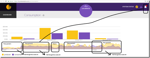
Hence, in the interests of pushing a real conversation along on this note, here’s what data we currently have access to at home. Apologies for the size of the image in the article – click on it for a better view.
(C) A few specific questions and/or observations
On the chart above, I have highlighted a few specific time ranges – for each of which I have added some specific commentary below. I’ve done this in the interests of helping the energy supply sector continue to grow to better serve all energy users – rather than to specifically single out any particular company, service provider, or service type.
Time period 0 = out with the old and in with the new
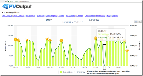
Before we start on the time periods highlighted in the image above, I should highlight one of the main triggers that prompted the change in August – from a free service (inverter data to PV output) to a paid service (Watt Watchers gadget within a Solar Analytics front end) – was the increasingly frequent occurrence of missing data from the free service.
I’ve flagged one in the chart above.
With the main driver for us at home being the cash benefit received from the generous 44c/kWh feed in tariff we enjoy, we have seen financial justification for watching the output of our small power plant (i.e. to give us near real time feedback, so we have the capability of responding to any unexpected drops in output). The justification for sticking with our first solution dropped significantly when we started to experience drop-outs in the data (especially when they were for unknown reasons, for unknown durations). As our confidence in the first “solution” dropped away, our interest in alternatives similarly rose….
Key take-away #1
This, to us, represents another example of why Data Integrity is the key – especially in the electricity supply sector, where supply and demand need to be managed in real time.
Time period 1 = initial teething issues
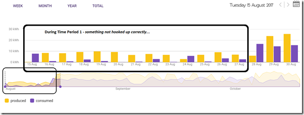
… so we upgrades our data view to a commercial offering provided by Solar Analytics. This brings us to Time Period 1 highlighted on the first chart above – which is also shown in more detail here:
During this period, we came face-to-face with one of the challenges of distributed generation – whilst the production might be automatic, and low short-run marginal cost, anything to do with the management and service of the apparatus (or the gadgets that monitor it) is time and labour intensive – which means both:
1) there is a non-negligible cost to it (both direct and indirect); and
2) being distributed, and hence relying on a large number of different people for Australia-wide coverage, the challenges of Quality Assurance are one that the industry needs to confront head on (we’ve seen this in Pink Batts, we’ve seen dodgy solar panels and installations, and we’ll no doubt see a share of dodgy battery installs – which is particularly concerning given the broader range of risks, which is why we’ve been working on this).
In our case we’d already had the solar installed for a couple years, and then moved and replaced again after the roof was written off in a hail storm (not without a snag in the reconnection, though – which will be a story for another day). In this article I’m only focusing on the monitoring – but even in this case we had four different parties effectively involved, in addition to us as the Home Owner:
| Four different parties effectively involved | |
| Stakeholder #1 Original Electrician |
Implicit in this process, we had the original electrician our builder had used in the renovation of our house.
Certainly a factor in the colourful words emanating from Stakeholder #2 when trying to install the monitoring gadget in the Circuit Board. |
| Stakeholder #2 PV Installer Monitoring Gadget Installer |
In our case this was a one-and-the-same party, but my impression was that this was a large coincidence –> we contacted Solar Analytics to purchase the gadget, and they arranged one of their agents in Brisbane to install the thing.
It just happened to be that this agent was the company we’d purchased the PV and inverter package from in the first place. |
| Stakeholder #3 Solar Analytics |
We have Solar Analytics, who are our supplier, in this case – and the ones we speak with in order to get access to the data (though software written by the growing Solar Analytics team). |
| Stakeholder #4 Watt Watchers |
Last but not least, we have Watt watchers – who we did not have to speak with at all through the process, but who I knew made the core technology within the gadget that enabled the Solar Analytics software offering.
Though probably many other customers would not, or would not care. |
As a general rule, I believe that the more different parties involved in a supply chain, the harder the process is to manage in order to ensure things do not fall through the cracks. My own experience (i.e. a sample size of 1 – so certainly not representative) was useful in illustrating this point.
In this case, we had the Gadget installer come onsite and (after a number of colourful words about the quality of work of the initial electricians in our Circuit Board) install the gadget. After physical install, there was then a software configuration step. At this point several hours had elapsed and the data that was being displayed did not look quite right.
I had a fair idea of what the data should look like, but still had to wait a couple days to confirm what my instinct was telling me at the time – at which point I was able to arrange for the installer to come back and have another go. The chart above shows the 14 day duration in between the visits (note that the reasons for which were due, at least in part, to my busy schedule) over which neither the consumption nor production data was what I was expecting to see.
However during this time I was thinking about the “Average Joe” consumer who perhaps would not have known enough to understand that something was not correct with the data – and I wonder what the proportion is of people who are dealing with these sorts or issues (e.g. with their data from solar or storage – or, more broadly, just in terms of retail bills)? This, I see, as one of the core challenges in the distributed energy space – and is summed up in the annotation on the first chart being a customer “Falling through the cracks #1” .
Re-iterating Key take-away #1
This only emphasised more strongly that Data Integrity is the key – however it also flags the general problem of the yawning deficit in Energy Literacy Adequacy (LINK TO COME) that is presenting huge risks to the emerging energy transition.
Thankfully, we were able to sort the data glitches out and we were onto the second time period…
Time period 2 = smooth sailing
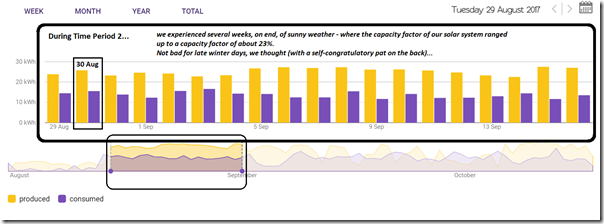
… During this period it really did seem like “smooth sailing”. The data was correct, and this corresponded (purely by coincidence) with bright sunny days when our solar harvest was quite good – as indicated in this chart here:
Three things occurred to us during this time – or, more truthfully speaking:
1) two things did occur to us, but
2) another (big) thing did not occur to us, but really should have given our penchant for analysis and objectivity …
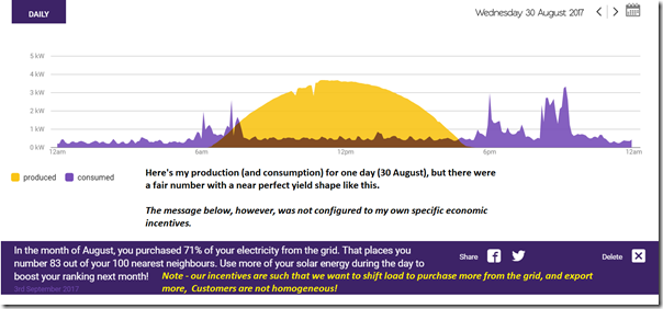
The first observation during this period was triggered by some friendly email alerts that I started to receive (part of the by-product of the registration process with Solar Analytics) that appear squarely aimed at incentivising residential users to self-consume their own solar production (i.e. by shifting load – like the laundry and the dishes etc – into the middle of the day). Here’s a snapshot highlighting just 30th August:
In the first chart above, I have highlighted this as a customer “Falling through the cracks #2” . By this I mean to say that it highlights, to me, the inherent desire to simplify the complexities inherent in each person’s unique sets of motivations (to build a “model”, as it were, despite knowing that a model’s just a model – it’s not reality).
Whilst I understand that there are both macro (i.e. addressing the “duck curve”) and micro (i.e. for those energy users on more miserly FIT where the incentive is reversed to mine) incentives for some to shift consumption to the middle of the day, the main point here is that it’s not the only possible (rational) incentive structure. Indeed, there are 400,000 customers still in Queensland on the 44c FIT whose rational incentive is to shift consumption outside of daylight hours (exacerbating the “duck curve” in the process).
Key take-away #2
We (as energy users) are not a homogeneous mix. The broader energy supply sector (that’s most of us now, as well) needs to understand this and not assume “one size fits all”.
I did highlight this to some key people at Solar Analytics on the sidelines of All Energy a month ago. The reason I bring this up more publicly here is not (at all) to bag them here (in fact, I see this company as one of several start-ups in the space that are promising great things, and starting to show signs of delivery).
Rather, I use this example to make concrete a broader challenge that is inherent with being a start-up:
Key take-away #3
Start-ups are start-ups. They have not perfected everything about their offer – and nor do they (currently) have the budget, or knowledge, to do so. This means that there is some inherent uncertainty about the extent to which they can do this, and hence achieve massive scale.
This is a challenge to them (at an atomic level) but is also a systemic challenge to the energy supply sector, if much of the energy transition is assuming that these new technologies (and business models) will emerge to support the new ecosystem of the future.
Whilst we’ve been around for close to 18 years, we feel the same sorts or pressures every day – given the massive ways the energy sector is changing, and the steps we’re taking to (hopefully) stay ahead of the core changes that particularly matter to us, and our clients. If you think you can help us with these challenges, always happy to hear from you.
Now the two observations (TA#2 and TA#3) above were apparent to us when we received the automatically-triggered notifications. I still shake my head, however, when remembering the metaphorical “self-congratulatory pats on the back” we were giving ourselves during the “sunny days forever” period when we were seeing production consistently higher than consumption… and weren’t we so good, etc…
It particularly irks me, given a drive for objective analysis and reason, that I could have essentially forgotten that not all days would be like this – something that was essentially only apparent when the rains started coming. At that time (Time Period 4) realisation returned that there were (of course!) dependent on the weather for our solar harvest – and financial bonus. I fell into that classic “recency bias” cognitive trap.
Key take-away #4
Everyone is subject to a “recency bias”, which is one of the core analytical challenges I have highlighted separately here.
But before the rains came (thankfully) we took a short holiday…
Time period 3 = brief holiday
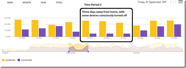
… therefore triggering what I have flagged as Time Period #3 on the chart at the top – and have expanded here:
This period triggered two different types of observations which I thought it might be useful to share:
Firstly, seeing this data (out of curiosity I had even checked it remotely, whilst away for the period) so clearly indicate a big reduction in usage pattern did bring home for me the concerns flagged by others in relation to the confidentiality of a customer’s data – both in terms of access by some unidentified 3rd party (e.g. a hacker, perhaps) but also in terms of the various parties (e.g. Stakeholders #2, #3 and #4 in the table above) who have been involved in the establishment of the monitoring device).
Whilst the concern in our case might be that someone (remotely) could discern that the house was unoccupied, I can envisage others might have different types of concerns. In the interests of ensuring some balance, I also flag here that this data could be very beneficial (e.g. such as a case of watching usage patterns and triggering alerts if expected events did not happen – like Grandma not switching the kettle on one morning by an expected time).
Key take-away #5
There are real and valid concerns about confidentiality of data that the energy supply sector (including the new entrants) needs to address.
Also here was a curiosity about the level of parasitic load evident in our household – starting with even knowing whether what we saw during those days was either good, or bad. As noted, we did (partly out of curiosity) consciously switch a few things off – such as a few PCs that are rarely off otherwise – but did leave other things running on standby (plus fridge and freezer, of course). Here’s the profile through 20th September, which really does reinforce the “no one’s home” theme:
I am genuinely interested to hear from those who know more than me to help me understand if that sort of usage pattern is to be expected with everyone away for the day (i.e. 5kWh over the day, shaped like that)?
Key take-away #6
This experience also did remind me that energy efficiency is remains the unloved “ugly sister” of the growing family that sees attention feted on the three younger siblings named Wind, Solar and Storage.
On the topic of energy efficiency, worth flagging that the National Energy Efficiency Conference 2017 is coming up on 20th and 21st November in Melbourne.
Also reiterating Key Take Away #3 (repeated below) I should just flag that on 25th September (i.e. after we’d just returned from holiday) we received this helpful congratulatory message:
Reiterating Key take-away #3
Start-ups are start-ups. Here’s another example of where the offer has not quite been perfected…
Tongue-in-cheek, I observe that the guys at Solar Analytics are encouraging us to always be on holidays as a method for increasing our energy efficiency!
Time period 4 = stormy waters
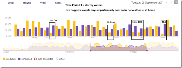
During time period 2 (above) we must have passed through many days without seeing a cloud in the sky – though, at the time, I fell into the “recency bias” trap of subconsciously assuming that it would all continue with the sunny day output for all time. As time progressed, however, things returned to normal and we did start to experience days where Brisbane received some welcome rain – and our solar output suffered as a result:
I’ve flagged five days in October (2nd October, 12th October, 16th & 17th October, and 21st October) of particularly poor performance.
Just like yin-and-yang (here with wind) this did focus our minds on what the implications are of these stormy days right across the NEM. One of our guest authors has previously highlighted NEM-wide cloud patterns that delivered the very low NEM-wide solar harvest seen on Friday 19th May 2017.
On the days of rainy weather in October, my mind did go to wondering how frequently these sorts of patterns exist. Hence running some analysis with the AEMO estimates for small-scale solar PV out of NEM-Review v6, which have been posted here in a separate article.
Key take-away #7
A balance of generation sources is required for the energy supply system of the future – just as has been the case for the past 100 years.
Time period 5 = escalating data requirements
As noted before, we’re a company full of data junkies of different flavours, and I am particularly inquisitive about all different sorts of energy sector data. Hence a general curiosity about what data might become more available with the rise and rise of distributed energy sources, buried deep in the distribution network.
However there are particular needs, as well – such as:
Need #1) Our need, at home, to watch our solar production closely, in order to ensure that we can quickly respond to any unexpected dip in production and so ensure our FiT payment is maximised each quarter.
Need #2) At work, we’re particularly interested in understanding what data is becoming more ubiquitous, in order that this can feed into our discussions with various clients (and potential clients) about problems they might want us to help them solve.
Whilst Need #1 has been met completely by our recent upgrade to a paid service, and has also (temporarily) sated our appetite for more and more data, we do have a specific additional need.
Need #3) Back at home, we’ve been blowing LEDs over the past couple years, which is a pain in a number of ways. I’ve been wondering if this was due to voltage in some way, and have also wondered if the cluster of solar systems on the end of our distribution line has been a contributing factor to that, but had not been able to check (no monitoring).
Possible Key take-away #8
It may be that this is an example of unintended consequences of the rise of residential PV. When I know more, I will post more on this…
As such, I was curious to know if our new gadget would afford us this capability – hence put in a call to some of the people we know at Solar Analytics to see if it was possible. Sure enough, I received a prompt response from one of the team with one view of data that did show some periods of low voltage (which might be a cause!), and with a promise to enable my access, so I could do a bit more digging. However I have not yet seen that access, and have mentally labelled this “Falling through the cracks #3”.
Key take-away #9
There are certain theories that hold that a business’ demanding customers are the ones that lead the company towards new opportunities. In the interests of balance, however, it’s necessary to point out that others hold a very different perspective.
I recognise that I’m probably pushing the offering more than a “normal” client might do, but I have several reasons to be very curious about the types of data that are available.
I can also remember a variety of occasions where we have had demanding clients stretch us in a variety of ways – on some occasions having a good effect (strengthening our core offering, to the benefit of all of our clients) whilst on other occasions being an expensive distraction for no broader benefit.
Stay tuned, in another couple months, for a further update.




[..] Yogi Berra who quipped “you can observe a lot by watching” (he even wrote a book with the title). [..] and I made a little blog post on his passing in Sep 2015 ..
http://eljeiffel.blogspot.com.au/2015/09/on-observation-yogi-berri.html?m=1
So many great ‘observations’ in this post. Will take a while to read, understand and absorb. As always, thank you for your generosity in sharing your experiences and learnings.
Seems like a lot of complexity to tell you what you must have already known really. Solar works best around the middle of the day, less well when its cloudy, sometimes it will supply more than i need , sometimes less. Its not clear to me how i benefit or what i would change as a result of converting basic reality to data and graphs. I must be mising something.
I agree to an extent, but have observed (over many years of user interface design for process plant operators, and frequent reading of other types of data presented in analogue, numeric tabular, or graphical X Vs Y or X vs T forms) that different people have widely different abilities to gain meaning or understanding from that data.
Thus while I might be like you and fairly adept at quickly interpreting data either by comparison with what we expect from our excellent understanding, or looking at a column of numbers and intuitively calculating average and variance, min, max etc, it remains true that there is incremental value in presenting it graphically.
Sometimes you will see learned patterns or changes to patterns that alert you to something significant. As the number of variables and data points increases, the ability of virtually zero cost additional flexibility in display the data in a variety of ways becomes nearly essential.
The trend graphs in Excel can offer even further insights especially if you resist the temptation with the polynomials to go to too many levels of complexity.
Paul,
By way of further analysis; the remark at:
http://australianenergycouncil.cmail19.com/t/r-l-jlbjyll-hyltdykhjy-i/
that “Port Augusta was the ideal location for a hybrid renewables power station because wind strength increased throughout the day and it had a high number of days of sunshine…mainly driven by the temperature differences between land and sea…” got me thinking that with the advent of large solar inputs at the transmission level about to arrive on the scene, including National Grid Metering, perhaps some accurate analysis could be done of the level of cover provided by the intermittency of each e.g. if the wind strength grows at Pt. Augusta as the day progresses it could alleviate the duck curve considerably.
Cheers,
Paul, re blown LEDs, could I suggest that you check your mains voltage. I my case the mains voltage was sitting at 253 volts on winter days – but it showed a weak correlation with PV output. I wrote to my electricity distributor with a spread sheet of 5 minute average voltage readings during a week, and to my surprise they responded immediately. I was also surprised when they said they had to setup their own monitoring (I expected that in suburban Melbourne it might already have been monitored). Within a few days of seeing with their own eyes they changed a distribution transformer tap. The voltage is now right on specification and with very little variation over 24 hours (except for the notable air conditioners causing ‘fuses’ to ‘blow’.
Thanks for your contributions.
Try http://www.smappee.com for a real power monitor. Hasn’t missed a beat for me in 4 years. Class 1 energy meter that actually measures the voltage (unlike most).
Good article. I just had a SA device/gadget installed yesterday, so I guess I’m in “time period 1”. Like you, I have the benefit of a high Net Feed-In Tarrif for another 11 months so my goal or value drivers are diff. to those that don’t have this. Not sure if the SA site deals with this yet. I also have a curiosity for more data, but need to temper this appetite with the understanding that more data doesn’t always lead to more knowledge.