At the request of a client, we’ve built a very particular dashboard for their specific needs. I can’t show you what it is, but can note that it’s alerted me this morning to the fact that wind farm output across South Australia is likely to be high this Wednesday 26th April (i.e. beyond the predispatch time horizon).
This morning saw the forecast as high as 1,320MW, but this did make me wonder – with the build-out of Hornsdale as the newest addition to the fleet, what has been the maximum all-time instantaneous wind production now?
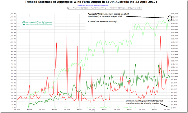
So I powered up NEM-review to run a quick query, and generated this trend of monthly extremes over 12 years:
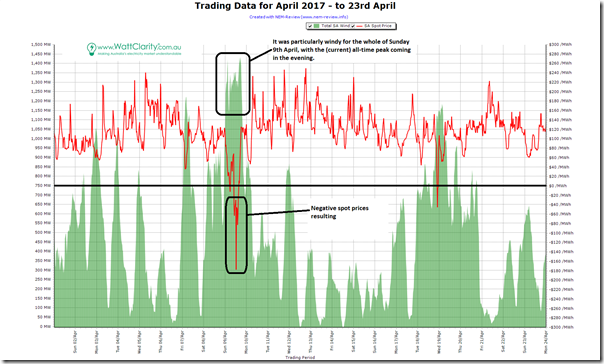
As noted on the image, we see that wind production peaked up at 1,434MW (when measured on a half-hourly basis) earlier in April. Zooming in to look at the raw half-hourly data for April reveals the following chart:
As can be seen, the high levels of wind production have driven negative spot price outcomes (a symptom of the 2nd stage challenges highlighted in this recent HBR article). I don’t have time to delve in more detail, but believe that this volume/price relationship will have changed significantly after 1st April and the closure of Hazelwood.
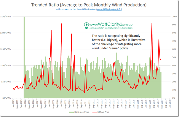
One final chart, for today, shows the average of Average Wind to Peak Wind for the month. If increased diversity of wind farm sites across South Australia was seen to be increasing the ratio, then this would be a good thing (i.e. meaning that the challenge would then reduce to catering for the low wind times).
However we see that this is not the case – with the ratio (whilst jumping up and down from month-to-month) is not trending significantly upwards. This was one of the challenges I grappled with in this kind of “10x analysis” in 2015 – challenges evidently not going away.
We’re yet to see what the yield patterns are like for any wind farms north of Southern NSW. That will be of keen interest!


Leave a comment