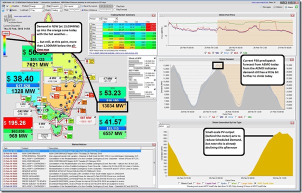
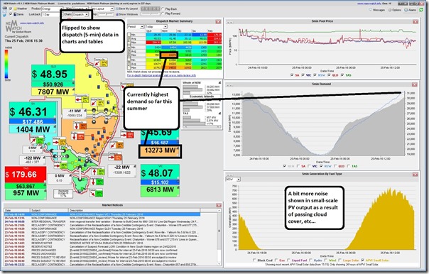
True to yesterday’s prediction (from the AEMO, not me!) we saw NSW demand rise higher today than on any other day this summer period (higher than the 12,845MW seen on 21st January).
Summer’s only a few days left to run, but there is a weekend in the way, so it’s likely that this will be the final level – except, of course, if you are one of our eager competition entrants waiting to see if you win a BBQ given we declared that the competition would run over “extended summer” till the end of March.
(A) What was today’s peak demand in NSW (highest so far this summer)?
Seen here is the NEM-Watch snapshot from 14:50 NEM time (so 15:50 in Sydney) showing the dispatch target demand published by AEMO rising past 13,000MW for the first time this summer (13,034MW in this snapshot, so into the orange zone):
Forty minutes later (at 15:30) we see that this demand had climbed another 253MW to be at 13,287MW, as seen in this second snapshot:
At least at the time of posting today, the highest point the demand reached was 13,529MW at 16:25 NEM time (when measured on a dispatch target basis). This had been building through the afternoon.
See, from the snapshots above, how the demand in NSW did reach the orange zone but was still some way (1,200MW or so) below the all-time maximum demand – i.e. the red zone (on the 1st February 2011, which we recorded on WattClarity back at the time, showing the age of both WattClarity and NEM-Watch).
(B) Why today’s peak NSW demand was well below the all-time maximum?
There are, no doubt, a long list of factors contributing to why today’s peak demand in NSW was well below the all-time maximum (despite the stinking hot weather). If you have particular ideas as to other factors that have contributed, I would invite you to comment below this post (or let me know offline, if you prefer). The following is list to get you going:
Factor #1) Heat not as bad as it might have been
It was hot today in NSW (or at least it looked that way, from the vantage point of a cooler Brisbane) – and it also looked somewhat warm in some parts of the state yesterday. However it was not as bad as it might have been (it’s never that bad ☺)
1a) Only 35 or so in Sydney today
First observation is that we’ve seen hotter days in Sydney – such as on the day above in 2011, and in this stinker in January 2013. That day in Sydney back in 2013 showed 45 degrees in Sydney (how much higher would the demand have been today if temperatures had been 10 degrees higher?!)
1b) Yesterday was not too bad
It’s been commonly understood in the industry for many years that electricity demand varies depending on how many consecutive days of abnormal heat have been experienced. This is both a result of:
(a) thermal properties of habitable areas, in terms of keeping heat out, and also a result of
(b) psychological factors (which might be colloquially termed the “screw this, it’s hot!” factor when people, who have resisted the first day or two, crank the air-conditioners to the max).
Factor #2) Small-scale solar PV behind the meter
Australia’s aptly named “solarcoaster” has delivered a bumpy ride to the growing solar niche/wedge, but also left a number of implications for the broader electricity supply sector – not the least of which is the ongoing production from small-scale solar operating behind house-hold meters, which the AEMO does not see in real time and hence has the effect of netting off the “Scheduled Demand” the AEMO focuses on in dispatching the market to keep all of our lights on (at least for the 99.99% of consumers who have not gone off-grid entirely).
With the permission of the Australian PV Institute, since early 2015 we’ve been pleased to include a trend of the past 24 hours in the installed version of NEM-Watch for our clients (also seen on an instantaneous basis in our more public – i.e. free – NEM-watch Widget on RenewEconomy). This has helped to complete the picture of the total supply mix.
As highlighted in the first image above, solar injections behind the meter have clearly had a significant impact on reducing demand below where it might have otherwise been (something like 700MW at its peak output today).
On solar PV’s effect in reducing peak electricity demand
Will come back to this ….
Better late than never, please see these comments here added on 9th March.
Factor #3) Closure of Kurri Kurri Aluminium Smelter
Another major factor was the closure of the Kurri Kurri aluminium smelter. If I had more time today I’d dig up some real numbers, but my receding memory is telling me that this was of the order of 350MW consumption, base-load (perhaps a reader can correct?)
Factor #4) Other factors
Some years ago I compiled this list of factors contributing to the general pattern we’d observed of declining electricity demand.
However that’s all I have time for today, folks – please feel free to comment below, or offline directly (tel +61 7 3368 4064). Would be especially good if you could link it to some numbers to indicate a scale of the effect!


Leave a comment