We’ve completed development of our our 2014 Issue Power Supply Schematic Market Map™ clarifying the physical structure of the electricity supply industry on the east coast (NEM) and the west coast (WEM).
Now we’re shifting attention to the commercial structure of the two main Australian electricity markets – the NEM on the east, and the WEM on the west – for the purpose of updating the 2014 Issue Power Trading Schematic Market Map™.
To do this, we’ve been compiling some data that clearly illustrate how much the market has changed in just a short space of time.
One of the outcomes of what’s been happening recently is that it looks like there won’t be enough space on the wall chart for all the ancillary information we had previously listed. Hence, to ensure that our clients can still gain benefit, we will be publishing some of this on WattClarity over coming weeks.
For now, I wanted to highlight one of the most significant changes I have seen in the 15 years we’ve been observing the market through GLOBAL-ROAM Pty Ltd (and in watching energy markets around the world for many years before that):
1) It’s getting very crowded at the bottom end of the market
Since the NEM started many years ago, we’ve seen the initial group of retailers grow smaller and smaller over time – as Origin, AGL, and EnergyAustralia have gobbled up pretty much everyone else who was there at the start (those who have seen them will recall Carl’s Pac-Man animations) .
The first wave of new entrants have grown their customer bases to be in the 100,000s now, though recently we’ve seen the exit of Australian Power & Gas (gobbled by AGL last year) and pending sale of Lumo – following on from from Snowy’s earlier acquisition of Red and Hydro Tassie’s coupling with Momentum. What’s next for players such as these?
However that’s not what’s most intriguing for us – rather, if we drop a zero (or two) from customer numbers, we find that there’s a veritable cornucopia of customer choice at the bottom end of the market, with a whole swathe of new options popping up in the past 12 months or so.
What’s more, it seems that this group of new entrants are establishing themselves in two opposing camps, competing directly against each other, whilst (at the same time) trying to eat the lunch of the “big, bad, three”.
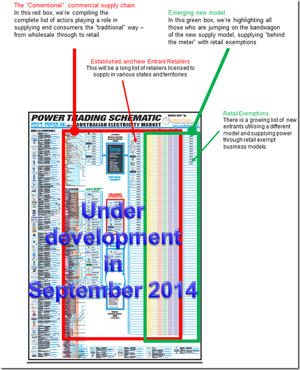
On the left-hand side (as shown in red below) we have a significant number of new entrant retailers that have popped up in the past 12 months or so. We also know of a few others with business entry in the pipeline, though a little too early to list here in this issue. Is there something in the water that has prompted this to happen?
On the right-hand side (as shown in green below) it’s like the floodgates are opening with a wave of (mostly small, some large) businesses gaining retail exemptions to supply solar PV on lease-back arrangements. Some of these are focused on residential customers, and some on commercial.
Two thoughts to leave you with, at this stage:
(a) Green is not the only game in town
Whilst a focus on renewables has certainly been a telling factor (and it’s certainly been making the headlines of late), that’s not the only potential differentiator we’re seeing emerge in the new entrants popping up. More on this later…
When the market was started, one of the promises made was that “innovation” would drive differentiation and better customer service. With a few exceptions, it’s not seemed that that has really happened to date.
Is what we’re seeing now the (belated) start of this wave?
(b) Is it big versus small, or left versus right?
Especially with the shouting match that the RET Review has devolved into, it would be easy to think that the only choice in town is (clean green) David versus (big black) Goliath.
However another way of viewing what’s happening is in terms of the left side of the chart versus the right. We’ll post more on WattClarity in the coming weeks about whether this is another case of privatising profits whilst socialising costs…
2) About the wall chart
The market changes currently washing through have been so significant that we’ve revamped the design of the “Power Trading Schematic” to accommodate. Here’s how it’s currently coming together:
As noted above, we’ll be posting more (on WattClarity) about the information we’d like to have still included on the chart, and yet has been squeezed out by what’s going on at the bottom end of the market.
For those who want more information about this wall chart itself, see here.


Leave a comment