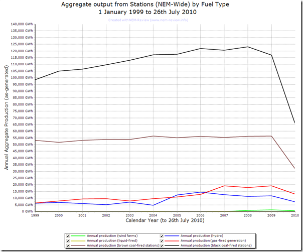
As part of some other analysis I’m putting together, I’ve generated the following trend of total generation volumes across the NEM by fuel type, through the use of NEM-Review 6.
Note that this analysis is current only up to, and including, Monday 26th July 2010.
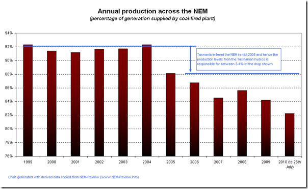
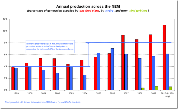
Taking the data generated by NEM-Review into Excel enables me to produce the following additional two points of analysis:
In the first chart (above), I’ve trended the percentage of total production supplied by coal stations (black and brown). As can be seen, market share has been dropping in more recent years – but only slightly, from high levels.
In the second chart (above), I have shown how production from gas plants (and, to a smaller degree, wind turbines) has grown to match the decline in coal-fired production.
Note that liquid fuel-fired peaking plants account for less than 0.1% and so are not shown.
The effect of the drought on production volumes from hydro plant can also be seen.
| For those who wish to perform additional analysis with the data shown here, we have uploaded the .NRF file to this location.
Just download the linked file, unzip, and double-click to open in NEM-Review 6 – then enjoy! |
 |


Great stuff Paul –
Some very interesting graphs.
Thanks Derek,
Would be interested to learn more about your particular areas of interest, so will contact you offline to understand this.
Cheers
Paul
It’s like you know what I’m thinking Paul?
Sitting at my desk trawling through 100+ page reports at Melbourne Business School on the final stage of my MBA researching wind and embedded generation and up pops your graphs on the changing generation mix! A quick cut & paste, a bit of text and referencing (of course) and I’ve only got 39,500 words to go. Sweet. Thanks mate. Cheers Marc
As always, Marc, glad to be of service.
Cheers!
Paul