As noted in the summary page, the highest actual NEM-Wide demand for winter occurred on Thursday 11th June 2009.
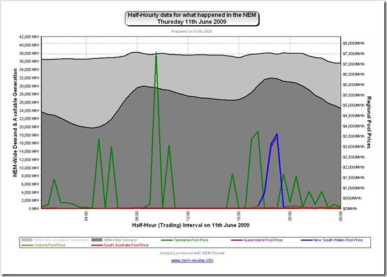
This page has been prepared after the fact to document some of the goings-on during the day. The following chart from NEM-Review provides a view of the trend in NEM-Wide Demand and Available generation capacity over the day. Regional Pool Prices are also shown:
As can be seen:
1) Prices in Tasmania were very volatile over the day – and contributed to Tasmania hitting the Cumulative Price Threshold a few days later.
2) Prices spiked in Queensland and NSW for 2 x half-hour trading intervals around the time of evening peak in demand.
.
Snapshots from NEM-Watch
In order to expand on what happened during the day, I have included here a selection of snapshots automatically by NEM-Watch during the day
(we have a display copy running continuously that contains alarms such as “if the price is high, then email us and include a snapshot”)
I trust that this will make the day more understandable to you?
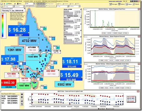
04:40 – price spike in Tasmania
See the snapshot taken from NEM-Watch when the price suddenly spiked up close to VOLL in the Tasmanian region.
A number of things can be seen clearly through the NEM-Watch display:
1) The level of demand in the NEM was very low (19,949MW) which is as would be expected at such an off-peak time of the day.
2) The demand in Tasmania (1097MW) was relatively high, compared with the demand in the other regions. This can be seen from the greenish colour-shading of that region.
3) See that there was plenty of surplus capacity available in the TAS region (with 698MW of net demand supplied by Tasmanian generators – after taking into account imports of 399 over Basslink – and 1993MW of available generation capacity – meaning an Instantaneous Reserve Plant Margin (IRPM) of 186% for the Tasmanian “Economic Island”)
4) Finally, in the prices chart included in the top-right of the display, we can see that Tasmania had seen similar price spikes occur over the previous 24-hours, which was the reason why the 7-day rolling Cumulative Price had already risen to $29,564/MWh – and on its way to the Cumulative Price Threshold (of $150,000/MWh) at which price caps were imposed.
We have not had time to look at these spikes in further detail at this stage.
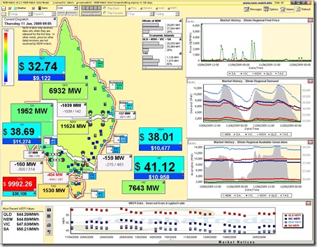
09:05 – one more price spike in Tasmania
As seen in the 2nd snapshot shown below
In this image we see the price in TAS has jumped again, whilst the demand in Tasmania has increased by 50% on its low, overnight level. Once again Basslink is constrained (the interconnector is red) and prices elsewhere are low.
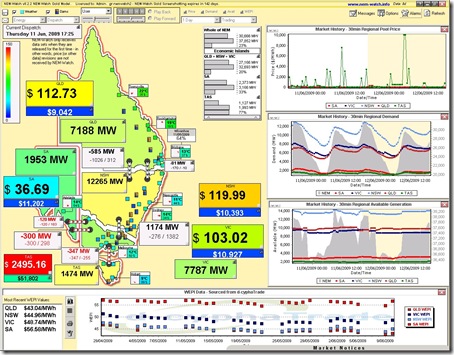
17:25 – Tassie prices up, and prices climbing elsewhere
As we approach the evening demand peak, we see the demand in NSW (in particular of the mainland regions) edge higher in relation to the all-time maximum demand (hence the yellowish colour).
The price has spiked in TAS again, as it has throughout the day (see the price history shown in NEM-Watch). On a NEM-wide basis, there is still plenty of surplus capacity (see the NEM-Wide IRPM is 23%, which is very healthy).
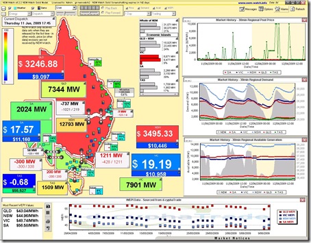
17:45 – constraints allow prices to rise in NSW and QLD
See 20 minutes later, however, that the prices have jumped in both QLD and NSW (with the NSW-VIC interconnector constrained).
Because of this constraint, QLD and NSW have formed what we call an “Economic Island” (where a generator in NSW/QLD has local market power and is responsible for setting the price.
As a result, it appears that they have used this power to force prices up above $3000/MWh in this dispatch interval (refer to the chart at the top of the page to see that the half-hour (trading) prices in NSW and QLD for 18:00 were in excess of $700/MWh (which implies that this dispatch-interval spike of $3000/MWh was the most significant spike in the half-hour). However, note that the IRPM for the “QLD+NSW Economic Island” is shown as a very healthy 24%.
Note in the diagram above that QLD and NSW have been coloured red as a result of the price being high (a visual alert has been set on this display copy to make this happen).
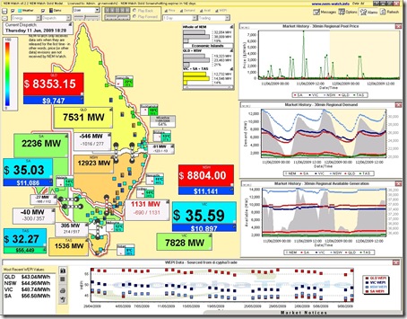
18:20 – constraints force prices high in NSW and QLD
At 18:20 (45 minutes later) the prices have jumped again in both QLD and NSW, this time above $8,000/MWh.
See that the NEM-Wide demand is shown as 32,054MW at this point in time (which is close to the maximum NEM-Wide Demand this winter).
In this case, as well, we see that the demand has risen in the NSW region to 12,923MW which is relatively high in relation to maximum demand (hence the orange colour). Despite the high demand, we see the IRPM of the “QLD+NSW Economic Island”, formed because of constrained flow in from VIC still sits at a healthy 21%.
Indeed the IRPM of the southern Economic Island is shown to be lower, even though prices in VIC, TAS and SA are also considerably lower.


Leave a comment