Contents
- Background
- Price spikes in context
- Sequence of Events
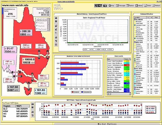
- The temperature in Sydney had reached only 28 degrees at 10:10 (Sydney Daylight Savings Time);
- NEM-Wide IRPM was at a high level (21%);
- Every inter-regional interconnector was constrained at the time (they are shown as red when this happens within NEM-Watch);
- In the “Available Generation vs Demand” chart, it can be seen that the NSW Demand actually exceeded the local Available Generation (meaning that NSW was relying on imports to maintain supplies).
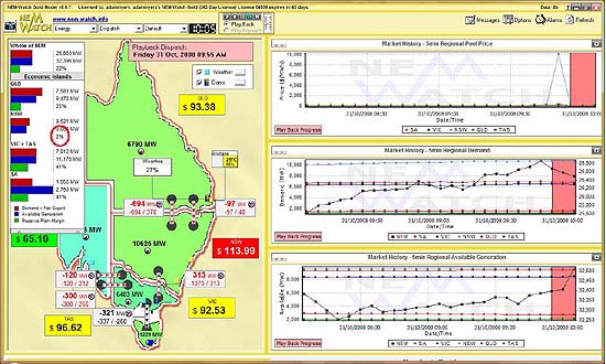
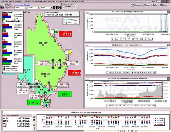
- Each island is indicated by red outlines on the map; whilst
- For each island, a local IRPM is calculated (treating the interconnector flow as static).
- The IRPM of the NSW Economic Island had dropped to an extremely low level of 1%.
- As can be seen, here, the region enjoyed a mere 99MW of spare capacity at the time.
- In contrast, the IRPM for each of the other Economic Islands ranged from 24% in QLD to a high
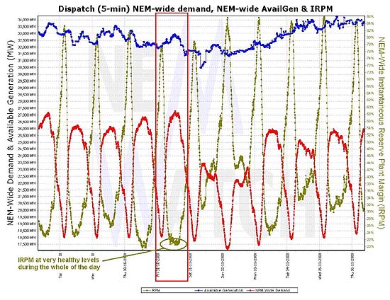
of 67% in TAS. This clearly demonstrates why the prices were so much lower in those regions. - It can also be seen (in the 3rd chart on the right) that the available generation in NSW had not changed markedly across the day.
- Dynamic Movie of the Events!
On the previous day (Thursday 30th October), we had trooped along to several locations to hear NEMMCO launch its “Statement of Opportunities” (SOO) for 2008.
We were interested to hear NEMMCO note that:
“The 2008 SOO shows that the point in time where spare (reserve) capacity may fall below target levels is …the summer of 2008/09 in Victoria and South Australia combined”
NEMMCO went on to explain that more detailed modelling showed that:
the capacity in Victoria and South Australia during 2008/09 will not impact on levels of reliability in the two states. The power system is deemed reliable if at least 99.998% of consumer energy demand can be met. This is the case in Victoria and South Australia this summer.
Hence, the coarse metric used in the SOO flagged summer 2008-09 as worthy of further consideration for Victoria and South Australia. Following further consideration, it appeared that reliability would be within acceptable bounds.
It was quite a coincidence, then, that the following day should see a period of sustained higher prices in NSW – the result of a tight supply/demand balance in NSW on the day, exacerbated by transmission constraints into the region.
It was also a coincidence that we’re currently finalising the development of NEM-Watch™ version 8 (which is a major upgrade on the popular NEM-Watch product) – with a view to having the new version available in early December, so clients can be upgraded before summer starts in earnest.
Hence, the high prices that occurred on 31st October provided a great opportunity for us to see the new features of NEM-Watch v8 in action (including the illustration of what we have termed “Economic Islands” – which are groups of regions commercially disconnected by the incidence of transmission constraints).
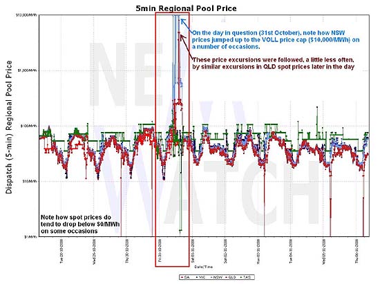
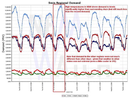
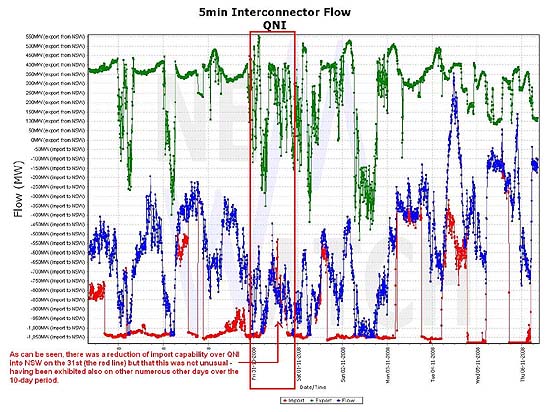
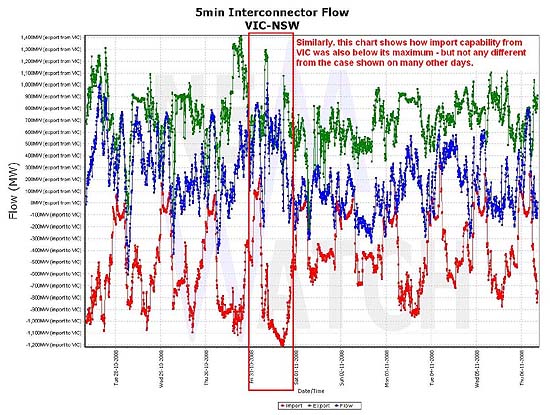
Firstly, we have included some charts (below) that illustrate how the price spikes fitted in with the context of what has happened in the market (otherwise) over the past week or so.
The following table provides a summary of what we have been able to ascertain as the sequence of events in the NEM over the day on 31st October 2008.
| Sequence of events on Friday 31st October 2008 |
|
At 9:50am (market time) the NSW price hit VOLL for the first time. This is illustrated in the screenshot taken from NEM-Watch version 7 at the time. Note in this record of the market that: |
 |
|
This situation can be seen even more clearly in the snapshot taken from the BETA version of NEM-Watch v8, which we have been running in our office for some time. This screenshot was taken at 09:55 market time (i.e. 5 minutes after the previous). Within NEM-Watch v8, we introduce the concept of “Economic Islands”, which we had previously talked about earlier in 2008 at the QLD Energy Conference. Within NEM-Watch v8, Economic Islands are defined dynamically – based on the presence of transmission constraints and: As highlighted below, the IRPM of the NSW Economic Island was a very low level of only 2% – in other words, the NSW region only had about 160MW of spare capacity at the time. Little wonder prices were sky high!
Note also that the colour of the NSW region is light green. With version 8. we have adopted dynamic scaling of the interconnector colours based on a historical range between maximum (red) and minimum (blue). Hence, light green implies demand was fairly average, at the time. |
 |
|
At 10:15 (returning to a v7 display) we see that prices jumped again. This display shows market conditions were very similar to those occurring at 9:50, when the spikes started.
|

|
|
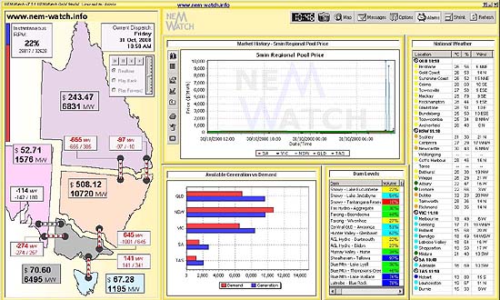
The following screenshot was taken to illustrate how temperature in Sydney had jumped to 31 degrees (as at 10:10 NEM time). At 10:50, prices had subsided somewhat. |
|
|
In this snapshot of the market (showing the 11:30 dispatch interval) we see that the temperature in Sydney had climbed to 32 degrees:
Prices remained significantly higher than “normal”, but still well below the levels of VOLL experienced earlier. |

|
|
At 12:05 the price in NSW struck VOLL again (the 8th time the price had exceeded $9500/MWh on the day). Prices in the other regions had all dropped, as shown below. |

|
|
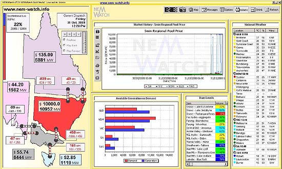
By the 12:20 dispatch interval (when the NSW price was VOLL, and the QLD price was creeping up again) we can see that the measured temperature in Sydney had reached 35 degrees (at 12:10 NEM time) and 34 degrees in Richmond, to the west. |
|
|
Our second screenshot from NEM-Watch version 8 (also taken at 12:20) reveals how: |
|
|
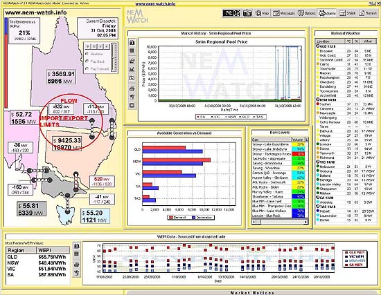
In the following snapshot (taken for the 14:05 dispatch interval) we see that the price in QLD had also sky-rocketed (for the first time that day). It is of interest to note that the QNI interconnector was not constrained at the time. As shown in the diagram, both the flow and the import limit are shown as -832MW, however the arrow is not red because the decimals of the two numbers (as published by NEMMCO) did not align exactly. Hence, it is believed that there was a very small amount of “headroom” available for further flow south. |
|
|
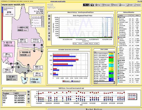
This situation was similar for 14:15, as shown below. Note, as well, that the temperature in Sydney had continued to climb (to 37 degrees). |
|
|
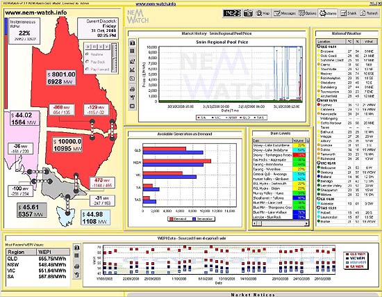
At 14:25, the price in QLD had continued to climb, breaking $8000/MWh for the first time. Temperature in Sydney had dropped 1 degree (note the disconnect, however, with temperatures in both Brisbane and Melbourne – where it was quite cool). |
|
|
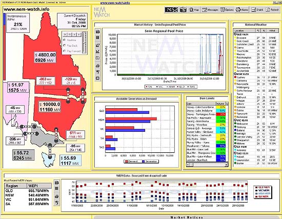
At 14:55, NEM-Watch shows that prices in NSW were still at VOLL (and had been for some time, as can be seen in the price chart) whilst prices in QLD had risen again to $4800/MWh. Note, for this time period, how NEM-Watch shows that QNI was actually flowing (-888MW) in excess of its import capacity into NSW -777MW). The Directlink and VIC-NSW interconnector were also breaching their limits, as well. In their report of 1st August 2005, NEMMCO explains that:
In other words, imports from VIC were higher than the published limits on this occasion as that additional 60MW of power (i.e 611MW-551MW) was needed to ensure demand could be met in NSW. |
 |
|
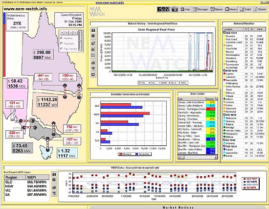
At 15:25 (shown) we can see how prices had subsided somewhat, and all interconnectors around the NEM were again constrained. Temperature in Sydney (as at 15:11) was 36 degrees, and the temperature in Newcastle had also risen to 36 degrees. |
|
|
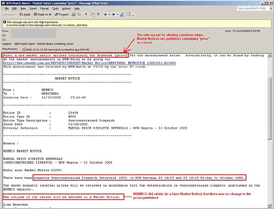
Later in the day, we also received notification (through the Market Notices updated by NEM-Watch) that NEMMCO was to investigate the price excursions that had occurred that day – as a result of Over-Constrained Dispatch Intervals.
As NEMMCO notes, in their report of 1st August 2005:
|
 |
|
In this instance, NEMMCO’s review resulted in no change to these published prices. The market was alerted to this fact through a subsequent Market Notice, which was automatically fed through to all NEM-Watch clients. |
NEM-Watch has incorporated the Playback functionality for a number of years.
With Playback, you can retrace your steps through recent market events and have a closer look at what happened at interesting times in the market – such as on Friday 31st October 2008.
To demonstrate the enhanced clarity you will gain through NEM-Watch v8 (once it has been released) we coupled the Playback functionality with an external movie-making software package to bring you the following dynamic, pictorial record of what happened in the market on 31st October:
[FLOWPLAYER=https://wattclarity.com.au/wp-content/uploads/otherfiles/movies/2008-10-31.flv,640,480]
A word of caution – this was our first experience of using the 3rd party movie-making software, and we could not work out how to show a full-sized, full-resolution NEM-Watch image – hence the movie is not as clear as we would like it to be.
We’ll keep working on that one!


Be the first to comment on "High Prices and Low Reserves in NSW"