All the way through today, we’ve been marvelling at the crazy-low prices that generators across the NEM are receiving for generation dispatched into the NEM today – and particularly in South Australia and Queensland.
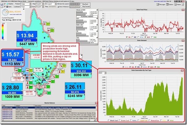
This NEM-Watch snapshot at 12:10 today highlights prices really in the doldrums in those two outer regions:
As shown in this snapshot, the strong output of wind farms across the NEM (but primarily located in the south) is one of the driving factors for the low prices seen in the South Australian region.
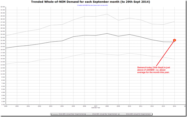
We note in this snapshot that the NEM-wide demand is only barely scraping above 21,000MW – which (as shown in this chart from NEM-Review) is about average for the month, but 2000MW down on the average from several years ago:
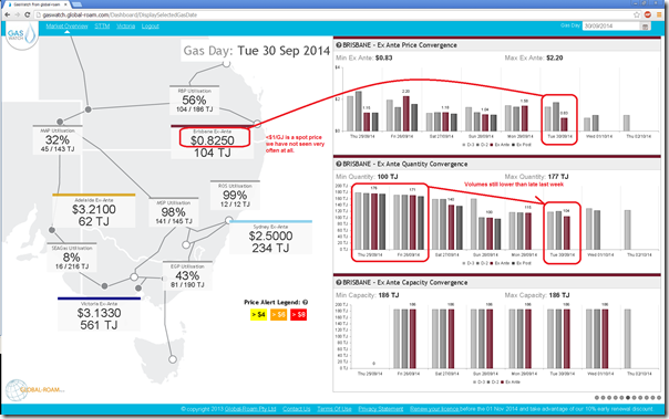
Looking to the north, in Queensland we see that the Brisbane hub gas price in the STTM has dropped below $1/GJ today, as highlighted in this GasWatch snapshot:
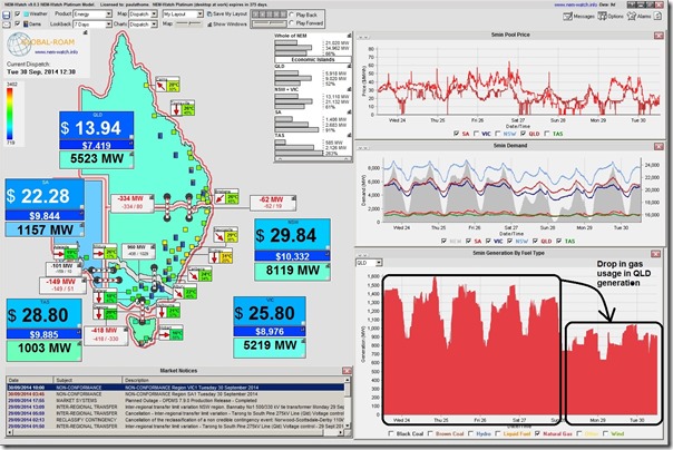
Despite this low price, we see that gas usage today is lower than it was at the end of last week (probably partly the reason that prices are lower). This lower gas consumption at the Brisbane hub is also translated to lower gas burn for power generation in the Queensland region as shown in NEM-Watch:
Hence, the oversupply of capacity in the NEM is also translating through to low spot prices in the gas market, on occasions. Also to be noted here is that the massive overhang of capacity amounts to a 65% Instantaneous Reserve Plant Margin across the NEM today (more than noted last week).
Such depressing prices are feeding into doomsday predictions for security of supply.


Hi Paul…pointing out more of a typo than anything. In the first graphic, it is probably more accurate to say wind is suppressing scheduled generation not scheduled demand. If only demand was scheduled, it would be so much easier to supply!
Hi Liam
Thanks for the comment.
I was focusing more on Scheduled Demand (which NEM-Watch highlights) more than Scheduled Generation, in this instance – though the wording could have been clearer.
We see South Australia is coloured a deep blue, being down towards the bottom of the historical range of Scheduled Demand experienced in the region’s recent history.
Paul
Okay it’s back to the MMS refresher course for me. It’s not a typo, it’s
Got it now thanks Paul. Even so, “Scheduled Demand” (other than demand response)does border on oxymoron territory…
Why is there such a large difference in gas prices between Brisbane and Adelaide ? As your gas chart shows, it’s clearly not limited by pipeline capacity. Is this price differential what the pipeline owners charge for the use of their asset ?