Whilst it’s true that we are investing a significant amount of time in compiling our forensic autopsy of the factors contributing to what happened in QLD over the past summer/Q1, we’re not looking exclusively at QLD, nor exclusively peering into the past.
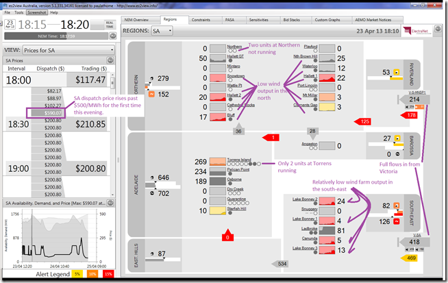
We’ve not helped noticing how prices in SA have kicked upwards in the shoulder season, such as shown in the snapshot from ez2viewAustralia for the 18:20 dispatch interval this evening:
This shows the first of several price excursions above $500/MWh this evening – on top of prices that have been higher than higher than “normal” for a number of weeks.
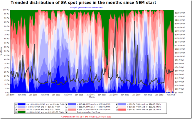
Running some quick queries in NEM-Review this evening, we can see that the price in SA has been above $58/MWh for substantially more time than all of the recent months (post Carbon Tax) except for July 2012 (we’ve colour-coded this green in the chart below for ease of reference):
There are a number of reasons why this has emerged – in this post we’d like to just list three that all combine to deliver low Effective Surplus Generation capacity in the SA region.
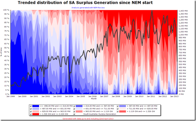
In the second chart from NEM-Review we show a trended distribution of Surplus Generation:
In the chart above, we can clearly see the distinctive pattern whereby Surplus Generation (defined here) increased from a low (indeed negative) base for the SA region following the commissioning of some plant, particularly Pelican Point, in the early years of the NEM.
Since about 2007 a more stable period seems to have emerged taking into account factors such as:
(a) The declining demand around the NEM, including in SA; and
(b) The fact that new capacity developed since that time has been mainly wind plant – some of which does not need to declare Available Generation figures to AEMO, and so are not included in the Surplus Generation metric trended above.
However, we see that April 2013 (to date) has seen an time-weighted average Surplus Generation of only 550MW – which is at such a low level last seen back in 2004.
There are several reasons why Available Generation, and hence Surplus Generation, has dropped – including the following three.
1) Plant Maintenance
The shoulder seasons (autumn and spring) are typically the time when planned maintenance is performed. This will have been especially necessary after a hot summer when plant capability will have been stretched.
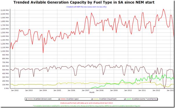
The following chart from NEM-Review does indicate that the available generation capacity for gas-fired plant is lower than it has been since 2005:
2) Low Wind Farm output
We can see in the illustration from ez2view above that wind farm output across SA was fairly muted at the time of the price excursion.
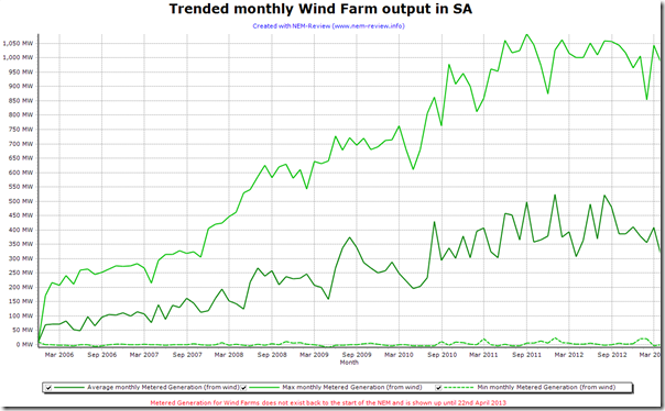
Further analysis from NEM-Review shows that the average monthly wind farm output in April seems to be lower than has been experienced for some time:
It’s probable that the wind farms, too, are undergoing planned maintenance – hence can produce less in aggregate, on average for the month.
If this is the case, then this effect would be layered on top of the dispatch intervals (such as those above) when the wind does not blow and so the remaining wind farms that are available are limited in output.
3) Withdrawal of Northern Power Station
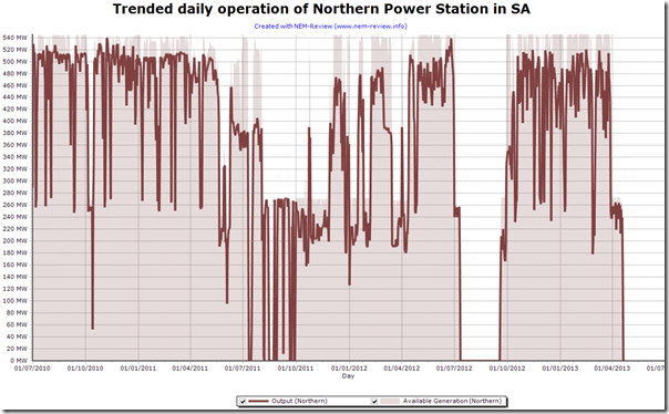
As noted by Power Station owner Alinta, Northern Power Station is now only being operated in the months of October to March each year.
This can be seen in the following daily trend in NEM-Review:
This withdrawal of capacity is a rational response to the fact that the returns generated by the station in the other months were insufficient to warrant continuous operations.
However it is ironic that the increased installed capacity of wind farms in recent years, whose energy supplied has been one of the contributing factors to lower spot prices and hence lower returns overall – hence the withdrawal of Northern – can be seen above to be unable to supply energy (at some other times) to the point where Effective Surplus Capacity drops to a low level and prices rise as a result – whilst at the same time Northern sits idle.
This is a symptom of the ongoing “Capacity vs Energy” debate in the NEM with respect to intermittent generation sources.
As penetration of these intermittent sources increases, supported by government policy objectives, this debate could well intensify, with some proponents making cases for the introduction of Capacity Payments* for thermal plant that will otherwise be discouraged from participating in the energy market as a result. A similar argument might also be made by others for the promotion of energy storage technologies, which might otherwise be similarly uneconomic.
The costs of these externalities, however, may well not be factored into the reported costs of introducing such intermittent sources.
* This should not be mistaken as advocating a Capacity Market for the NEM – rather, just highlighting how managing concurrent (and perhaps sometimes competing) priority objectives in a complex market will require some intelligence and wisdom (and less politicking and vested-interest-lobbying) in the months and years ahead.


Paul,
With regards to your last points on Northern: We all get that wind is intermittent, and if average wholesale prices have fallen and the consumer is receiving that cost reduction then any market volatility is purely a problem for the retailers. Maybe instead of focusing on Northern which is mostly hobbled by the carbon tax you could be asking why several important peakers and intermediate plant weren’t made available for generation over the recent weeks? Summer was pretty weak and no-one had to push their assets hard. I count over 1 GW of unavailable gas plant. The entire point of some of these assets is to provide capacity yet they did not deliver. Maybe there is something in holding on to that gas…
You also brought up externalities for wind (of which neither example exists); why not talk about the health costs of coal generation? 😉
Cheers,
Tom
Thanks for these questions, Tom
This is the second lot from you I have not yet responded to. When I do find some time to look more thoroughly, I’ll be sure to post more on WattClarity.
Regards
Paul