We’ve noted a few tweets today from people who’ve noted that wind production in South Australia yesterday supplied over half of South Australia’s demand. Given interest in this topic, we thought it would be of value to put yesterday’s production in the context of what’s been happening over the past 6 months or so.
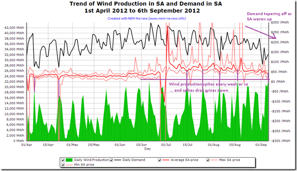
We used NEM-Review to produce the following trend of the output of both demand in SA and the aggregate output from all the wind farms in South Australia.
For completeness we also included the price range of SA spot prices on each of these days, as well.
From this chart we can make a number of observations, including the following:
1) We can see the wind production yesterday was indeed high – and that these high levels of production seem to occur every week or so, on average. In between these spikes in wind production are times of very low production (previously discussed here and here, etc…).
2) Because demand has been tapering off in SA in the past couple weeks (on the tail end of winter) we see that the percentage supplied (from the same peak volume) is higher now. This was the subject of a number of tweets.
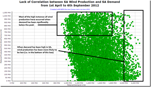
3) We can see that the production of wind is somewhat reverse-correlated with demand in SA – as is also shown in the following correlation:
Update added on 18th September
Allan O’Neil added a question about the type of demand we used in performing this analysis, and in particular with respect to the second chart (above). This followed a similar query we received offline from people at AEMO.
For those who are interested, you can read more about three different measures of demand in this “Regional Demand Definition” document from AEMO – in summary, there are three different measures of demand = Native Demand, Operational Demand and Scheduled Demand.
The demand used in the three original charts in this post is Scheduled Demand, with the key point of interest here being that the Scheduled Demand does not take into account Non-Scheduled Generation (which is mainly wind generation).
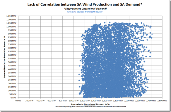
Because of this fact, the apparent reverse correlation shown in the chart above is not as clear when we add back in the amount of Non-Scheduled Generation for each trading interval over the same date range to produce an approximation of Operational Demand – as shown in the chart below (in blue, for clarity):
From the chart above, we see that wind production and demand are still not positively correlated – but that the degree of negative correlation is not as strong.
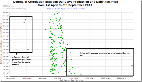
4) We also see the reverse correlation between wind production and price (i.e. higher production from wind puts downward pressure on prices in SA – sometimes to the cost of the wind farm operators (or PPA holders) who have to pay back to AEMO whenever prices drop below zero overnight.
(a) In the chart above, we’ve capped the axis range from +$300/MWh to –$300/MWh in order that the scale of the numbers can be seen better, but keep in mind that daily peak prices rose over $4000/MWh and dropped to almost –$1000/MWh
(b) This is easy to understand, as the wind is dispatched with zero marginal cost and hence squeezes out the more thermal plant, which has a higher short-run marginal cost (and hence bid price).
(c) This reverse correlation can also been seen here, over the same date range:


There has been heated debate since the report in the “Weekend Australian” (6/9) that wind energy is avoiding very little CO2 emissions and doing so at a cost of $1,484/t CO2 avoided. I would like to know how we, in Australia, can say how much emissions reductions can be attributed to wind generation?
Australia has no actual measurements of CO2 emissions from its power stations. We have crude estimates of emissions based on long term average fuel consumption. AEMO quotes the same emissions intensity for all units in the one power station no matter at what state of efficiency the unit is operating at the time and no matter whether the plant is ramping up or down. So clearly, the emissions intensity figures are very crude estimates and do not allow for changing intensity as the output and efficiency of the units changes.
We don’t even measure the fuel used in most power stations, let alone at the frequency needed to estimate the emissions avoided by wind generation.
We need at least the emissions data quality and frequency that Ireland has http://www.eirgrid.com/operations/systemperformancedata/co2intensity/ or, better still, we’d need what the US EPA requires for emissions measurement and reporting. But we’d need the information at preferably 5-minute intervals, or at worst 15-minute intervals, for every unit to allow us to determine how much CO2 emissions are avoided by wind generation.
Here is a recent analysis of the emissions avoided by wind generation in Ireland: http://joewheatley.net/emissions-savings-from-wind-power/
CO2 savings per MWh of wind generation (relative to savings at zero wind penetration) are:
Wind Penetration CO2 Savings
0% 100%
10% 90%
20% 77%
30% 62%
40% 47%
At 50% wind proportion of total generation, 1 MWh of wind would be avoiding about 32% of the emissions from 1 MWh of fossil fuel generation, all else equal.
In fact it’s probably worse than that. I understand the Irish emissions intensity calculations do not include the extra emissions from fossil fuel units, for example: starting up and shutting down; in spinning reserve mode (i.e. not generating), powering up and powering down to back up for the changing wind power, etc.
Ireland’s figures apparently do not include all the extra emissions attributable to backing up for wind. But Australia has nowhere near the quality of emissions intensity data that Ireland has. So how can we make any reliable statement about how much emissions are being avoided by wind generation? Can we state what is the cost per tonne CO2 avoided by wind generation?
Hi Peter,
Thanks for your detailed question.
I did not read the article you mention, but understand that there are a number of views being promoted on aspects of:
1) Whether the emissions reduction from wind is large, or not; and
2) Whether the same emissions reduction is expensive, or not.
In the analysis we publish (and tools we provide) we strive to remain technology agnostic – and just to present facts, such that people can make up their own minds in terms of judgements such as large/small and expensive/inexpensive.
In the 5+ month period analysed above, for instance, Metered Wind Production in SA totalled 1,591GWh, whilst total SA demand over the same period totalled 5,795GWh.
This means that (based on these numbers) wind supplied 27.5% of the total demand over the period – and, as the chart above shows, oscillated to a significant degree over that period between cyclic high and low points. Both factors reinforce the fact that wind power is an energy-play moreso than a capacity-play. Both are important in the context of the broader energy supply industry.
Determining what emissions reduction resulted from this production is not a precise science as one needs to hypothesise about “what might have otherwise been”. At an extreme we might look at the emissions factor of Alinta’s Northern Power Station (whose output has been curtailed due to a combination of factors, including declining demand and increased wind production) and calculate an upper bound of emissions reduction as follows:
0.95 tonnes/MWh sent-out x 1,591GWh = approx 1.5Mt abated.
Is that not much, or a lot? There will be a range of views on this.
In terms of the cost of this abatement, this is analysis that we’ll have to leave for another time.
Does this help?
Paul
Hi Paul,
Thank you for your quick response and for your upper bound calculation of the emissions avoided by wind generation in the SA grid.
You say:
However, you’ve estimated an upper bound but not a lower bound or best estimate. I suggest it is really important to present this information objectively and with proper balance. The costs and benefits of wind energy is an important issue. Australia is committing to and spending billions of dollars on wind energy, apparently without objective analysis of the costs and benefits. So I’d urge that the estimates for CO2 emissions avoided and the CO2 avoidance cost be calculated and presented objectively.
Your upper bound estimate assumes 100% of the wind power displaces coal power. Many studies show this is not the case. The paper I linked to in my previous comment is one example. There are many others from Europe and North America that reach similar conclusions. Australia does not have any emissions measurements, so we are guessing. We don’t even have accurate emissions estimates, let alone at the 5 to 15 minute time spacing that is needed to do the equivalent of the study of the emissions avoided by wind generation in the EirGrid.
I’d urge you to balance your comment by also presenting the lower bound and the best estimate.
I would suggest the emissions avoided should be compared against three baselines:
1. the average emissions intensity of the SA grid, excluding wind power
2. the average emissions intensity of the fossil fuel generation that would have been the case now if the government had not mandated and subsidised wind power – if government policy had not mandated and subsidised wind power, the SA grid would have more CCGT and less OCGT, and the OCGT would be running more efficiently (lower emissions intensity) than they are, so the average emissions intensity of the fossil fuel generators in the SA grid would be lower than it is now.
3. Baseline #1 with the emissions embodied in the wind farms included.
Below I show an example of how I suggest the calculation could be done for the first case above. However, please note that numbers used in my example below are fictitious. I’d urge the analysis be redone using the best available numbers.
Assumptions and calculations:
CO2 emissions avoided:
SA grid average emissions, excluding wind = 0.7 t/MWh
Wind power displaces 65% of emissions at 27.5% wind penetration (“Emissions savings from wind power”: http://joewheatley.net/emissions-savings-from-wind-power/ )
Emissions avoided by wind generation = 65% x 0.7 t/MWh = 0.46 t/MWh
CO2 Avoidance cost:
Additional cost of electricity from wind generation (this cost should include all the hidden subsidies and hidden cost transfers to the fossil fuel generators) = $60/MWh
CO2 abatement cost with wind generation in SA = $60/MWh / 0.46 t/MWh = $132/t.
I’d urge that the best available numbers be used to calculate a lower bound and best estimate.
Hi Peter
Thanks for your second comment.
I appreciate what you’re seeking – however this is not something that WattClarity will provide, for three main reasons.
1) First and foremost, an answer to a question “what would emissions have otherwise been?” is, in truth, unknowable –
2) Of course it would be possible, through rigorous analysis, to progress down the asymptote to deliver an answer more refined than my crude upper bound estimate (above):
3) More fundamentally, however, this is not an area of debate WattClarity will engage in.
There may be other places you can find the assistance you’re looking for.
Regards
Paul
PS you asked about time-based emissions data, which is available from the AEMO for the Australian NEM – though I suspect it has been generated with the use of the same gross simplifying assumptions that are (to my knowledge) also the case for time-varying unit efficiency calculations right across the world.
Paul
Thanks for publishing this interesting analysis. Quick question – what definition / source of system demand are you using for plots 1 & 2 above? With nearly 400 MW of non-scheduled wind capacity in SA, obviously wind production and scheduled demand are going to show an exaggerated negative correlation.
Good pick-up, thanks Allan
One of our friends at AEMO contacted me offline with the same question and I have been investigating further since that time.
It appears that the “Metered Demand” figure we update in NEM-Review falls under the “Scheduled Demand” classification, described further here.
http://www.aemo.com.au/en/Electricity/Market-and-Power-Systems/Dispatch/Regional-Demand-Definition
As we find the time, we’ll add in the updated figures in additional charts above.
Regards
Paul