With the concerns being raised about the possibility of rising wholesale costs for electricity, and the need for new baseload capacity in the NEM, I thought it worthwhile to post the following two charts, generated from NEM-Review 6.
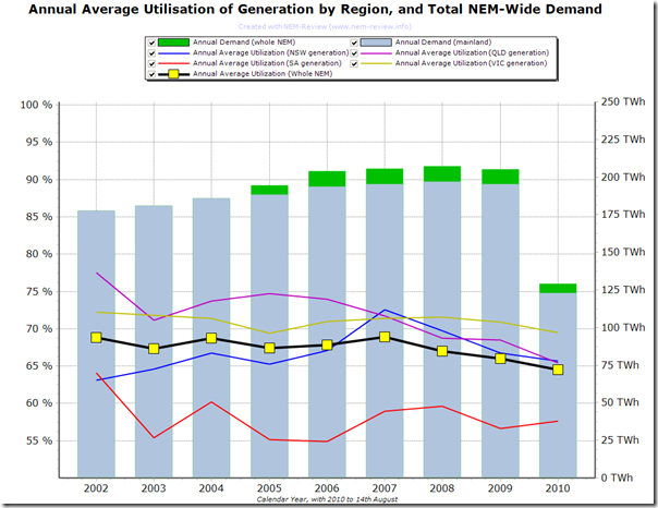
This first chart shows the calculation of annual average utilisation of generation plant allocated by region.
This calculation has been performed by aggregating the outputs of all generators currently in each region (and for each year back to 2002) and dividing by the aggregate declared available capacity of the same units, across all 17,520 half-hour periods in the year.
The chart only begins at 2002, as that is the first full year in which available generation capacity was published by NEMMCO/AEMO.
As can be seen in this chart, there has been a slight decline in the utilisation of available capacity, right across the NEM, since 2007. This would be due, at least in part, to the slowing of demand growth in the NEM – such as that discussed here for the winter months.
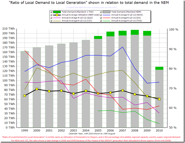
In the second chart (below) I’ve performed a similar analysis – except this time all the way back to 1st January 1999.
In this case the chart plots what I have described as “Ratio of Local Demand to Local Generation”, which is not quite the same as station utilisation.
It’s calculated in a similar way to Utilisation, except that it’s calculated based on local demand in a region, as opposed to local generation output in a region. Hence it is different from Utilisation to the extent to which interconnector transfers are present.
If there is a formal term for this ratio, I have forgotten what it is – if you know of one, please note it as a comment below (or just let me know so I can update this post).
In this case, the chart can be provided all the way back to 1999 because available generation on a regional basis was published by NEMMCO back to the start of the NEM.
As can be seen in this chart:
1) In the early years, the ratio for South Australia was very high, due to a relative shortage of installed capacity (though note that the Heywood interconnector was flowing consistently westward in those years).
2) As noted in the chart, there is a big reduction for NSW and VIC in 2008 and again in 2009 as a result of the Snowy capacity being allocated to those regions from 1 July 2008.
The main point that can be seen in this chart is that the NEM-wide utilisation has varied only slightly over each of the 11.5 years of NEM history.
1) Hence, in very general terms, it can be concluded that new capacity is being added to the NEM (and made available) at almost the rate required by growth in average demand:
(a) in aggregate the level has gently declining from about 70% in 2000 to be 65% in 2010
(b) this 5% represents an installed capacity of 1,800MW at total demand of 210TWh.
2) Follow-on questions might include:
(a) the extent to which this decline is material, and whether it can continue into the future (i.e. what’s the optimal point)?
(b) how the situation is different when we look at peak demand?
(c) whether the capacity that has been added has been in the “best” locations, and
(d) whether the capacity added has been of the “best” type – in his presentation at the EUAA Annual Conference last year, Paul Simshauser provided his view about this.
| For those who wish to perform additional analysis with the data shown here, we have uploaded the .NRF file to this location.Just download the linked file, unzip, and double-click to open in NEM-Review 6 – then enjoy! |  |


Be the first to comment on "Trend in annual Generator Utilisation by Region"