Lots of things are changing!
After a busy start to the year, it was great to spend some time looking through the Generator Statistical Digest 2020 (released at the end of January) and to take a step back and understand how much (and how quickly), the NEM is changing. There were numerous things that jumped out to me but two I wanted to share now:
1) the increasing impact of decreasing spot prices / increasing network constraint limits on solar generation; and
2) the value of looking at all assets in the fleet together.
If you are a consultant in the electricity market, someone trying to operate power stations in the NEM or a developer of solar generation, then this article (along recent articles by Marcelle on 17th March, 26th March and a third to come) will be of significant interest to you.
Solar Generation: Ain’t what it used to be?
As a specialist consultant, I see lots of business cases for new generation entrants, especially wind and solar. Once I have become familiar with the technology being used, I always look at a couple of key parameters: the expected capacity factor and volume weighted price. Both key metrics are highly dependent on the physical location in the network where the asset is to be located, because, the new asset is a power station in an electricity network and not just an environmentally friendly financial asset class!
Having been around a while, Nyngan, Broken Hill and Moree used to be the assessment baselines, with capacity factors around 30% .
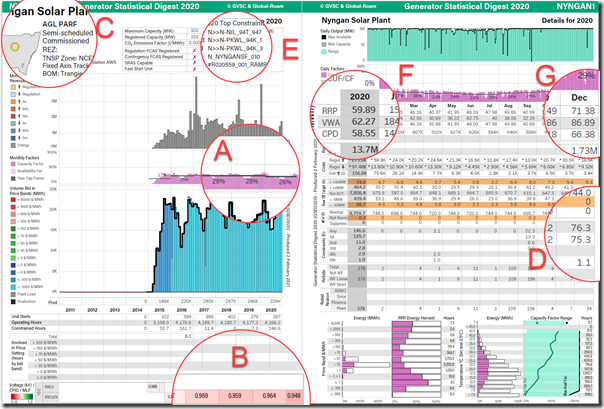
Using both A and B pages of the GSD2020, I could see that that the capacity factor for Nyngan was down in 2020 from previous years (A), with the MLF also coming down from 0.986 to 0.948 (B). Understanding the location of the asset in western NSW (C) and that lots of new generation has been entering the market, the impact of network constraints was my next area of interest. In 2020, network constraints began increasing significantly (D), with the ‘N>>N-NIL_94T_947’ constraint the main culprit (E). This system normal constraint (ie it is invoked all the time to manage thermal constraints on the network) showed December 2020 with 75 hours of binding constraint alone (and considerably more now in 2021).
The subsequent impact of this on the year (F) does not show too much of an impact with RRP, VWA and CPD all around the same level, but when we zoom in on December 2020 (G), we can see the CPD Price (Connection Point Dispatch RRP – effectively the nodal price) is starting to drop away from both the VWA Price (Volume Weighted Average) and RRP (time weighted RRP). Although participants are paid the RRP for volume delivered to the RRN, the CPD heavily impacts the physical dispatch of the power stations and hence, irrespective of the participant having a PPA that locks in price; if the volume is decreasing due to network constraints, revenue will be down!
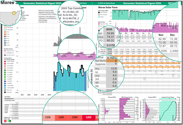
Given these interesting findings, I did the same with Moree, and sure enough, very similar patterns could be observed – although network constraints are not (yet) as critical, system normal constraints are certainly starting to have an impact.
This goes to the heart for the solar developers out there looking at consultant reports – make sure you are getting a detailed and clear picture of the system normal constraints AND their subsequent impact on the effective nodal price for your area!
1) If your consultant tells you there is no such thing as a connection point dispatch price – find a new consultant!
2) Paul’s prior article about ‘Which units were most impacted by constraints in 2020?’ (also using the GSD2020) presents a broader picture – not just about Solar Farms.
Similarly, if you find yourself with a constant MLF despite all the projections of increasing wind and solar generation – which will be generating in your area at the same time as you, time to re-check your business case.
Regional Changes in Capacity Factors
This got me thinking further about capacity factor trends in 2020 given Nyngan and Moree were traditionally around 30%.
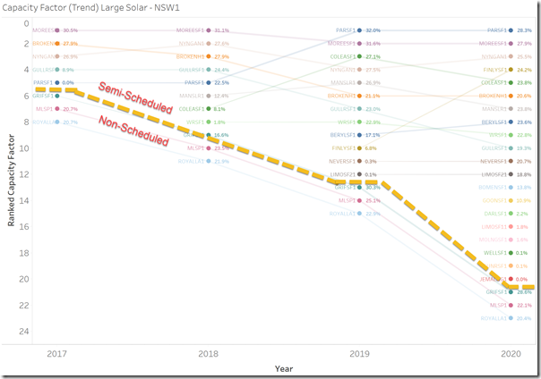
With access to the background data that we used to create the GSD2020, I was able to chart all the similar units in a region using a ranking chart (just NSW shown here). The semi-scheduled and non-scheduled units are split with the dotted yellow line.
A number of points are clear from these two charts:
Insight #1) Unless there is significantly different technology being deployed, capacity factors* used in business cases need to be between 25%-30%, not 30%-40% (as I have seen in a few places).
* i.e. what makes it to market to be sold as distinct from the availability factors that some asset managers may say is ready to generate.
Insight #2) There is significant operational pressure to maintain previous levels, with many of the plants installed in 2017/2018 struggling to maintain the similar levels, obviously for a variety of different reasons, but nonetheless, operating pressures are significant.
Complete your own analysis
Don’t just rely on your appointed consultant, though – we’ve made it easier for you to complete your own analysis.
If you would like to purchase the prepared ‘GSD2020 Data Extract’, get in touch with Paul or myself, or use this form. The value of seeing all the regions at the detailed and comparative level, especially for developers and consultants, is invaluable.
————————————–
While working through the datasets and GSD2020, I could not help but notice the big changes in gas generation capacity factors, and hence changes in spot market revenue – and I note that Allan did already share some thoughts in ‘Transition Fooled?’ (also referencing the GSD2020). But alas, that will be for another article called “Gas: Where is their revenue coming from?”
————————————–
About our Guest Author
|
|
Jonathon Dyson has nearly 20 years practical experience in the Australian NEM, having held senior operational and trading roles in participant organisations and now as the Director of a specialist market consulting organisation, with a specific focus on renewable energy integration. Current clients include some of Australia’s largest integrated utilities, market regulatory organisations, transmission system operators and not-for-profit market observers. Jonathon has spent considerable time working with AEMO, Australia’s energy market operator.
As a former member of the NEM’s Dispatch and Pricing Reference group, Jonathon’s intricate knowledge of power system dispatch and security, coupled with practical, on-site experience with power system operations across all forms of electricity generation, allows him to bring operational and energy trading realities to strategically significant policy discussions. Jonathon has degrees in Engineering and Management, and is a member of the Australian Institute of Company Directors, CIGRE and IEEE You can find Jonathon on LinkedIn here. Jonathon, and his team at Greenview, are also co-authors of the GSD2020 – and (before that) the GSD2019 and the GSD2018. |


Capacity factors are only going to decline further as we get more clouds due to more cosmic rays.
We are already at the highest concentration of cosmic rays in recorded history and it keeps climbing.