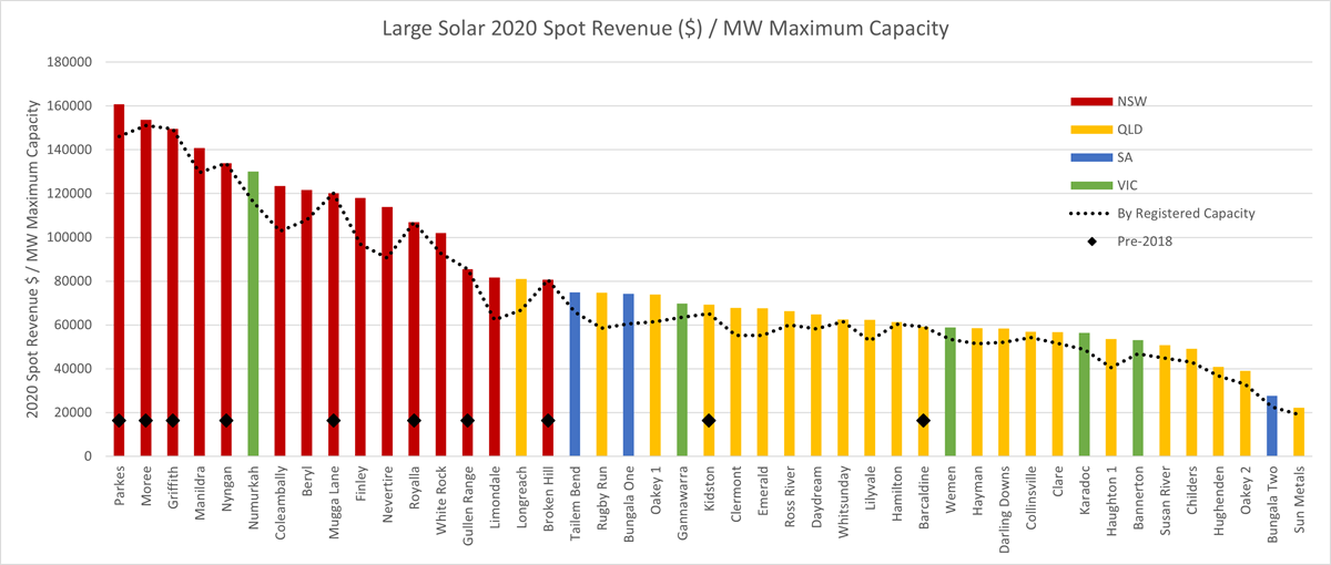
Last week I presented at the Clean Energy Council’s Large-Scale Solar Forum on the topic “Exploring the market performance of large-scale solar farms across the NEM in 2020”, based on data from the Generator Statistical Digest 2020, a recent publication by Global-Roam and Greenview Strategic Consulting. Here’s a look at one of the measures of performance. There’s an equivalent graph for wind here.
I’ve chosen the metric Revenue per MW of Maximum Capacity to compare the performance of large-scale solar farms. I chose this metric in preference to two other metrics often used in league tables:
- Capacity factor (MWh generation divided by MWh at continuous maximum output): This is interesting as a comparison of technical performance, but doesn’t capture whether the energy was valuable when generated;
- Volume-Weighted Average Price (weighted average of market price by generation MWh each trading interval): This is a big improvement on capacity factor for capturing the value of the energy, but with the increasing incidence of negative prices and of solar farms incentivised to reduce output in response, the VWAP can be misleading. Imagine a solar farm that chose to run only for one hour a year when the prices were high. It’d have a spectacular VWAP – but negligible annual revenue.
The metric Revenue per MW of Maximum Capacity attempts to compare estimated spot-market revenue return across farms of different sizes by normalising using MW of Maximum Capacity as a rough proxy to the capital cost.
Note: There are two figures that AEMO publishes from generator registration information – the “Registered Capacity”, which is the “nameplate rating” of the site – for a solar farm, typically the PV panels installed, while the “Maximum Capacity” is the maximum the farm can dispatch – which is limited by its network connection. Many recent solar farms have Registered Capacity exceeding Maximum Capacity to get a better return on the expensive network connection capacity.
The comparison here is made using only public data from AEMO’s market systems, so doesn’t take account of a lot of factors (including hedging arrangements, operational costs and green certificate value) that would be needed to calculate the return to the owners. What it does indicate is the spot market revenue creation ability of the farm, which might not be of much interest to a PPA-holding developer, but is of a lot of interest to the offtaker (the counterparty to the PPA), to market-exposed generators, and to investors in future solar farms.
Some notes on the detail:
- Only solar farms that were operational for all of 2020 are included.
- Spot Revenue is estimated from AEMO public data (using DISPATCH_UNIT_SCADA to estimate generation), accounting for applicable loss factors.
- Maximum Capacity was chosen for normalisation, but it could be argued that Registered Capacity is a better measure, or somewhere in between. The dotted line on the graph shows the metric Revenue / Registered Capacity. Using this metric changes the ordering a little but not a lot.
A few observations:
- The NSW sites on the whole are performing a lot better than the QLD sites on the metric Spot Revenue / MW Maximum Capacity. The best performing NSW farm (Parkes) is estimated to have annual spot revenue of $160,000/MW, compared to the best QLD site (Longreach) at $80,000/MW.
- In VIC, Numurkah did well, but the other VIC sites are significantly lower in relative revenue, mostly due to the impact of constraints from an oscillation problem early in 2020.
- Four of the top five performing sites were in operation before 2018.
- In SA, we see Tailem Bend and Bungala One scoring similarly on this metric, which is quite different to their results on the other two metrics I mentioned above, given their very different bidding strategies. Tailem Bend’s VWAP for 2020 was about $42/MWh with capacity factor 19%, compared to Bungala 1’s VWAP of about $32/MWh with capacity factor 27%.
In a follow-up article I looked at how the results change when an estimate of the value of the LGCs created is added in.


Congratulations on taking in this type of analysis. It is refreshing.
It must also be possible to assess each solar farm earnings against an assumed PPA strike price, to gauge the ongoing effectiveness of the CfD as a hedging strategy for purchasers.
I presume a similar effort will be made on wind farms?
Confused. There must be a structural reason that NSW is consistently top of pack?